Last Updated on November 21, 2023
Imagine that you’re about to read a classic book bursting with deep emotion. The synopsis promises love, forgiveness, and redemption. You plop onto your favorite couch, tissues at the ready. Upon opening the book – the text is in Helvetica!
Sure, you might argue that it’s only a font. No big deal. But it is, especially if you want a complete and enjoyable reading moment.
You want the text you’re reading to reflect its content and feeling. The appropriate text font will complement the overall tone and message of the author. When it all aligns, the reader’s experience becomes seamless, and the text effortlessly “flows.” Conversely, an ill-suited typeface can create a jarring effect.
Therefore, it’s imperative for every author to carefully assess a font before picking it for their upcoming book project. But with thousands of options out there, where do you begin?
We’ve gone ahead and prepared a rundown of the best book fonts to enhance your readers’ experience. Check them out below, along with some quick font facts.
Brief Introduction to Fonts
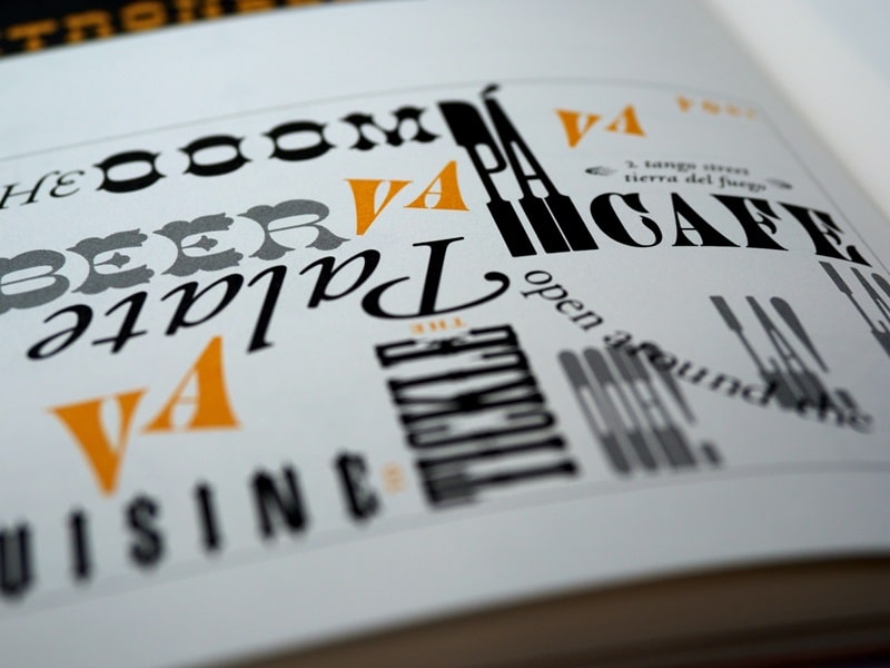
Fonts fall under two major categories: serif and sans-serif.
Serif fonts feature tiny lines, strokes, or flourishes at the end of each character. These small elements are useful in accentuating individual characters in the font.
They are especially suitable for books printed in large blocks of text, as the tiny flourishes allow the reader’s eye to seamlessly travel over to the next word. The quirky elements also create a realistic reading experience due to their emulation of handwriting.
On the other hand, sans-serif fonts are fonts without serifs. Instead, they comprise simple, clean letters. Popular examples would be Helvetica, Futura, Avenir, Open Sans, and Lato.
Other popular font categories aside from serifs and sans-serifs include;
• Script Fonts – they resemble cursive handwriting.
• Display Fonts – Bold and stylized fonts, which are best suited for titles and headings but unsuitable for large text blocks.
Considerations Before Choosing the Right Font for Your Print Book
a) Legibility
Legibility is the biggest aspect when picking a font for your print book. Your readers shouldn’t struggle to make out the individual words or characters in the book. Note that this isn’t only impacted by the font chosen; it also depends on the font point used.
b) Suitability
Fonts are a critical aspect of your book’s graphic design. They play the same role as other graphic elements, such as color. Therefore, you want to choose a font that captures the book’s theme and genre. For instance, cartoonish fonts will aptly suit whimsical and comedic themes while grunge fonts would be perfect for books with bleak or sinister storylines.
c) Audience
Staying with suitability, some fonts resonate better with members of certain demographics. A classic case is gothic fonts, which tend to attract most readership from older generations.
d) Visual Appeal
After all is said and done, you want a font that makes your book stand out in the library shelves. The font used should be appealing enough to pique any passerby’s interest. Remember that you’re targeting both avid and random readers. The latter category is commonly drawn in by aesthetic appeal.
Best Fonts for Print Books
Serif Fonts
1. Baskerville
Baskerville is a font designed in the 1750s in Birmingham, England, by John Baskerville. He took heavy inspiration from his own background in calligraphy while creating his eponymous font. It’s ideal for authors who want to infuse a touch of realism into their works.
2. Caslon

Caslon is a serif typeface developed by English designer William Caslon I in the 18th century. It’s also a name for any font resembling or inspired by Caslon’s original typefaces. The font stands out for its textured appearance, small caps, and swash letters. These elements combine to boost its aesthetic appeal.
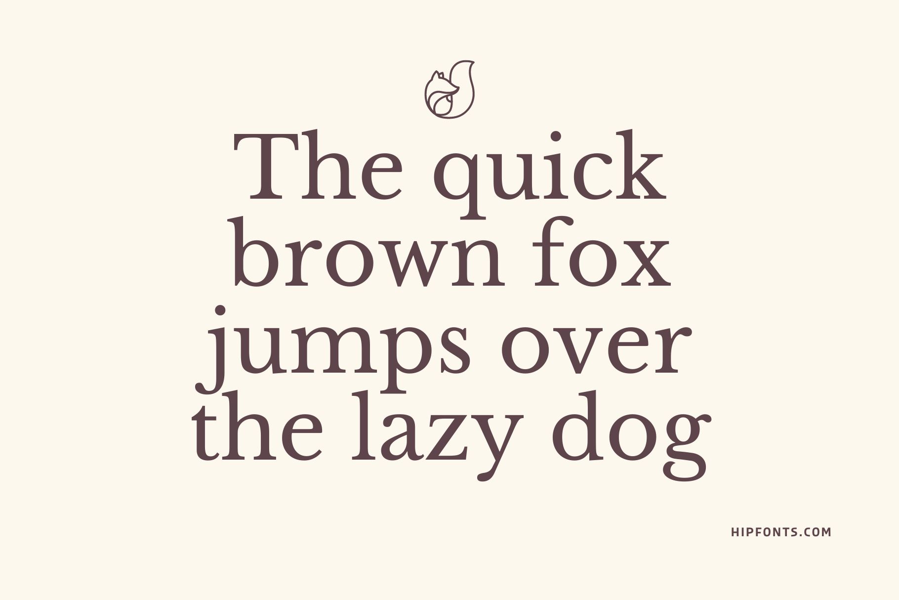
3. Merriweather
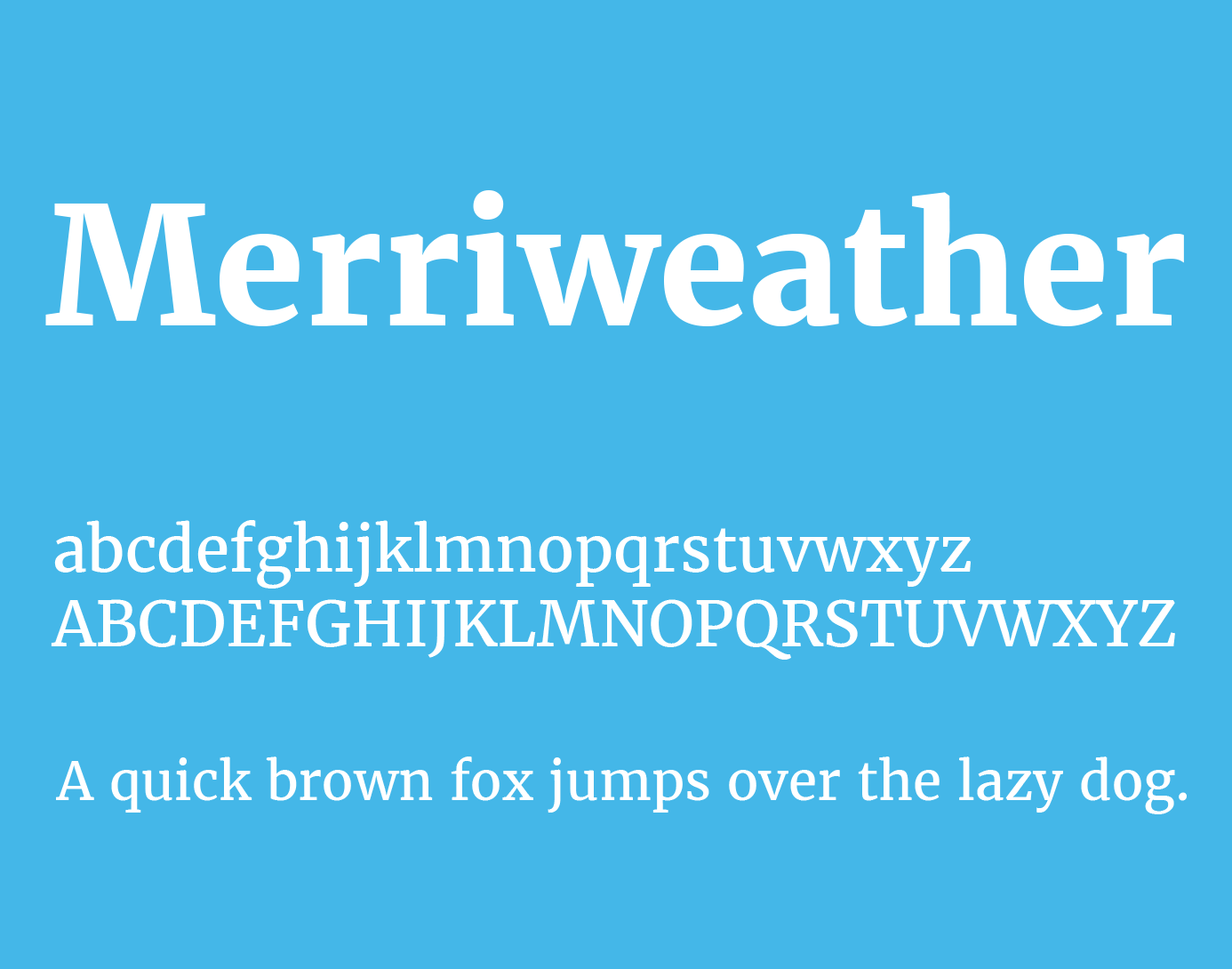
Merriweather can aptly be described as the “Mayweather of print book fonts.” Designed by Eben Sorkin for Adobe Fonts, this typeface stands out for its powerful feel and effortless readability. There are up to eight different styles available. These include sans-serif versions like Merriweather Sans.
4. Georgia

Georgia was created in 1993 by font designer Matthew Carter and subsequently hinted by Tom Rickner for Microsoft. The font looks exceptionally stunning when used in small or low-resolution prints.
5. Palatino
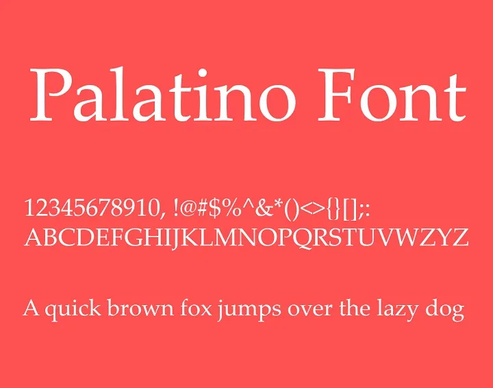
If your novel is set in post-World War II and are scouting for a suitable font, you might want to check out Palatino. It’s an old-style serif typeface created by Hermann Zapf. It was initially released in 1947 by the Stempel Font Foundry and later reissued by other foundries, such as The Mergenthaler Linotype Company.
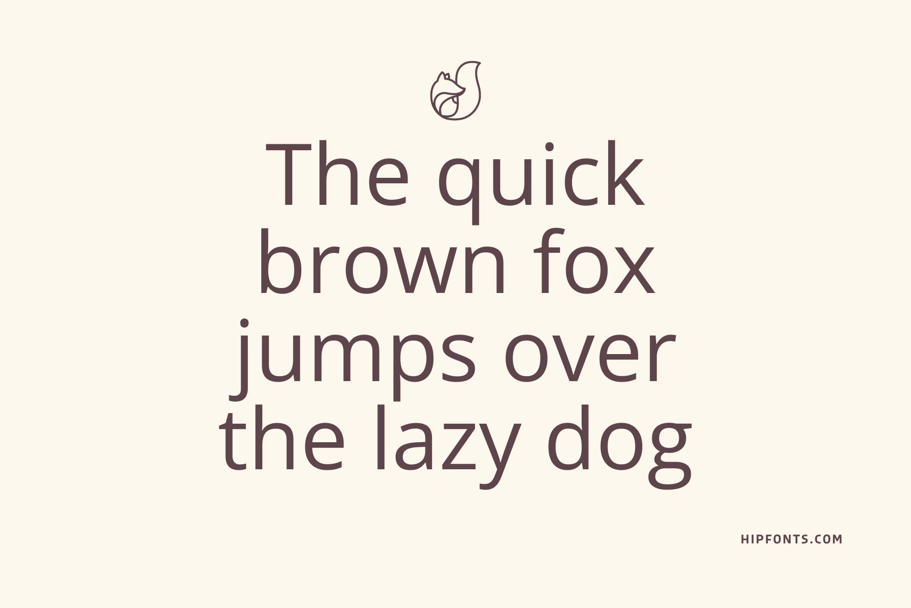
6. Winslow Book Hairline
The name of this font alone paints a rough picture of its aesthetic appeal. Designed by Kimmy Kirkwood, Winslow Book Hairline is the most preferable print book font for injecting fun and charisma into your book. Although a serif font, this typeface features balanced thickness that makes your text clean and tidy.
Download Winslow Book Hairline
7. Minion Pro
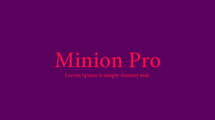
Minion Pro is widely regarded as one of the most readable print book fonts. The typeface is the work of renowned font author Robert Slimbach, who designed it in 1989 taking inspiration from late Renaissance-era type. It was first released in 1990 by Adobe Systems.
8. Alegreya
Created by Juan Pablo del Peral for Huerta Tipográfica, Alegreya is a humanist font that includes both serif and sans-serif families. It conveys a sense of rhythm and can help readers to navigate long texts.
9. Cinzel
Is your book a seamless blend of classic and contemporary storylines? If yes, then Cinzel would make an excellent font. It was created by Natanael Gama based on 1st-century Roman inscriptions and inspired by classical proportions. It’s perfect for different book genres, ranging from romance and fantasy to crime and adventure.
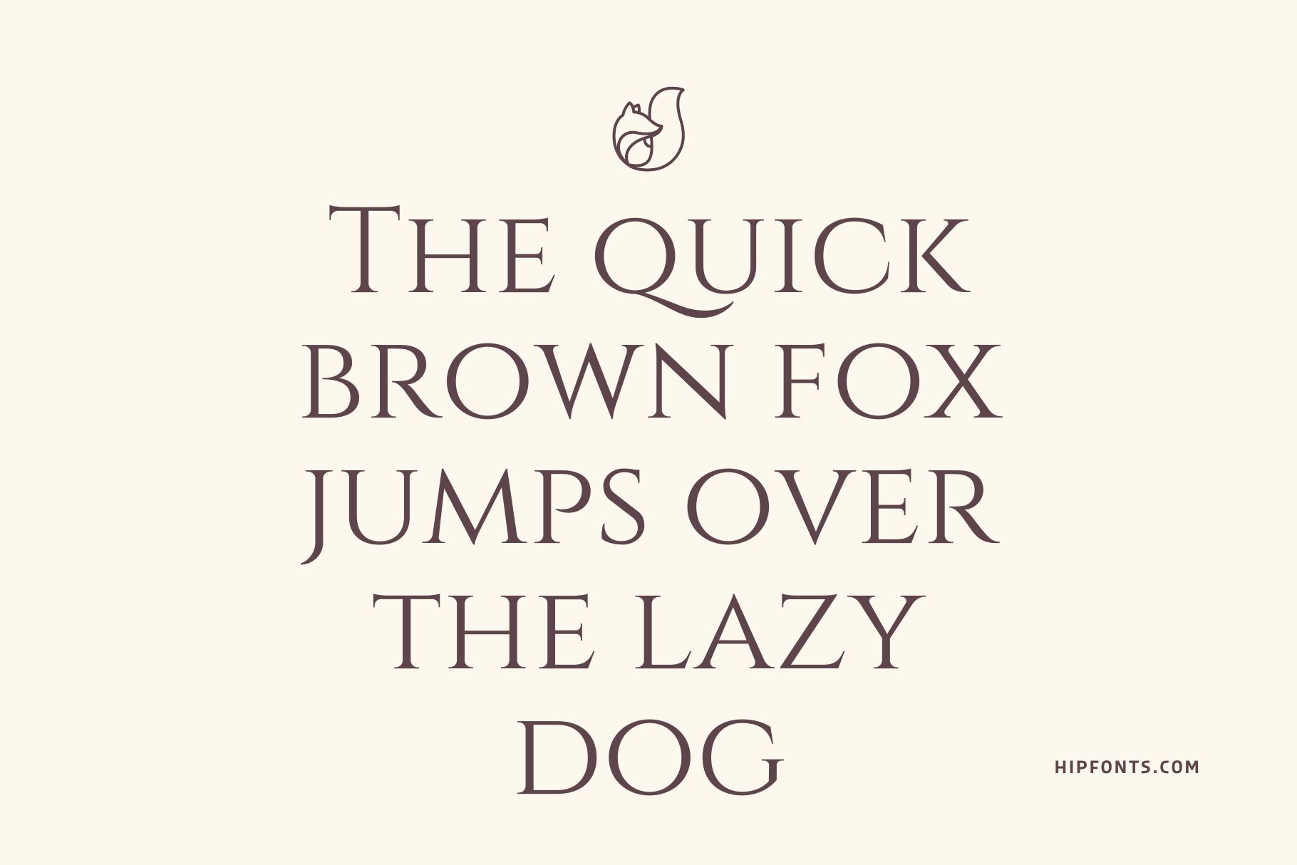
10. Garamond
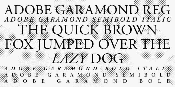
It’s difficult to highlight the best serif fonts for print books without mentioning the ever-graceful Garamond. This typeface was developed in the 16th century by renowned French engraver Claude Garamond. It’s a perfect font for adding a classical aura to a storyline.
Sans Serif Fonts
11. Helvetica Neue
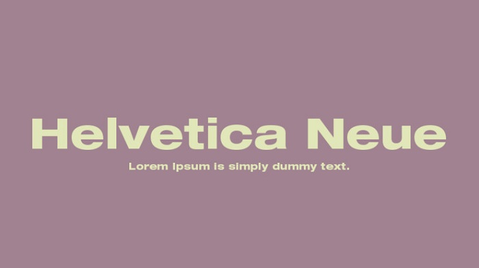
Originally known as Neue Haas Grotesk, Helvetica is the work of designers Max Miedinger and Eduard Hoffmann. It comes in numerous weights and styles, including display versions that you can use exclusively for titles and headlines.
12. Myriad
Myriad is a humanist, sans-serif typeface developed by Robert Slimbach and Carol Twombly in the 1990s for Adobe Systems. It’s a general-purpose font that will look great in various elements of your book, from the cover title to fine print and even quotations.
13. Orion Pro
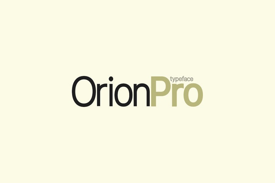
Orion Pro is a modern sans-serif type family inspired by various popular Swiss typefaces. It’s mostly a display font that will work best for your book’s cover title and chapter headlines. With up to 12 unique styles and matching weights, you’re sure to find a version that works for fine print, too.
14. Rosario
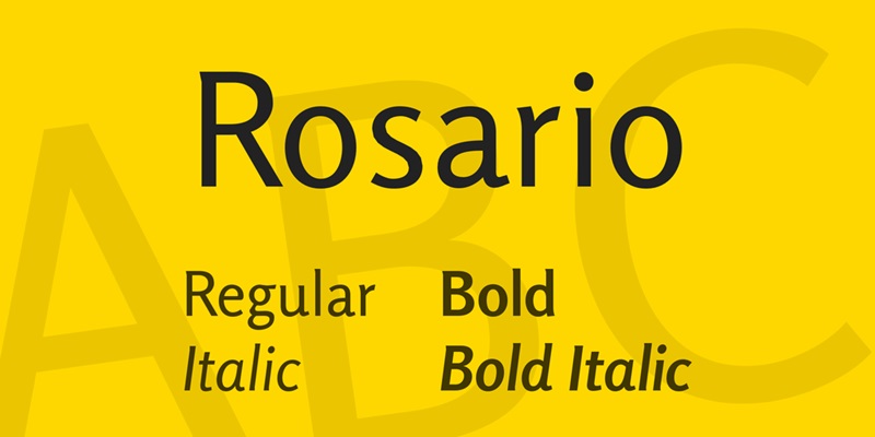
Named after the Argentine city and hometown of its designer, Rosario is one of the most elegant fonts for print books. According to the designer – Hector Gatti – this font is especially suitable for books set in the classical era. Its crowning jewels include soft endings and subtle contrasts.
15. Rosarivo
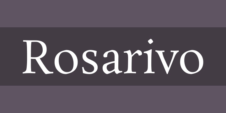
Rosarivo is a distinct typeface developed by Pablo Ugerman primarily for letterpress printing. The font is outstanding for its elegant and luxurious feel, making it ideal for romance or fantasy-themed books.
16. Morton
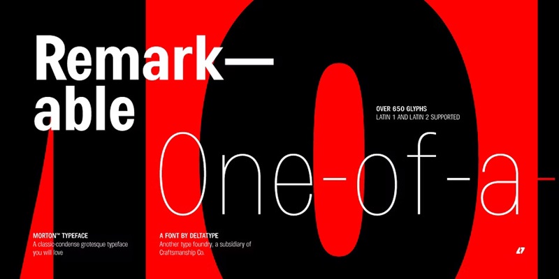
Morton is another modern, sans-serif print book font that looks beautiful whether used for titling or body text. There are up to nine different styles, each with matching weights. The entire family was developed by Kwanchai Akkaratammagul and originally published by Deltatype.
17. Open Sans
Open Sans is a humanist, sans-serif typeface by Steve Matteson and commissioned by Google. This font was originally released in 2011. It was created based on Matteson’s earlier humanist design known as Drop Sans. Although primarily a sans-serif font, Open Sans incorporates several serif elements.
18. Roboto
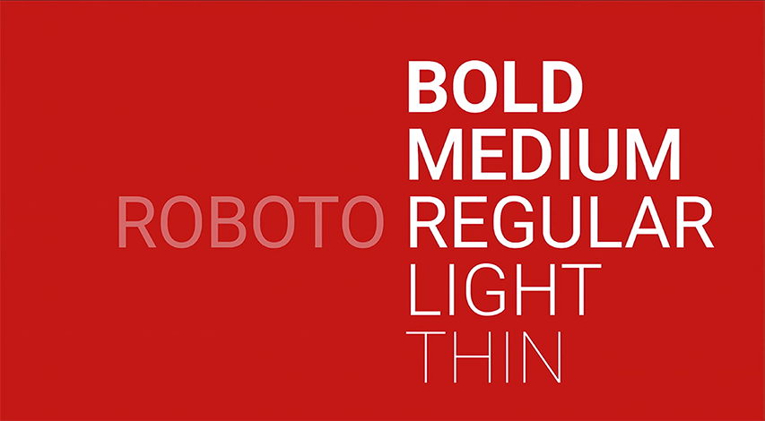
Roboto by Google is another top recommendation for book authors looking for versatile fonts. It’s a grotesque typeface, which pretty much sums up the genres it’s suitable for. It maintains a surprisingly clean appearance, unlike most grotesque fonts which typically feature distorted letterforms.
19. Pequena Pro
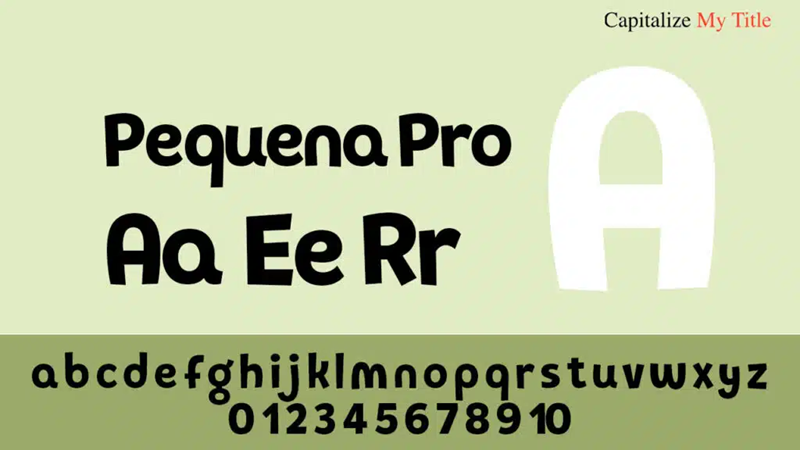
Pequena Pro is a sans-serif typeface family that combines artistic expression with readability. There are font two options – the Pro bold version and the thinner Pro Layer One. The pack also comes with Ornaments and Shapes. We recommend this one for children’s books.
20. Captain Comic

Think of a typeface inspired by characters straight out of a comic book and Captain Comic is probably the first font that springs to your mind. This handmade typeface comes in four different styles. Its appearance is enough to infuse some comic relief into any storyline.
Final Word
When choosing fonts for your masterpieces, it’s important to balance tradition and readability. Consider your readers expectations and the overall aesthetic appeal of the final output. Ultimately, a well-chosen font enhances the reading experience. It will complement your content and let your book speak for itself.