When was the last time you thought about what you would like to wear for that day? And why did you select that particular outfit? Is it because of the style, the fit, or the function?
Just as clothes can represent different things to the onlooker, the same is true for fonts. They can convey a whole world of emotions and perceptions. That is why picking the right one is critical to the success of a project. But where do you even begin?
Why not start by understanding the difference between a serif and sans serif font.
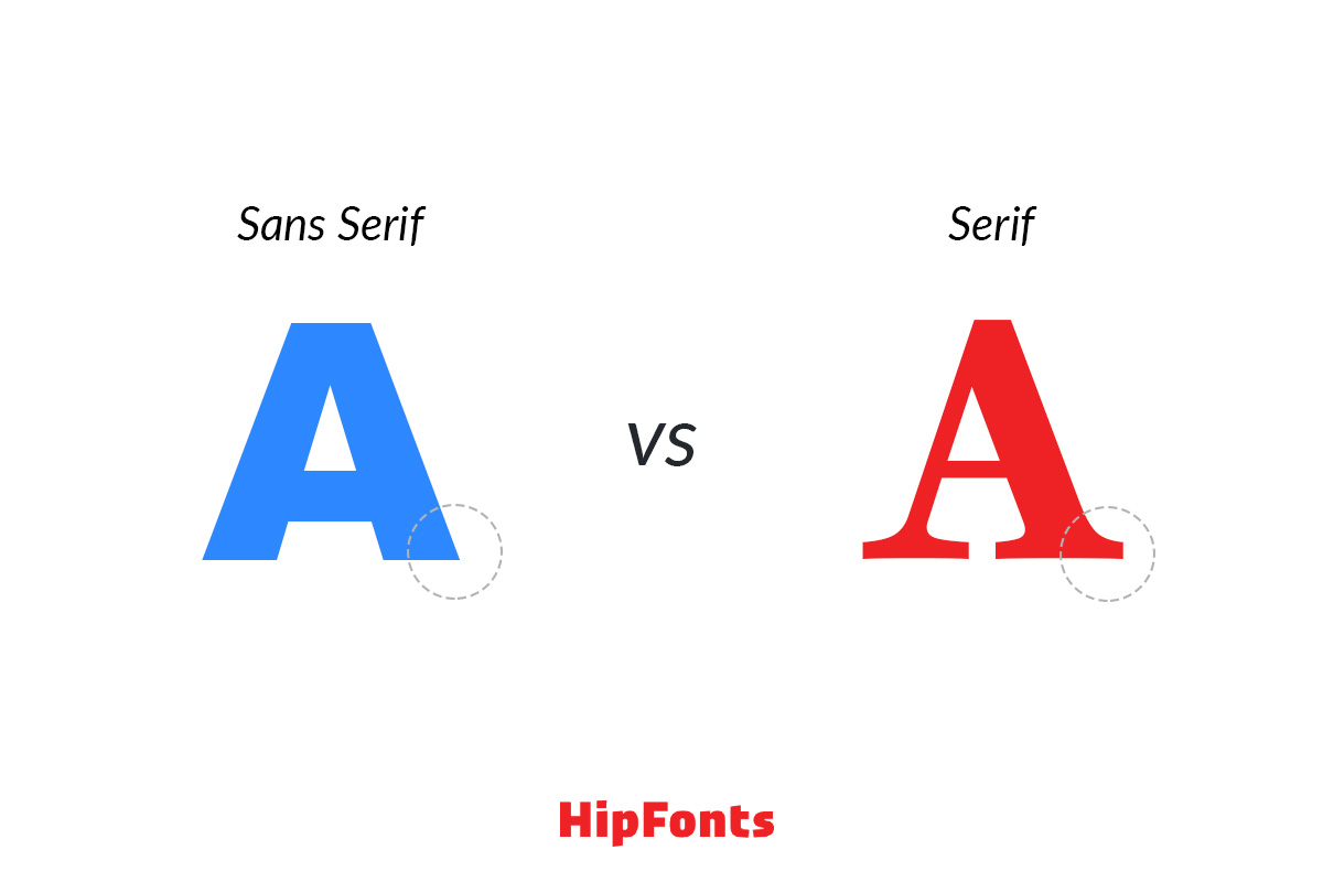
What is a serif font?
You’ve probably encountered your fair share of serif fonts by now. These are letters that have those decorative ‘tapers’ or ‘serifs’ at the beginning or end of their stems. They are also sometimes called ‘feet’ or ‘tails’. Common serif fonts include: Times New Roman, Garamond, Courier New, and Baskerville.
What is a sans serif font?
Sans serifs on the other hand, don’t have these ‘tapers’ or ‘serifs’; hence the name. Perhaps you’ve seen these on minimalist works like modern logos or tech start-ups. The letters look clean, simple, and are even throughout. Common sans serif fonts include: Calibri, Proxima Nova, Futura, Arial, and Helvetica.
Which font is better?
In general, there is NO one better font. It’s a matter of understanding your brand and what message you want to convey to your audiences. However, keep these tips in mind:
Serif fonts have a long history that dates back to the 18th century. That’s why you’ll recognize old writings with characters that resemble them. They look traditional, classic, and sturdy. Pick this font if you want to express strength, seriousness, and reliability. Many companies that employ this type are in traditional industries such as legal, finance, music, and education. They value trustworthiness, sophistication, and heritage.
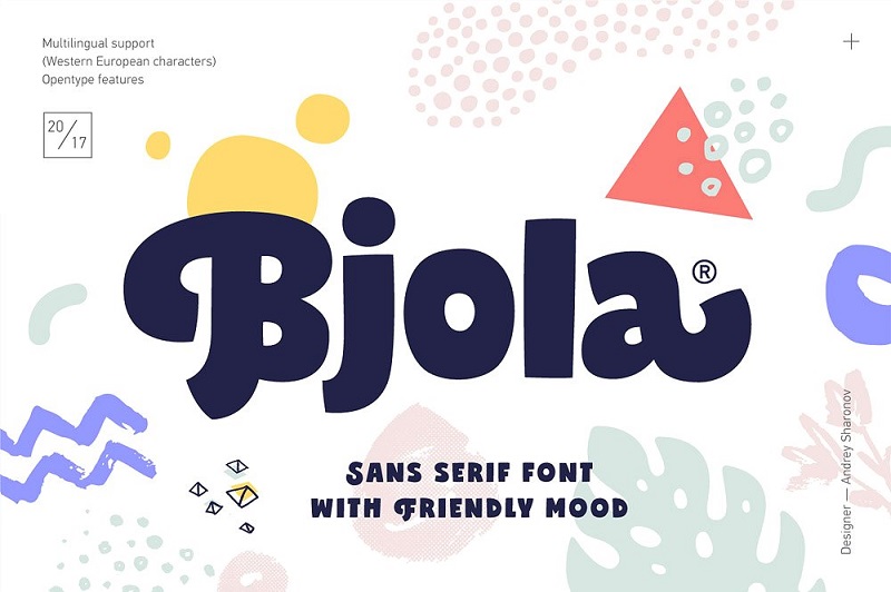
Meanwhile, sans serif fonts are the exact opposite. These letters have clean, sleek lines and a simple feel. Without the ‘tapers’ to hold them down, they are seen as more approachable and youthful than their stuffy serif equivalent. These fonts are often used by companies in tech or creative fields for their more modern quality.
Over the past years, there has been a silent ‘sans serif’ movement. Businesses across various industries are re-branding to attract a new crowd, or to make their message appear more exciting and new. A few examples of corporations that have made the switch are: Google, Spotify, HSBC, MAD Magazine, and Balmain Paris.
In Closing…
Think of fonts like clothes you put on your back. Whether we like it or not, our clothing communicates a certain message or impression on people around us. The same can be said about using a serif or sans serif. One conveys a different message than the other.
So choose wisely.


