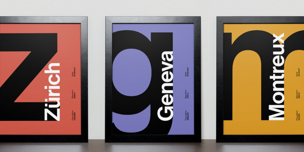
Believe it or not, the Helvetica we are familiar with today didn’t start out looking the way it does. Somewhere along history, its origins got ‘lost in translation’. However, thanks to talented type designers, we are now shedding light to the beginnings of the Helvetica font. Here’s where Neue Haas Grotesk comes in.
Neue Haas Grotesk Then and Now

Designed by Max Miedinger from 1957 to 1958, Neue Haas Grotesk was the Swiss answer to British and German grotesques that were widely popular at that time. Grotesque fonts, which came out during the 19th century, have low contrast, even widths, and an average slope. In a sense, they were the first sans serifs.
When Linotype AG got hold of Neue Haas, it was revised and became known as Linotype Helvetica. This was to accommodate the lettering for Linotype’s hot metal linecasters. These changes include making the matrices for the Regular and Bold equal in width, with the Bold style having a noticeably narrower proportion.
Sometime in the 1980s, a rationalized, standardized version of the typeface was released to make way for the switch from metal to phototypesetting. In this case, Neue Haas – now more commonly called Helvetica – underwent more modifications.
By 2004, type designer Christian Schwartz was commissioned by Mark Porter to begin the revival of the ‘Helvetica’s original name’. It was supposedly for the redesign of The Guardian. However, it wasn’t used at all. The project was continued and eventually completed in 2010.
Neue Haas Grotesk Today

Schwartz believed that much of Neue Haas’ original warmth was lost during all its alterations. Thus, the project was more of a restoration task than a revival for digital use. The challenge was bringing the original shapes and spacing to life – but with the luxury of kerning.
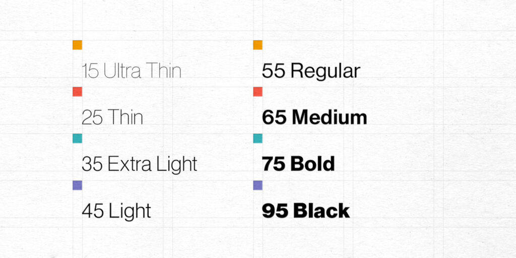
If you’re a fan of Helvetica, then this typeface is not to be missed. Get all its variants from My Fonts, or snag complimentary versions from Dafont Free website.

