
Classics are a classic for a reason. Aside from being unbeatable when it comes to style and function, their names are generally associated with dependability.
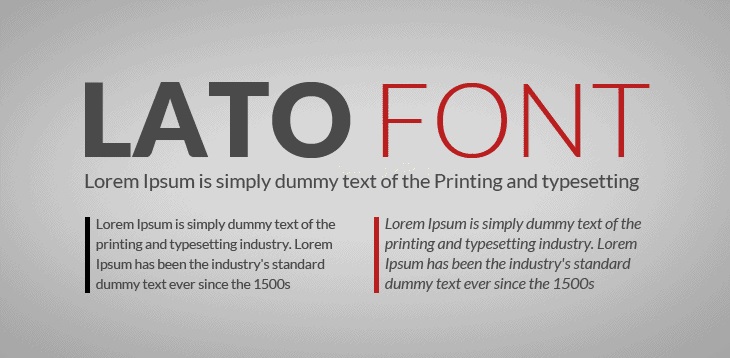
The same could be said in typography. The Lato font family for instance, remains a classic favorite by designers and type masters for a reason.
Originally crafted by Lukasz Dziedzic, the name ‘Lato’ means ‘summer’ in Polish. This unpretentious sans serif is all about details.
While it contains some semi-rounded aspects, it maintains its rigid structure to provide that steadfastness most people expect from a high-value typeface.
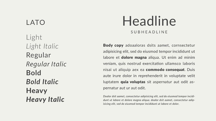
Today, the Lato font family has more than 9 weights and supports 100+ Latin-based languages, and 50+ Cyrillic-based languages.
The best part? Thanks to the SIL Open Font License, it’s offered FREE for personal and commercial use. Be sure to regularly check in with this font because it’s always a work in progress!
Download FREE Lato Font Family