Last Updated on September 28, 2023
It’s nearly impossible to discuss warmth-imbuing colors without making significant reference to coral. Aptly named after one of the ocean’s most beautiful creatures, it’s unsurprising that coral is also one of the most elegant pigments in nature.
But if you’ve never used this color before, it’s best to understand its potential aesthetic appeal before adding it to your designs. You’d also want to know the psychological impact this pigment can infuse into your space and how well it pairs with other colors before using it.
Fortunately, we’ve gone ahead and researched everything there is to know about the coral color. From its appearance to psychological meaning, and preparation methods.
What Coral Color Looks Like
Coral is a bold, vibrant pink-orange color. Some outlets also define it as a bright pink-red color, although orange is typically more noticeable in coral pigments compared to red. The coral color has a hex code of #FF7F50.
The Individual Colors in Coral
Orange and pink are the dominant hues in coral. The pigment appears in vivid shades of orange and pink regardless of the shade it comes in.
But if we were to split coral into its individual components, you’d realize that it also comprises red, yellow, and white. That’s for the simple reason that orange is a mixture of red and yellow while pink is a mixture of red and white.
Is Coral A Warm or Cool Color?
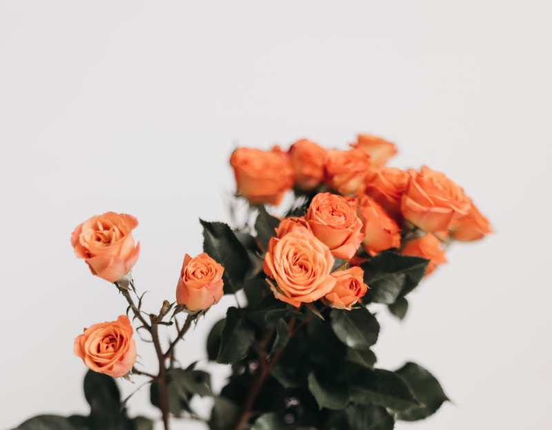
The primary warm colors are red, orange, and yellow. As the name implies, these pigments tend to evoke warm feelings, such as sunlight and heat.
On the other hand, cool colors like blue and green are more soothing than stimulating. They tend to conjure up the images of nature, particularly green vegetation, the oceans, and the sky.
Now, coral is made up primarily of orange and pink. Orange is a warm color while pink can be warm or cool depending on the shade. But since orange and red tend to be the dominant hues in coral, it’s evident that coral is a warmer color.
Where Is Coral Located On The Color Wheel?
This pigment doesn’t feature on the traditional color wheel. That’s because the pigment itself is a blend of colors that appear on the color wheel – pink and orange. However, you might find coral on certain contemporary color wheels. The color would typically sit between orange and pink or orange and red.
Shades of Coral
In 16th century color books, the coral color appears more orange or red than pink. These descriptions make sense when you consider that the pigment had only a few shades back then.
Today, there are several variations of the coral color. Most of these hues lean towards orange or red while a few lean toward pink. Below are the common shades of coral;
a) Coral Red

Coral red is easily noticeable for its higher saturation of red than pink.
b) Coral Pink

Coral pink, as the name implies, appears more pinkish than reddish. It’s one of the oldest shades of coral, with the first recorded use of the term in the English language being in 1892.
c) Light Coral

Light coral is nearly identical to coral pink except that it’s lighter.
Etymological Facts Behind Coral Color
The coral color derives its name from the skeleton formed by a group of marine invertebrates of the same name. The first recorded usage of the term “coral” as a color name in the English language was in 1513.
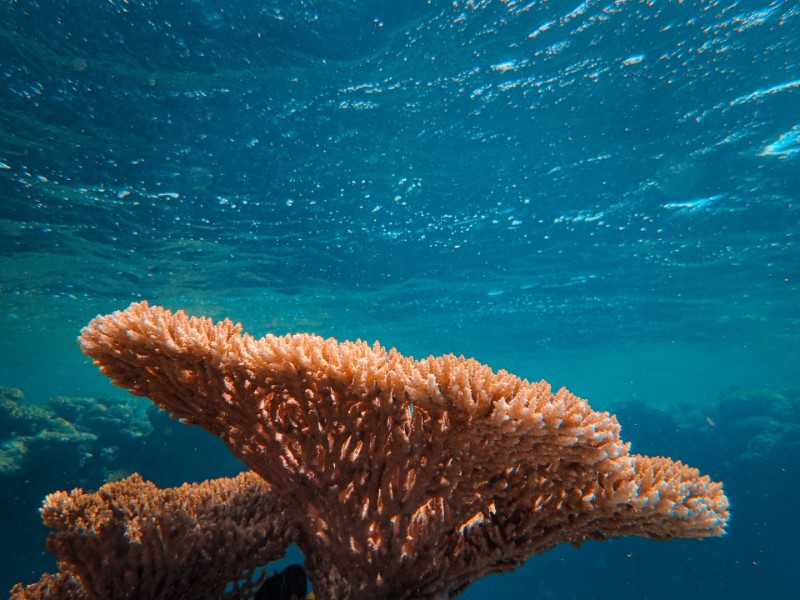
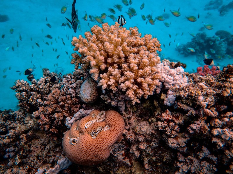
Corals belong in the phylum Cnidaria and the class Anthozoa. These sea creatures typically thrive in compact colonies of numerous identical individual polyps. They include a reef-building species which plays a key role in maintaining the ocean’s ecosystem.
It’s worth noting that while coral is typically a pink-orange color, the organisms that lent their name to this pigment aren’t necessarily pink-orange. These ocean dwellers can take on a range of different colors, including red, brown, blue, green, and yellow. Some corals may even appear fluorescent.
The exact color of marine corals depends on the combination of the zooxanthellae algae present in their tissues. Zooxanthellae are symbiotic organisms that seek shelter in the hard coral exoskeleton while supplying the corals with nutrients required for photosynthesis in return.
The Origin and History of the Coral Color
Coral is one of the most exploited pigments by contemporary artists and designers. The color has a relatively long history too. Red, orange, and pink all enjoy a long history of human use. Coral’s history is tied to all three colors as it pretty much derives from them.
According to archaeological findings, the red coral traces its origin thousands of years ago. Numerous pieces of evidence point to red coral jewelry making during the Mesopotamian civilization some 5000+ years ago. Both ancient Egyptians and Romans wore coral jewelry, with the latter associating these gems with the power to overcome evil and temptation.
The coral color was also a special preference of ancient painters and architectural designers. Its association with protection persisted well into the Renaissance period. Several paintings made during this era depicted Baby Jesus as donning a coral amulet.
A notable mention is ‘The Madonna di Senigallia,’ a painting by Italian mysterious artist of the Early Renaissance period Piero della Francesca. The painting portrays angelic Madonna holding Infant Jesus, with Madonna’s fabric and Baby Jesus’ amulet all in a bright shade of coral.
The popularity of coral jewelry continued through the Victorian period. And so did an increase in the demand for coral pigments.
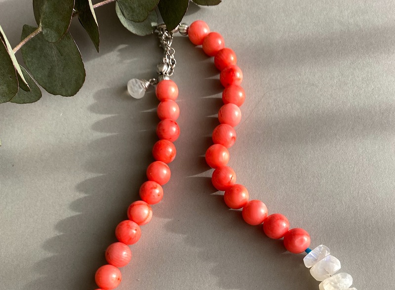
This beautiful shade shot to the limelight yet again in the 1920s when artisans began incorporating the pigment into Art Deco jewelry. The counterculture movements of the 1960s and 1970s also did an excellent job at popularizing this beautiful color.
Coral’s popularity continued to rise even after the end of the hippie years. The color dominated the disco era of the ‘80s and ‘90s before eventually penetrating the global fashion design, architecture, and interior design industries.
More recently, coral is best known for being declared the 2019 color of the year by Pantone. In response to this decision, the company claimed to have settled on the color for its “life-affirming” and “nurturing” shade.
The Meaning of Coral in Color Psychology
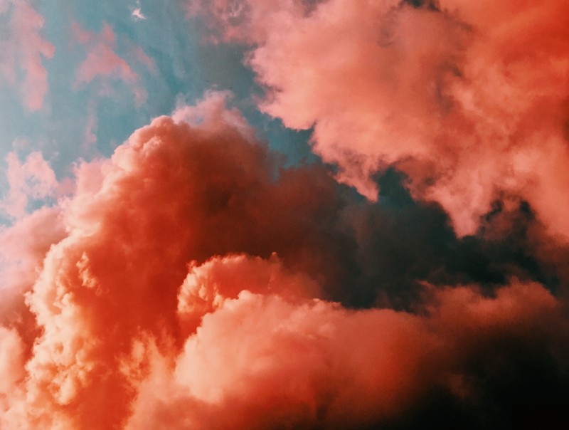
Coral is a bold, vibrant color that’s both stimulating and soothing. The color’s animating properties can have it breathe life into a dull setting while its soothing effects can come in handy in quelling racing thoughts. It’s contrasting effects make it a top choice for use in glamorous designs. The pigment would stand out in any color scheme it finds itself in.
Thanks to its reminiscence of the marine-dwelling creatures, coral may also represent life and rejuvenation. The color can inspire the same happy feelings as yellow while pointing to nature’s calming effects.
It is also the color of diversity. The organisms after which the color is named come in myriads of species. Besides, they can sport a variety of shades other than the pink-orange color.
The coral color stands for support and cooperation. The pigment is reminiscent of the symbiotic relationship between corals and the zooxanthellae algae.
Although it’s not a shade of green and doesn’t resonate perfectly with lush greenery, coral is still an excellent choice for creating vacation-themed art. The color would best suit themes that border on the exotic and sea voyages due to its association with the ocean.
You might also incorporate coral into your space as a way of attracting luck into your life. Remember that ancient Egyptians, ancient Romans, and even the Victorians wore coral jewelry as a protective talisman. The color can ward off danger, helping you manifest positive things.
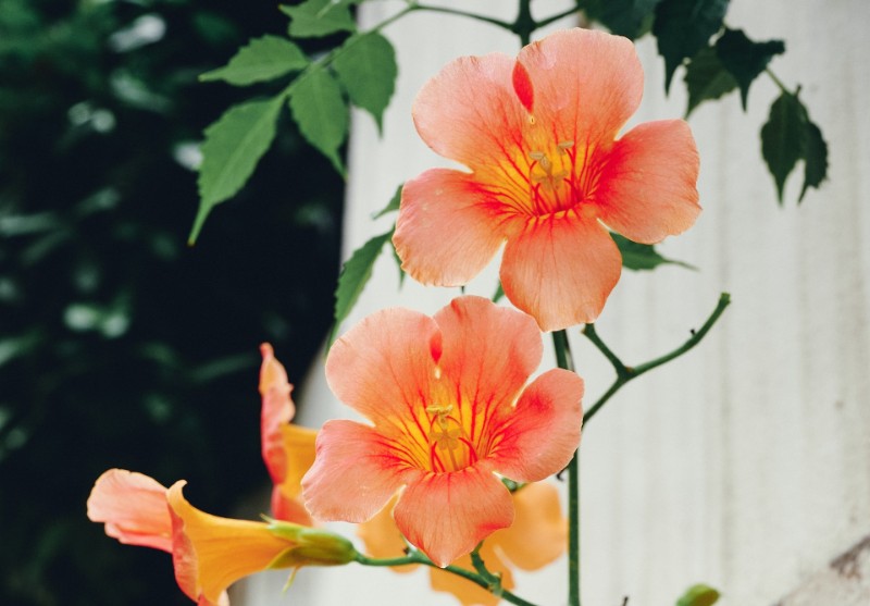
This pigment may also resonate with life’s longevity. It’s one of the go-to pigments if you wish to imbue a sense of timelessness into your creations.
In addition to its time-defying effects, coral may also bring harmony and balance into your projects. The color is a little more sophisticated than orange, slightly less feminine than pink, and far less aggressive than red. It’s a perfect choice when you want to use a shade of all three colors without incorporating too many accents.
Various cultures have linked coral to spirituality. For instance, a red shade of coral symbolizes the Muladhara Chakra in Hinduism.
Coral is unmistakably beautiful in a rather exotic sense of the word. The color has such a striking impact that it can transform the visuals of any design it’s used on. Consider it while designing company logos, particularly those that deal in travel and beauty products.
And like most shades of orange and red, coral can be sensually alluring. Donning coral lingerie will bring out the best in your partner while setting the right mood for an explosive sexual encounter.
On the flip side, coral may convey a sense of rebellion and non-conformism. That’s especially if you consider its association with the counterculture movements of the 1960s and 1970s.
How to Make Coral
i. Procure red, yellow, and white paint from your local art store.
ii. Add equal amounts of red and yellow paint to a color mixing palette and stir to obtain a true orange.
iii. Since you need a brighter shade of orange, add a little more red to darken it.
iv. Combine equal amounts of red and white in a different bowl and stir to obtain pink.
v. Add more white to create a lighter shade of pink.
vi. Combine your dark orange with light pink in a separate bowl and stir to create coral.
vii. Add more orange or pink depending on the shade of coral you wish to create.
Coral Color Combinations
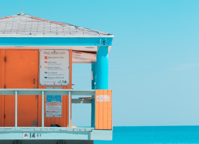
It’s a versatile color that combines well with others. The pigment looks especially spectacular when complemented with white and tiffany blue.
Coral would also blend seamlessly with warmer colors, such as yellow. And for a more contrast appearance, you could mix the color with cooler or neutral tones like blues, grays, and taupes.
Pairing coral with forest green, charcoal gray, or deep purple will create a dynamic combination that can suit any designs. On the other hand, combining the color with navy blue is a creative way to strike a perfect balance between blue’s masculinity and pink’s femininity.
Wrap Up
The coral color is rich in meaning and symbolism. It’s also one of the most dynamic shades of red and can fit into a wide range of designs.

