Last Updated on August 29, 2023
Puce is not a color that will readily pop into your mind when developing a palette for your next art or graphic design project. Which is unfortunate considering how enchanting this pigment can be.
Not only is puce remarkably beautiful. The color also enjoys a history steeped in blood and fleas. And like any pigment, puce can convey a range of emotional feelings.
Still wondering what this color constitutes? Well, read on for a comprehensive guide to the unusual puce color.
What Color Is Puce?
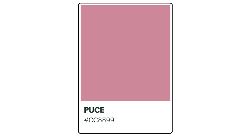
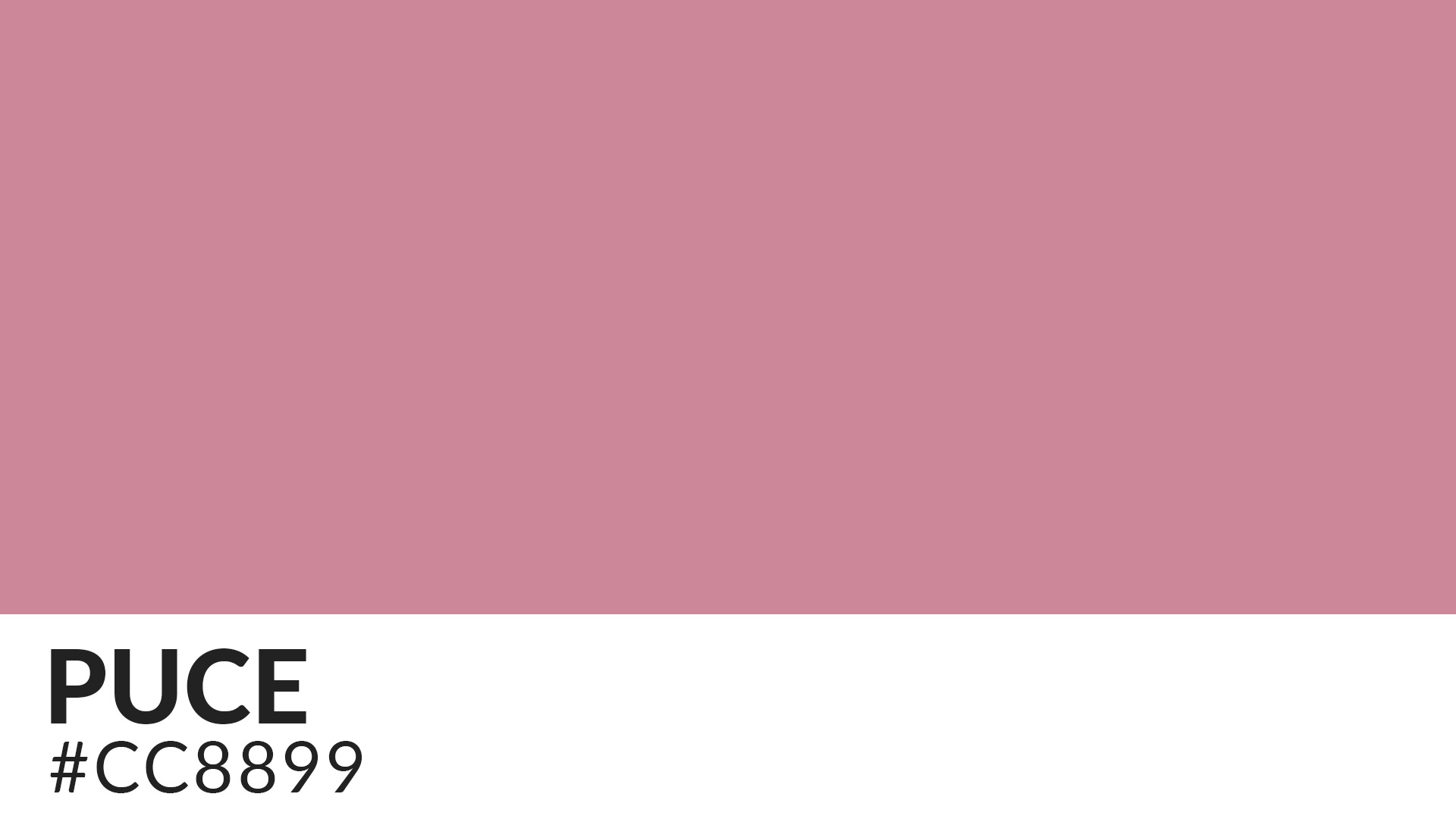
When making a list of the most ambiguous colors, puce would definitely feature high up on that list. The color’s actual description depends on who’s defining it as well as the specific shades and hints visible to an observer’s eye. Its hex code is #CC8899.
According to Wikipedia, puce is a brownish purple color. The free online encyclopedia also defines the color as a dark red or dark reddish brown color. Other definitions of this hue includes: dark pink or slightly purplish red color (The ISCC-NBS Dictionary of Color Names); a dark grayish reddish brown color (Pantone); deep brown color (Pourpre.com).
Pourpre.com’s definition of puce is the original version of the color from which other tones derive.
How Does Puce Compare To Other Similar Colors?
Difference between Puce and Mauve

Puce is commonly confused with mauve and you might even find some people using the words interchangeably. But if examined more up-close, you’ll notice glaring differences between these two shades of purple.
Mauve is softer and lighter compared to puce. And unlike puce which typically appears with dark-brownish hues, mauve tends to sport blue or gray undertones.
Difference between Puce and Dusty Rose

Dusty rose is another color that bears striking resemblance to puce. However, dusty rose is a light grayish-red color that sits between pink and violet on the color wheel. Dusty rose is assigned the hex code #DCAE96. It’s a popular choice for wedding parties and decorations due to its subdued but elegant shade.
Difference between Puce and Coffee Pot

Much like mauve and dusty rose, the main difference between puce and coffee pot lies in their most visible hues. Coffee pot is a gray-toned, mid-brown color. The color stands out from other shades of brown by its reduced intensity, which is mostly due to the gray undertones.
Origin of the “Puce” Name
This color shares the same country of origin with Burgundy, Bordeaux, and Champagne – France. According to the Oxford English Dictionary (OED), the term “puce” (pronounced pooce) was first used with reference to a color name in 1778. However, certain sources claim that the word was in use from as far back as the 14th century.
“Puce” was entirely derived from the French language. The French version of the word further borrows from the Latin words ‘pulex’ or ‘pulic,’ both of which translate to the blood-filled bellies of fleas.
The name was originally used to reference the color of the bloodstain on bedsheets or linen caused by flea droppings or after these blood-sucking insects have been crushed.
History of the Puce Color
Puce has been in existence for as long as humans have been spilling blood and watching it dry. However, the color did not gain mainstream attention until the 18th century when it was popularized by French royalty.
The story goes that French dressmaker Marie-Jeanne Rose Bertin made a stunning gown for Marie Antoinette Josèphe Jeanne (the last queen of France before the French Revolution). The dress blurred the lines between maroon and brown but stood out for its conspicuous pinkish-gray hints.
When Marie Antoinette’s husband – King Louis XVI – walked into a room where his wife was chilling out, he was immediately blown away by the elegant gown. The king is said to have exclaimed, “C’est puce,” French for “That is puce!”
But the king’s remarks weren’t out of thin air. He had actually observed, and rightfully so, that the silk dress worn by his wife resembled the color of a flea. While fleas were already looked down upon for their vampiric feeding behaviors, King Louis XVI actually meant his comments as a compliment.
Not only did this incident make Rose Bertin one of the most celebrated dressmakers in history. It also marked the turning point of a color which was largely unknown until then.
It wasn’t long before puce became the favorite choice for artists as well as fashion and interior designers. The fact that the new color didn’t soil easily and was less expensive than other lighter tints of purple added to its already booming demand.
According to ‘The History of Fashion in France,’ the demand for puce dyes surpassed their production output. The pigment found favor with both the bourgeoisie and proletarians.
It’s also worth noting that puce originally came in different shades depending on the age of a flea. And perhaps as a tribute to the insect that gave more meaning to the color, various garments were manufactured bearing images of different parts of a flea.
However, the puce bubble burst faster than expected. And more interesting is that the color’s fast-waning popularity was also tied to French royalty.

According to legend, King Louis XVI saw his wife in another fabulous gray gown only a few months later and exclaimed, “That dress is the color of your hair!” The remarks did not directly dent the reputation of puce. But they propelled yet another color to stardom – queen’s hair. Sadly, the high demand for queen’s hair meant that puce would be relegated to the background.
Puce continued to slip into oblivion throughout the 19th and 20th centuries. The color made a modest comeback around the mid-20th century due to renewed publicity by art historians. Although not as common as other shades of purple, puce continues to attract attention for its insect-inspired origins and sheer elegance.
Notable Examples of Puce Usage throughout History

There are hardly any significant historical paintings using puce. It’s even interesting to note that there’s no portrait of Marie Antoine wearing puce despite her enormous influence in popularizing the color.
Puce appears to enjoy more application in legends, literature, and the cinematic world. In the King Arthur legends, Sir Gareth is portrayed as fighting Sir Perymones, who’s also called “The Puce Knight.”
And in the 1985 movie “Santa Claus: The Movie,” Towser (played by Jeffrey Kramer) is seen picking puce for the color of Patch the Elf’s (played by Dudley Moore) lollypop. Towser goes ahead to describe puce as a color that blurs the line between fuchsia and lavender, but with a bit more pink. He also mentions to his boss B.Z (played by John Lithgow) that the company would emerge with a “Puce Juice” if the puce color chosen for the lollipop is successful.
Other noteworthy cinematic references to the puce color are in the 1985 supernatural horror film ‘Fright Night’ and the 2001 computer-animated film ‘Monsters, Inc.’
The Meaning of Puce
Puce is a color stained in blood and destruction. But that’s only because the pigment is analogous to fleas. Despite its bloodstained history, puce might be the best color to add a magic touch to your arts and graphic designs.
The fact that puce is a shade of purple speaks to its association with royalty. For many years, purple undertones were so rare and expensive to produce that only the nobility could afford them. It’s no coincidence that even the color puce itself traces its origin to royalty.
The hue might have been in existence long before it began making the headlines. However, the color’s popularity literally exploded courtesy of its association with Marie Antoinette. And that relationship is the reason puce is commonly analogized with royalty. Pops of the color can add a regal touch to your designs.
It also stands for luxury. The color can inject a rare feeling of splendor and opulence into its setting. Therefore, it would aptly suit fancy occasions like weddings and high-end corporate dinners.

The color puce can convey trust and reliability. Again, these are attributes it borrows from its parent color – purple. As a sign of trust, puce would be a great theme color for family get-togethers and other informal social gatherings.
Puce can symbolize tenacity on the one hand and obstinacy on the other. That’s because the color of bloodstains left on bedsheets tends to linger on even after the linen has been laundered. Besides, the puce color itself doesn’t fade easily compared to many lighter purple undertones.
It resonates with creativity and mystery as well. The color’s mysterious aura mainly comes from its rarity while its creativity relates to its association with purple.
And despite its creepy association with nasty bugs, puce is sensually stimulating. The color’s sensuality was inspired by a poem composed by renowned French lawyer Monsieur Étienne Pasquier (7 June 1529 – 1 September 1615).
In one of his poems, Étienne Pasquier compares himself to a flea perched on the bosom of Mademoiselle Catherine. The following excerpt from the poem leaves little doubt about Pasquier’s view of fleas as sexually stimulating insects;
“Oh flea… thanks to you, Madame is aroused for me. For me she is aroused, and has a flea in her ear.”
Due to its sexual connotations, puce may make an excellent choice for outfits like wedding dresses and lingerie. The color would also blend well into romantic occasions, particularly events intended to evoke a sense of female elegance and sophistication.
How to Make and Use the Puce Color

Puce was initially extracted from the crushed bodies of fleas. The extracts were then mixed with other pigments to create the true puce color.
However, this process proved too expensive and labor-intensive. Dyers eventually came up with modern methods, including basic paint-mixing procedures.
Much of the puce color available today is created by mixing red and blue or purple and brown pigments. The process is remarkably fast and even novice painters can get the hang of it. Perhaps the only challenge is knowing what colors to pair with puce.
Puce tends to work well with bolder hues like orange, yellow, and lime green. You can also use it with whites, deep greens, or earthy browns for contrasting effects.
Wrap Up
Puce is a fairly uncommon but highly versatile color that has been around for many years. Although it doesn’t appear in famous paintings (perhaps due to its creepy history), this color will work best in any palette you use it in.