Last Updated on September 28, 2023
Understanding the color wheel and using it effectively can do wonders for anyone, but especially for designers, craftsmen, and artists. The science of color theory will be your guide in selecting, pairing, and using all kinds of hues – from fiery reds to unassuming neutrals. And it begins with analogous colors.
Analogous color schemes are often used in design and art to create unity and balance. Typically, one color takes the lead while the others act as accents. Familiarity with the color wheel and analogous colors is key to crafting visually appealing compositions and color combinations.
In this guide, let’s go through analogous colors, including what they are as well as how you can use them to transform your art and design projects.
Introducing Analogous Colors

Analogous colors are colors positioned adjacent to each other on the traditional color wheel. These colors typically occur in threes. Examples include red, orange, and red-orange.
There are tons of analogous colors on the color wheel. However, certain parameters must be satisfied for a set of three colors to be deemed analogous. You simply cannot pick any three colors at random and classify them as analogous. It’s also worth noting that some analogous colors may exist in combinations of more than three.
Difference Between Analogous and Complementary Colors

Color pairing is an intricate process that requires in-depth knowledge of color psychology. Any artist worth their salt cannot simply pick two or more colors at random and use them alongside one another.
Instead, they’d want to know how the colors look together before matching them. More importantly, they’d need to understand the emotional attributes associated with each pigment.
Two major factors usually come to play before deciding to pair colors – harmony and contrast.
Analogous colors tend to create harmony in both their visual appearance and emotional effects. That’s for the simple reason that they exist next to each other and therefore share numerous similarities.
On the other hand, complementary colors create contrast. Remember that complementary colors occur on opposite sides of one other on the color wheel. That makes them different in every way. But it’s that very polarity that artists usually exploit to create contrasting effects.
Besides the difference in effects created when used alongside each other, analogous colors also differ from complementary colors in terms of the resultant effects when mixed together.
Mixing analogous colors will result in a similar color that retains most of its physical appearance and emotional qualities. However, mixing complementary colors results in a muted color that’s considerably different from its constituent pigments.
Etymological Origin of the Term Analogous

The word “analogous” is fairly common. You must have stumbled upon it in many other contexts, including those that do not involve colors at all.
Now, the name “analogous” derives from the Greek word ‘análogos,’ which means “proportionate” or “equivalent.” We often describe two or more things as analogous if they correspond to each other or share certain similarities. And as you’re about to find out, the same meaning applies to analogous colors.
The Composition of Analogous Colors
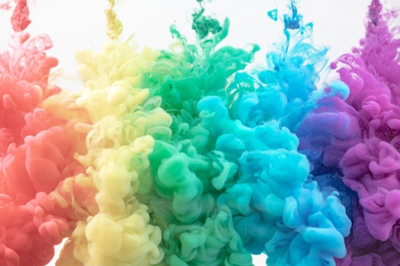
This color scheme usually contain one dominant color, one supporting color, and one color that’s either a combination of the first two colors or an accent color that pops. The dominant color is typically a primary or secondary color while the supporting color is usually a secondary or tertiary color.
To clarify, the primary colors are red, blue, and yellow. Secondary colors are green, orange, and violet while tertiary colors include red-orange, blue-green, yellow-green, etc. The dominant color is sometimes known as the mother color. That’s because the two other colors situated next to it contain decent amounts of it.
What Is An Analogous Color Scheme?
An analogous color scheme simply refers to the visual appearance or impact created by analogous colors. These can range from fairly simple to quite complex. Despite how sophisticated, each scheme must contain the dominant color.
Below are the most common analogous color schemes;
• Red-orange, red, and red-violet
• Red-orange, orange, and yellow-orange
• Red-red-orange, red, and red-violet
• Red-orange-orange, red-orange, and red
• Red-violet-red, red-violet, and violet
• Orange-yellow-orange, orange, and red-orange
• Blue-green, green, and yellow-green
• Blue-green-blue, blue-green, and green
• Blue-blue-violet, blue, and blue-green
• Blue-violet-violet, blue-violet, and blue
• Green-blue-green, green, and yellow-green
• Violet-red-violet, violet, and blue-violet
• Yellow-yellow-green, yellow, and yellow-orange
• Yellow-orange-yellow, yellow-orange, and orange
• Yellow-green-green, yellow-green, and yellow
Locating Analogous Colors on the Color Wheel
Pick any primary or secondary color. Then, note any two colors located directly to the right and left of the first color. The three colors make up your analogous scheme.
Remember that analogous colors can also occur in combinations of more than three. But if you’re new to this concept, it’s best to start by isolating the colors in threes.
Locating Analogous Colors in Nature
There are tons of analogous colors in the natural world!
A succulent is a classic case of an analogous color scheme, with its blue, green, and blue-green leaves. The idyllic sight of the setting or rising sun is another noteworthy example of analogous colors in nature, with its vivid hints of red, orange, and yellow.

Here are two main examples of analogous colors in nature;
a) Snake Plants
Snake plants are indoor plants highly prized for their ornamental value and air-purification abilities. These plants are outstanding for their shades of green, yellow-green, and yellow leaves.
b) Coral Reefs
Coral reefs are one of nature’s most intriguing creatures. Found mainly in the Caribbean, these marine dwellers look spectacular with their bright blue and violet tentacles, which often create vibrant effects against their bluish surroundings.
Effects Associated with Analogous Color Schemes
Analogous color schemes can convey a range of emotions. It all depends on the specific colors making up the combination. They can evoke romance, serenity, or even luxury.
For instance, a blue-green, green, and yellow-green scheme resonates with nature. Such hues can imbue a sense of calmness into your designs while also conjuring images of lush greenery.
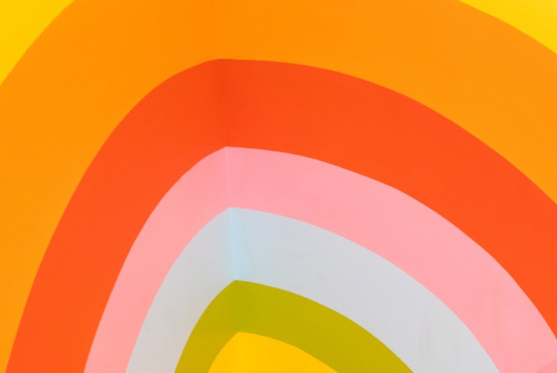
On the other hand, a red-red-orange, red, and red-violet combination is dramatic, bold, and intense. These are better suited for romantic, powerful, or attention-grabbing projects such as movie titles, posters, headlines, etc.
Regardless of their individual pigments, analogous color schemes tend to be easier on the eyes. That’s due to their prevalence in the natural world, which means that the human eye has been preconditioned to prefer them over other color palettes which aren’t immediately found in nature.
They are incredibly easy to spot thanks to the absence of contrasts. They lack the sense of tension often associated with complementary colors, as all the components are either all warm or all cold.
Analogous colors are also famous for blending well into their surroundings. These pigments can imbue a sense of harmony and homeyness into any setting they find themselves in.
Another great thing to love about this color scheme is that you can still use them alongside complementary hues. Since analogous colors look pretty much like a single pigment nestled between its shades, you can simply match them with one complementary color to still create stunning contrasts.
For example, you could pair a red-orange, red, and red-violet analogous scheme with blue and the effects would look a little more breathtaking than if you would have paired red with blue.
Tips for Using Analogous Colors
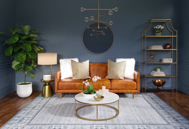
One of the common tips when using colors in general is to never overdo it. Because an analogous color scheme already has at least three different pigments that look very similar, moderation is vital.
The following are other expert tips when working with analogous colors;
1. Take Inspiration from Mother Nature

The natural world teems with analogous color schemes. So, it doesn’t hurt to borrow some cues from it. Ideally, taking inspiration from Mother Nature entails understanding where and how to use a specific analogous color scheme.
For instance, reds, oranges, and yellows are synonymous with the sun. And the sun is associated with revitalizing properties. Therefore, analogous schemes involving any of these colors would best suit designs where the goal is to stimulate warmth and exuberance.
Blues, greens, and yellows also exist alongside each other in the natural world. However, these combinations are common in green plants and water bodies. They’re more likely to induce soothing than stimulating effects.
2. Experiment with Neutrals
We’ve already underscored the importance of using analogous colors sparingly. However, analogous schemes comprising warmer colors (reds, yellows, and oranges) may still look quite overwhelming even when used moderately. This is where neutrals come in.
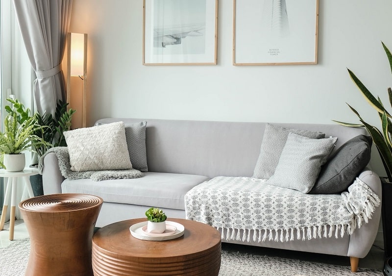
Experts recommend using neutrals as a base and then adding smaller touches of warm analogous colors. Examples of neutrals include black, white, gray, cream, and ivory.
Obviously, you want to choose a neutral that complements the overall visual effects of your analogous scheme. Black would add a touch of class and elegance to your designs while white can inject a breath of freshness and innocence.
In addition to using neutrals, you might also consider picking muted shades of an analogous color. For instance, if you’re using analogous colors based off red, you could experiment with darker shades of red like rose ebony as opposed to more vibrant ones like scarlet.
Alternatively, you could use analogous colors as accents. This allows them to stand out in a space without looking too overwhelming.
3. Apply the 60-30-10 Rule
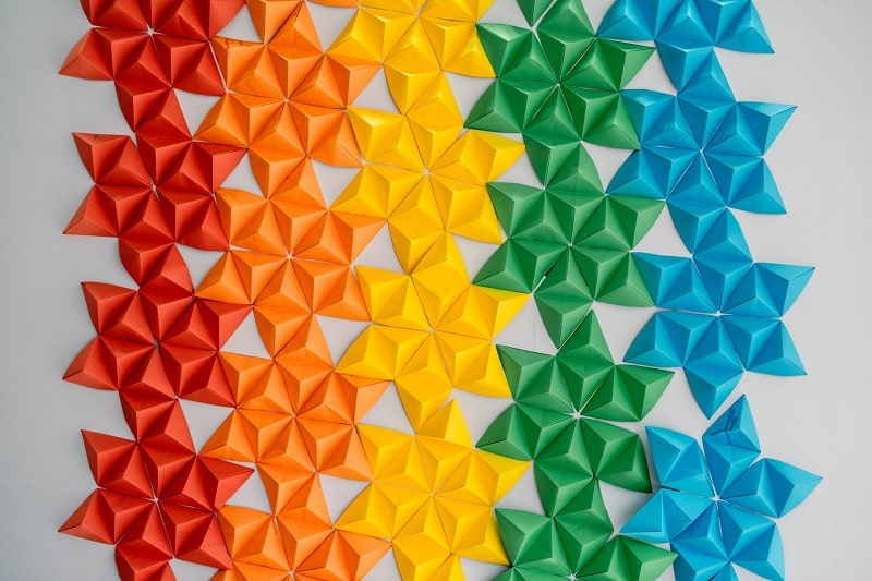
The 60-30-10 rule is a formula used by many artists and designers to ensure that analogous colors strike the right balance between being peaceful and visually appealing.
The rule dictates that 60% of your design should consist of a base color, 30% of the accent color, and 10% pop of color.
Below is an illustration of the 60-30-10 rule with your home interior as the benchmark;
• 50% of base color for the walls, large furniture, and area rugs
• 30% of accent color for the accent chairs, bedding, and window treatments
• 10% of pop color for wall art and accessories like throw pillows
Final Word
Using analogous colors in a composition can create a sense of cohesion and balance. One color is usually dominant, while the others are used as accents or supporting elements. Keep in mind that while these hues work well together, it’s essential to consider contrast and harmony in your designs to ensure readability and visual interest.

