Last Updated on December 11, 2023
Envision a gentle whisper of color that dances between the innocence of a baby‘s laughter and the warmth of a sunlit afternoon. Light pink, like the soft petals of a cherry blossom, is a hue that radiates modest elegance. It’s the color that blushes with grace, casting a subtle spell that invites you to explore its delicate charm.
In this article, we’ll explore explore the history, meaning, and versatility of light pink . From its origins to its role in baby clothes, interiors, and product design, discover the color’s evolution.
Gain insights into leveraging light pink in your creations. By the end, you’ll grasp the color’s significance and be inspired to infuse it into your artwork. Keep reading for a splash of creativity!
What is the Color Light Pink
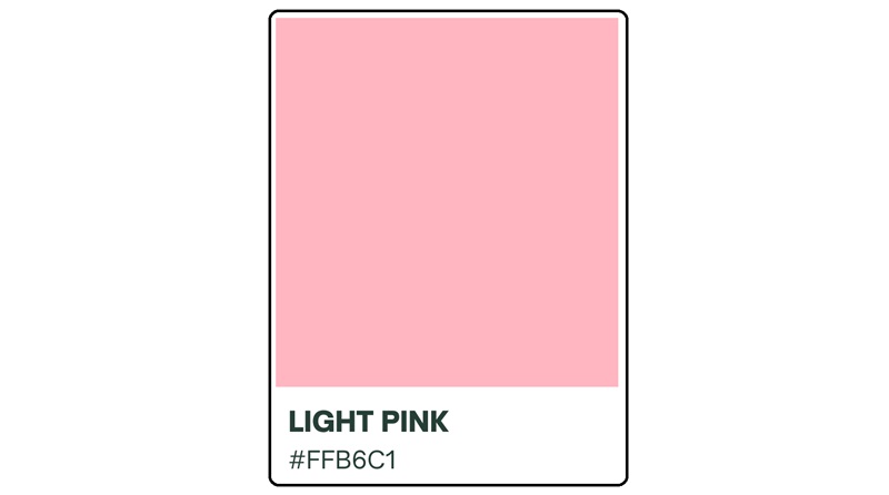
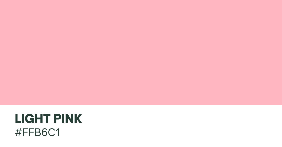
Light pink is a pale version of pink with the hex code #FFB6C1. It’s a gentle, soft color often linked with love, innocence, and a calm feeling. People commonly see it as a feminine color and connect it with romance.
You can use this code to create color palettes for web design, branding, and digital art. You could also use the RGB code of 255, 182, 193 to generate a precise color match for light pink. This makes it easier to ensure that your designs look consistent across multiple display formats.
To make light pink, add white to red pigment until you achieve the desired result. Remember that shades of light pink may vary slightly, and designers might use different hex codes to achieve specific tones within the light pink spectrum.
How does light pink compare to other shades of pink?

“Baby pink,” “light pink,” and “pink” are terms that describe different shades within the color spectrum. While these tones may vary depending on personal interpretation and cultural factors, there are slight variations.
Pink for instance, is a broad term for a range of colors that fall between red and white. Pink can encompass a variety of shades, from pale to intense. Light pink, on the other hand, generally refers to a paler version of pink. It’s softer and less vibrant, often associated with a delicate, subtle, or pastel hue.
Lastly, baby pink is a specific shade of light pink that is often described as a very pale, muted pink. It is so named because it’s commonly linked with baby-related items. Gentle and sweet, it’s usually seen in nursery decor.
What colors can be combined with light pink?
This gentle hue harmonizes seamlessly with a range of colors. The classic pairing with white exudes elegance and simplicity. While the addition of gold accents introduces a touch of sophistication and glamour. For a subtle and calming contrast, soft gray tones complement light pink.
Experimenting with contrasting shades, navy blue or charcoal gray can add a bold and modern twist. On the other hand, pairing light pink with colors like mint green or soft yellow infuses a fresh and cheerful vibe, perfect for creating uplifting atmospheres.
For a dreamy and romantic palette, consider combining light pink with lavender, evoking a sense of softness and femininity. Ultimately, the versatility of light pink opens the door to a myriad of creative possibilities. So don’t be afraid to explore what’s out there by letting your mind wander!
Origins of Light Pink
The origins of light pink trace back to the 18th century when this shade of pink was first used in fashion to evoke feelings of love, romance, and innocence. During this period, the color was a popular choice for dresses and accessories for formal events, such as weddings. Light pink enjoyed tremendous cultural significance throughout this era, as it was seen as a symbol of femininity and elegance.
The hue continued to evolve over the years. The color became a popular choice for baby clothes and nursery decor in the 19th century. Eventually, light pink became the go-to pigment for imbuing a sense of sweetness.
It became more widespread in the 20th century. The hue has seen a resurgence in popularity recently, and it doesn’t appear as if the craze for this exquisite shade of pink is about to die down. The timeless color can be used in a variety of ways, from creating a sense of romance and tenderness, to inviting peace and serenity to an environment.
Light Pink Uses and Applications
Light Pink in Fashion
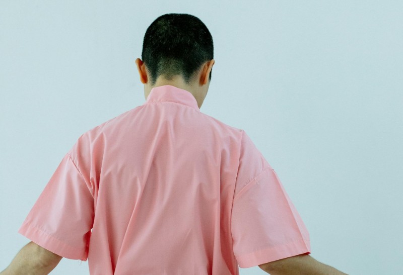
Fashionistas have long embraced this shade of pink for its varied emotional connotations. The color commonly appears in dresses, blouses, and many other feminine apparel. You’ll also find it in accessories for weddings and other formal occasions.
The most recent fashion trends have seen light pink become even more popular, with designers incorporating the color into their collections in various ways. From runway inspirations to celebrity photography, light pink has become the go-to hue for all types of fashion styles.
Light pink looks great when paired with neutral colors, such as black, white, and gray. Combining the color with neutrals creates a more modern and edgy look, while still allowing it to make a powerful statement.
Accessorizing with items like jewelry, bags, and shoes in the same color palette is highly recommended if you wish to achieve a cohesive look. The color blends well with bold hues like red, yellow, and blue for a more eye-catching look. Alternatively, you can wear it with neutrals for a subtle, sophisticated appearance.
Light Pink for Babies
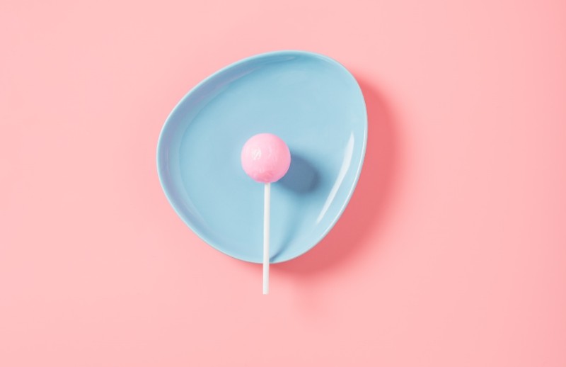
Soft, delicate, and innocent, it’s a popular choice for baby clothes and nursery decor. The color can be a gender-neutral hue as well. Therefore, it’s ideal for baby clothing or nursery decor for both boys and girls.
When it comes to fabric choices, light pink enjoys incredible versatility, too. The color is compatible with many different types of fabric, from lightweight, breathable cotton to heavier materials like wool.
However, note that there are certain cultural factors to consider when using light pink for baby clothes or nursery décor. In some cultures, the color may be seen as a symbol of masculinity, while in others it may resonate more with femininity.
Light Pink in Interior Design
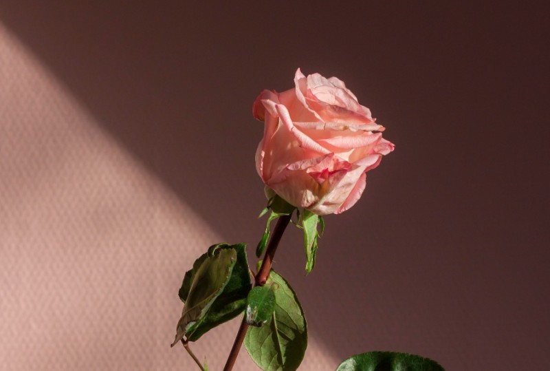
Who says you can’t use light pink indoors or out? Light pink is highly adaptable and can be used in numerous ways to create a peaceful, serene feeling. Incorporating this shade into your living space can be an excellent way to invite positive vibes into your home.
When used in interior design, light pink works best in combination with other pigments. You could use light pink as the dominant color to achieve subtle effects, or as an accent color to add a romantic touch to a room.
Accent pieces, such as pillows, throws, and wall art are excellent at accentuating the light pink hue while also adding a touch of femininity. Light pink accents are especially lovely for bringing out the beauty of other colors in the room, such as blues, greens, purples, and yellows.
Curtains, bedding, and other fabrics in light pink can invite a sense of light and positivity. Furniture items, lighting options, and wall treatments are just some of the many areas where light pink would look exceptionally stunning.
Consider wall treatments, such as wallpaper, if your primary goal is to add softness. On the other hand, pick the right lighting to enhance the effects of light pink, including brightening up your interior space.
Still on interior design, light pink can help set the right mood for yoga and meditation. That’s due to its soothing effects. You could also use the color to brighten up a room to give it an illusion of space.
Light Pink in Product Design

The color is a popular choice for adding a sense of sweetness and innocence to products. Many designers draw inspiration from light pink’s history and symbolism. Others also take market trends and user preferences into consideration while experimenting with this warm shade.
Pairing this color with pastels can create stunning visuals that appeal to younger customers. In addition, light pink can help to convey playfulness. That’s especially important for items designed to appeal to a younger crowd.
Symbols and Meanings Associated with Light Pink
Light Pink and Femininity
Frequently associated with femininity, light pink embodies qualities of sweetness, delicacy, and tenderness. The color has been culturally and traditionally linked to concepts of femininity. Its soft, pastel nature is commonly used to represent qualities associated with girls and women.
Psychologically, the color pink is said to have a calming and nurturing effect, promoting feelings of warmth and compassion. It’s also generally linked with notions of love and romance. Light pink maintains these qualities while offering a subtler, more understated expression compared to bolder shades of pink.
It’s essential to recognize that color associations can vary across cultures and are not prescriptive. While light pink is culturally linked to femininity in many contexts, individual preferences and interpretations may differ. Some people may embrace or reject these associations based on personal tastes and societal influences.
Light Pink Color Emotional Effects

Drawing upon its associations with love, romance, and innocence, light pink has the power to evoke strong emotions and create a peaceful atmosphere.
Studies have shown that light pink has mood-enhancing effects and can inject a sense of calm into a rather chaotic atmosphere. Indeed, light pink has been applied in places like spas, salons, and aesthetic centers to influence moods and promote relaxation.
In the home, light pink is mostly beloved for its ability to invite a sense of serenity. The color is also a popular choice for nurseries and baby clothes because of its connotations of innocence and femininity.
With its timeless appeal, it’s unlikely to go out of style anytime soon. Its ability to evoke strong emotions and create a peaceful atmosphere make it a popular choice for fashion, interior design, and product design. This gentle hue also resonates with romance, tenderness, or a peaceful environment.
Understanding the underlying symbolism behind light pink is key to ensuring that your designs convey the desired emotions.

Conclusion
This lovely color goes beyond just looking pretty. It’s not too bold and not too soft, striking a nice balance. Whether it’s in clothes, decorations, or art, light pink has a special charm that lasts.
Sweet, gentle, and warm, this hue connects with pleasant feelings and calm vibes. It certainly brings a touch of beauty and romance to different parts of our lives.
The next time you think about the color light pink, don’t just associate it with all things nice and feminine – think of it like a gentle friend that adds a simple yet beautiful touch to our world.

