Last Updated on September 28, 2023
As one of the most intriguing shades of yellow, pastel’s history and symbolism is definitely something worth exploring. With a light and airy appearance, pastel yellow evokes feelings of warmth, happiness, and optimism.
Its subtle nature is reminiscent of the gentle rays of the morning sun, casting a soothing and tranquil effect. This delicate shade of yellow is often associated with freshness, joy, and a sense of youthful innocence.
In this article, let’s delve into the origins and history of this charming hue. Hopefully, by the end, you’ll have a better understanding of the pastel yellow color and its diverse applications.
Pastel Yellow Definition and Hex Code
Pastel yellow is a subtle, pale yellow hue that’s the result of adding yellow paint to a white base. The color is assigned the hex code #FDFD96 and its hue angle is 60 degrees. Its RGB values are R: 99.2, G: 99.2, and B: 58.8, whereas its CMYK values are C: 0, M: 0, Y: 0.41, and K: 0.01.
It should be noted that pastel yellow is a subtler pale version of yellow. The color is not to be confused with the more vivid, saturated lemon yellow.
Comparing Pastel Yellow to Bright Yellow
Compared to the brightness of lemon yellow, pastel yellow has a subtler and more inviting presence. However, while this color is a great choice for interior design, there are pros and cons to consider.

When it comes to fashion trends, pastel yellow enjoys certain gender inclinations despite being generally considered to be unisex. It’s often favored by women and has been a popular choice for expecting parents when decorating a nursery.
The color has a timeless quality to it; but on the other hand, some may find it too subtle for their taste. In terms of color psychology, pastel yellow has a friendly, positive, and sensitive personality. It can be used to create a warm and inviting aura.
It’s worth repeating that pastel yellow may not be visually stunning when used as a single hue. To get the most out of the color, it’s best to pair it with other pigments.
Pastel Yellow Characteristics and Personality
One of the reasons behind the color’s smashing popularity is its rather washed out appearance.
Unlike vibrant shades of yellow, pastel is won’t overwhelm your eyes. That’s precisely why the color resonates with balance, romance, and tenderness. It’s an ideal choice for those who value a sense of friendliness without going overboard.
It is also associated with comfort and coziness. While it would probably look dreary if used as the only theme color. But it can perfectly complement other colors.
Brief History of Pastel Yellow

As it’s a pale representation, pastel is often used to create a calming effect. It’s also an excellent choice for gender-neutral designs. This shade has a long and illustrious history that dates back to at least the 18th century. It was one of the pigments favored by Marie Antoinette.
After the French Revolution, pastel yellow was briefly unpopular. However, the hue witnessed a resurgence in the United States during the 1950s and was fashionable again in the 1980s. The color became widely associated with tenderness, innocence, and calmness. Many also used it as a symbol of friendliness, optimism, and sensitivity.
With a low-to-medium saturation, it might explain why it’s linked to harmony, romance, and levity. Many color experts discourage using bright yellow for entire room decorations. Instead, they recommend muffled versions of the color, such as pastel yellow.
Pastel yellow has a significant presence in art, photography, and web design. It has also become a timeless choice for expecting parents. The color’s low saturation makes it easier and less overwhelming on the eyes. It’s preferable in designs where balance and sanity are the overriding themes.
But perhaps the biggest connotations of pastel yellow are those of warmth, happiness, and coziness. The color pairs nicely with pastel purple, white, dusty rose, lilac, black, and periwinkle.
Qualities Associated With Pastel Yellow
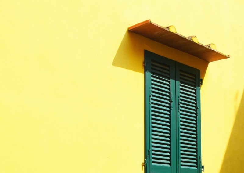
The soothing effects of this pigment evoke feelings of warmth, contentment, and tenderness. This pale version of yellow is no respecter of gender. That’s why you’ll often find it in nurseries and baby products.
The color’s gender-fluidity also makes it ideal for skincare products, interior design, photography, and web design. Its peaceful nature has a way of bringing a calming atmosphere to any room, making it perfect for both home and office decorations.
The pastel yellow color has a long history of use.
It was especially popular in the 18th century in the French court of Marie Antoinette. But shortly after the French Revolution, it experienced a dip in popularity, only to be revived again in the 1950s in the United States. During this resurgence period, pastel became a fashion trend and was used in a variety of ways, from decorating walls to clothing.
Pastel yellow has maintained stable popularity since then. Today, the hue is mostly used to communicate feelings of positivity and friendliness.
How To Use Pastel Yellow
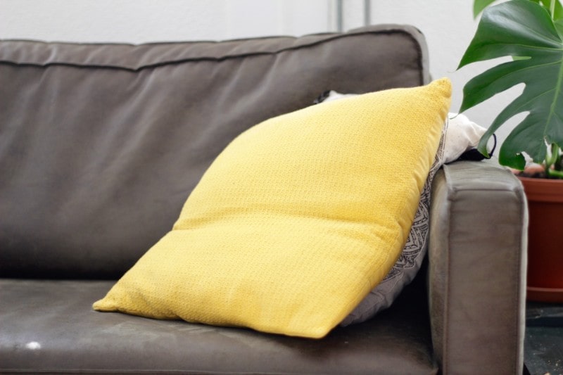
As with most colors, it’s best to figure out how to use pastel yellow to make the most of its visual effects. It’s even more important to know the colors it pairs best with for a beautiful, timeless look.
Pastel’s muffled saturation makes it ideal for subtle hues such as rose quartz, dusty rose, and baby blue. But it will also look stunning against solid colors like black, orange, and white.
Enhance your home décor with the soft and inviting charm of pastel yellow. Consider painting your walls with this delightful hue, whether as an accent wall to make a statement or for the entire room to infuse warmth and brightness. Extend the use of pastel yellow to your furniture, accessories, and textiles to introduce pops of color, effortlessly creating a cheerful ambiance.
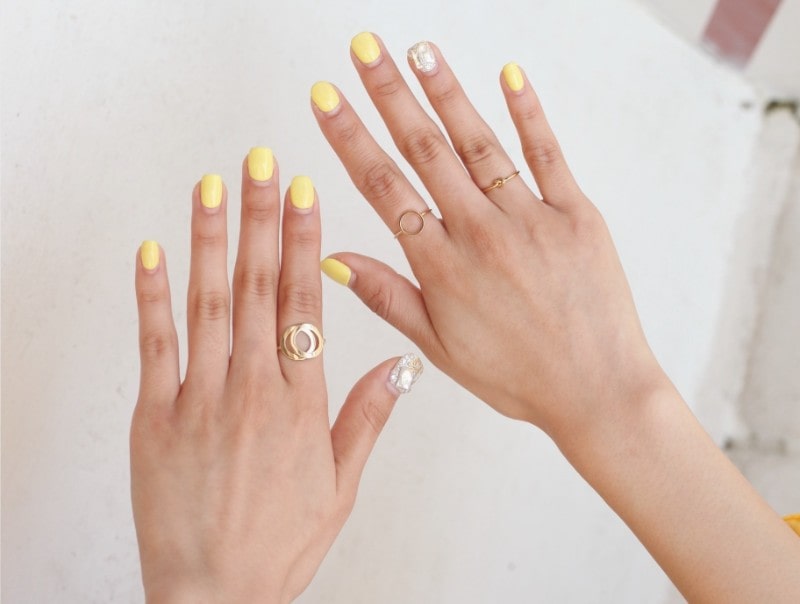
Embrace its playfulness in your wardrobe. Opt for a pastel yellow dress, sweater, or pair of shoes to bring a refreshing and youthful vibe to your outfit. To add a subtle touch of color, accessorize with pastel yellow jewelry, scarves, or handbags, elevating your style with a hint of delightful hue.
Unleash your creativity in various artistic mediums, as pastel yellow proves to be a versatile companion. Use it in your paintings, drawings, and crafts to create gentle backgrounds, accentuate specific elements, or infuse your artwork with a touch of lightness and softness.
The key is to use pastel yellow in a way that complements your personal style and the overall mood or theme you want to achieve. Don’t be afraid to experiment and have fun!
Pastel Yellow Trends Throughout History
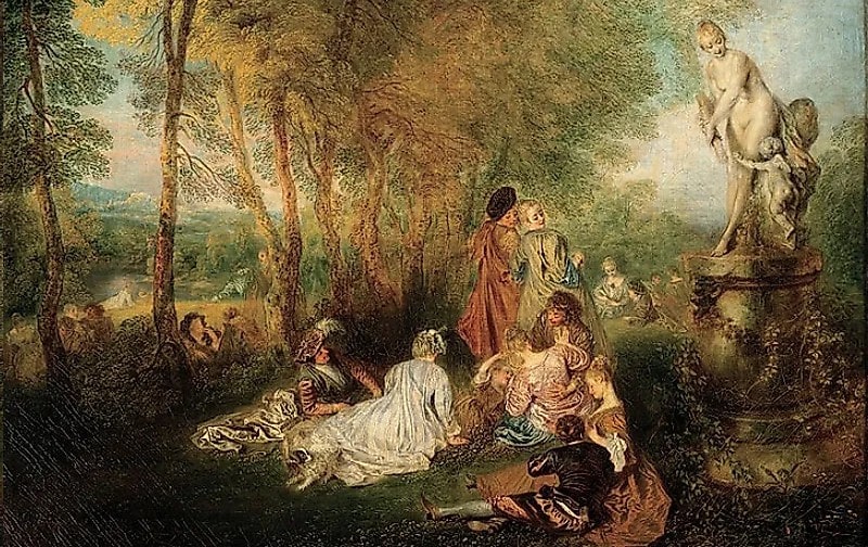
Although Marie Antoinette is credited with popularizing pastel orange, the color had already gained recognition centuries earlier after it began featuring in the palettes of many artists. This shade of yellow was widely used by Leonardo da Vinci and Michelangelo during the Renaissance.
Pastel witnessed a temporary dip in popularity after the French Revolution. But like phoenix emerging from the ashes, the color bounced back to the limelight in the United States during the 1950s and 1980s. Its soft hue and low saturation has continually made it a great choice for those who want to make a subtle statement.
From the Marie Antoinette period to the ‘50s and ‘80s, pastel yellow has been a favorite color of many designers for centuries. The color has maintained stable popularity due to its associations with positive attributes. These range from calmness and balance to romance and tenderness, warmth and happiness, etc.
This shade of yellow has also been considered a gender-neutral color for years. That means its usage on nursery decoration, baby products, and skincare products didn’t start today. Overall, the color is much sought after because it’s easy on the eyes.
The Significance of Pastel Yellow in Art and Culture
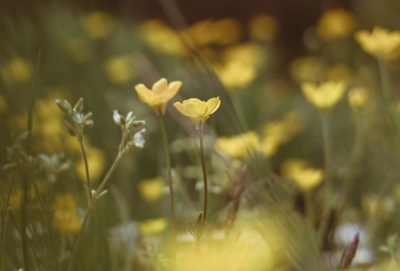
During the Renaissance, artists like Leonardo da Vinci and Michelangelo incorporated various pastels into their works. French Rococo art, which utilized light colors, featured pastel yellow in many of its pieces.
This color has also been used in many famous works of the Impressionist period. Monet, in particular, often employed pastel yellow in his works, such as “Water Lilies” and “Sunrise”.
Pastel yellow has appeared throughout history to convey certain ideas and emotions. The use of pastels by artists like Leonardo da Vinci and Michelangelo, as well as during the French Rococo period, was mainly due to the color’s synonymy with frivolity, calmness, balance, romance, and tenderness.
A radiant hue reminiscent of springtime and Easter, it holds the power to transform your space into a seasonal oasis. Embrace this delightful color from early March through June to capture the essence of the season.
To evoke the spirit of spring, consider pairing pastel yellow with gentle companions such as peach, soft pinks, shades of orange, serene sky blue, and warm yellows. This harmonious palette reflects the blossoming nature and vibrant energy.
Alternatively, for a warmer ambiance that exudes rejuvenation and growth, infuse pastel yellow with richer yellows, earthy browns, and brighter tones. This dynamic combination radiates a sense of warmth while symbolizing the renewal and flourishing of nature.
Let the allure of pastel yellow create a captivating atmosphere that celebrates the beauty and optimism of springtime.
Pastel Yellow and Its Application in Website Design
Web designers have also fallen in love with pastel because it’s easy on the eyes. Thanks to its soothing attributes, pastel yellow can be a great addition to any web design project.
It’s the perfect color for creating subtle designs that are easy on the eyes. This muted shade of yellow can improve your site’s user experience significantly since it doesn’t overwhelm the senses.
Most of your website visitors will find pastel yellow both aesthetically appealing and easy to interact with. Again, that has much to do with the fact that this color is neither too bright nor too dark.
Pastel can make your site more accessible to a wider range of users, since it’s easier to read and navigate.
But the benefits of using pastel yellow in web design extend beyond just aesthetics. The color can also help create a sense of trust and familiarity. That’s due to its associations with the feelings of positivity and warmth.
When used thoughtfully, pastel yellow can be a great way to add a touch of color and personality to a website without compromising user experience or accessibility.
Conclusion
Delightful, charming, and calming, pastel yellow will add a touch of softness and cheerfulness to any project. Despite its muted tone, it can create a serene and inviting aura. This makes it a popular choice for various design applications, from fashion and interior décor to art and graphic design.
As a highly versatile hue, it brings a touch of brightness and happiness wherever it is used – capturing the essence of sunshine in a beautifully subtle and harmonious way.

