Last Updated on November 20, 2023
Soft, delicate, and warm, this timeless hue gives off an understated elegance in the vast palette of colors. With muted tones reminiscent of dairy cream, this versatile shade is what neutrality would look like with just the right hint of cheerfulness.
The cream color serves as a sophisticated canvas that seamlessly blends into various design schemes. From classic to contemporary, it can make the onlooker feel tranquil and comfort, perfection and ardor. That’s why it’s such a popular choice for interiors, fashion, and minimalist aesthetics.
Whether you’re an artist seeking inspiration, a designer looking for a functional color palette, or simply someone curious about the deeper meanings behind cream – this article will equip you with the knowledge you need to fully grasp the complexities and beauty of this enduring hue.
What Color Is Cream?
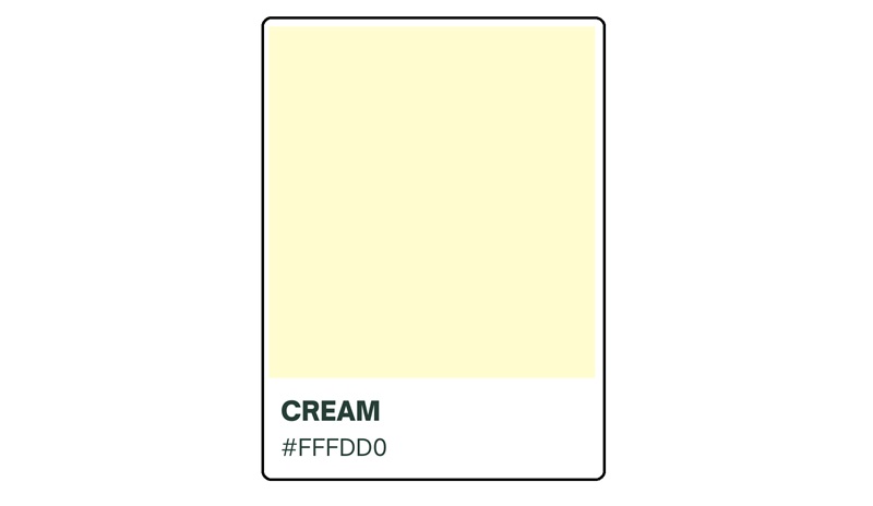
Cream is a pale, light hue that resembles the color of dairy cream. It’s often described as a warm and soft shade with a slight yellow or ivory undertone.
The hex code for cream can vary depending on the specific shade and interpretation. However, a common hex code is #FFFDD0. It falls within the neutral color category, making it a handy choice for various design applications.
While it shares similarities with white, cream is warmer and tends to have a softer, more muted appearance.
The best thing about the color cream is that it pairs well with a variety of shades, including both warm and cool tones. Try it with bold hues (such as cerulean, coffee brown, and burgundy) to create beautiful, stunning contrast.
How does cream compare to beige?

Beige and cream, both neutral colors, exhibit subtle differences in tone and undertones. Cream, with its warm and often slightly yellow (or ivory) undertone, resembles the color of dairy cream. On the other hand, beige is a neutral hue that ranges from light tan to pale sandy shades, with undertones that can include gray, brown, or even pink.
While cream is generally lighter with warmer undertones, beige can vary in depth and may have warmer or cooler undertones, depending on the situation. The choice between cream and beige ultimately depends on personal preference, the desired atmosphere, and the overall color scheme of the design project.
The Origins of Cream Color
Cream traces its origins back to ancient civilizations, where natural materials like clay, limestone, and ochre were used to create pigments that produced the creamy hues. These early societies discovered that mixing such materials with various binders, such as animal fat or plant extracts, could create a wide range of colors, including the subtle, soothing tones of cream.
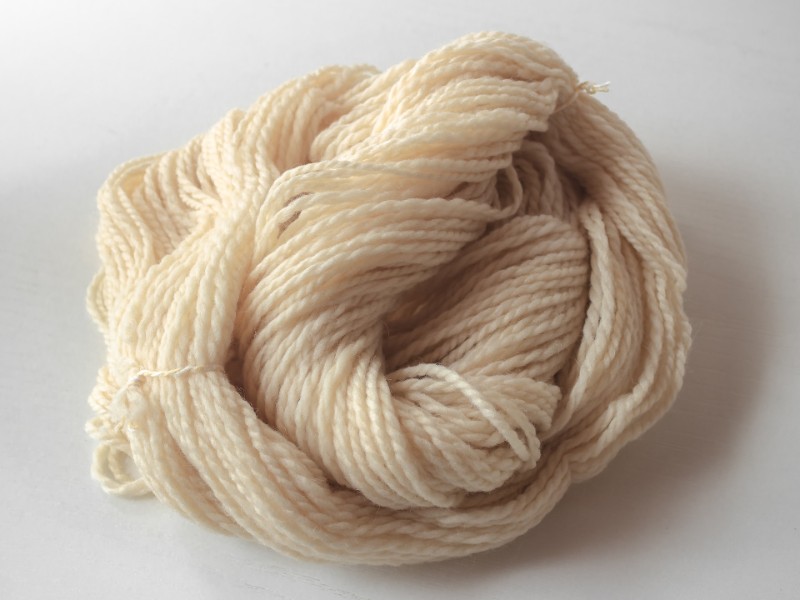
In ancient Egypt, cream held immense religious significance. Ancient Egyptians used cream-colored pigments to depict the skin tones of royalty and gods in their elaborate murals and sculptures. The Greeks and Romans also incorporated cream into their artwork, often using it as a background color to enhance the vibrant hues of other elements.
Most of these civilizations associated the color with purity, elegance, and luxury. In medieval Europe, cream-colored garments were reserved for the highest ranks of society. Such outfits symbolized wealth and prestige. This association with luxury continued into the Renaissance, where cream-colored fabrics were favored by the aristocracy.
The historical significance of cream can also be seen in its usage in religious and spiritual contexts. A good number of religions used cream-colored robes or vestments as a symbol of purity and devotion. This tradition continues today in various religious ceremonies and rituals.
The Symbolism and Cultural Significance of Cream
One area where cream holds significant meaning is in religion. In many religious traditions, cream resonates with purity, chastity, and divinity. The color is often used in religious ceremonies and rituals to represent spiritual enlightenment and invoke the presence of the divine.
Cream also plays a prominent role in literature. In some literary contexts, the color symbolizes calmness, serenity, and tranquility. And in others, it evokes a sense of purity and simplicity, providing a contrast to the complexities of the human experience. There are yet other literary scenarios where cream may represent the passage of time, nostalgia, or even the bittersweet nature of life.
It found its way into wedding ceremonies too, where it holds deep significance. This subtle hue is often chosen as a wedding color due to its association with purity and elegance. It can also add an extra layer of sophistication to wedding outfits. Indeed, it’s a classic choice that represents the beginning of a new chapter in life and the hope for a bright future.
The fashion industry has also tapped into cream’s popularity. The color is frequently incorporated into traditional clothing, especially among people who associate it with profound cultural significance. In many countries, cream-colored garments are worn during special occasions as a symbol of tradition, heritage, and cultural identity.
You’ll also find cream in home décor. Interior designers prefer this color for its ability to create a sense of warmth, comfort, and coziness. Cream-colored walls, furniture, and accessories can go a long way in inviting a dash of serenity into your living space.
The Psychology of Cream Color
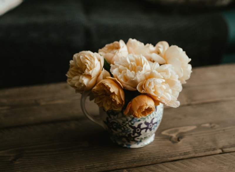
One intriguing aspect of cream is its ability to produce a soothing atmosphere. This psychological effect is largely attributed to various factors, including individual color preferences.
Preferences can be highly subjective. Studies have shown that individuals often have personal preferences for certain colors. That said, most color enthusiasts consider cream as a favorable choice due to its soft, gentle nature. This preference for the color may stem from its association with relaxation and calmness.
It’s also strongly linked to feelings of nostalgia. The color’s warm and muted tones can evoke memories and a sense of familiarity, reminding individuals of the good, old days. This nostalgic association further contributes to the psychological impact of cream, especially when seeking to create artwork that’s reminiscent of specific time periods.
Note that cream bears a striking resemblance to warm tones, such as beige and off-white. These warm colors have been found to promote feelings of coziness and relaxation, making them a popular choice for creating a serene atmosphere. The combination of cream with other warm tones can invite an aura of tranquility into a space.
By incorporating cream into your surroundings, you can create a calming atmosphere that reminds you of the good ol’ days.
Cream in Art and Design
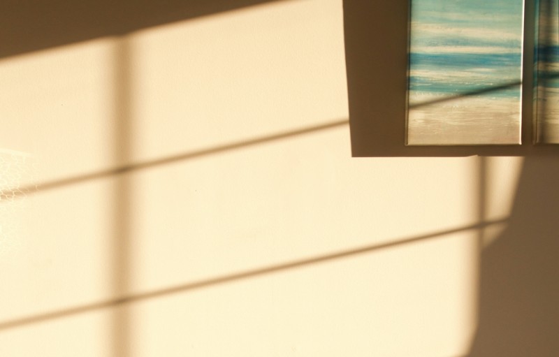
This neutral tone is frequently utilized in art and design to add tranquil vibes. Its soft tone makes it ideal for various artistic mediums.
In abstract art, it’s especially useful in creating a calming and harmonious compositions. Artists often incorporate cream into their abstract works to balance out more vibrant colors and create a sense of depth and dimension.
In graphic design, cream is most effective at conveying elegance and sophistication. Graphic designers can use cream as a background color to enhance text legibility or to highlight important elements. Similar tones also work well in creating vintage or retro aesthetics, adding a touch of nostalgia to the overall design.
In architecture, cream has proven highly effective at communicating a sense of warmth and coziness. Architects and interior designers often apply cream to walls, ceilings, and furniture to create a soft and inviting atmosphere. Cream-colored elements are also crucial in creating the illusion of space, making a room appear larger and more open than it truly is.
Branding experts utilize the color mainly to convey a sense of innocence, cleanliness, and luxury. Cream-colored packaging can give products a timeless and classic look, appealing to a wide range of consumers.
In photography, cream is mostly used to create a hazy, dreamy effect. You can apply the color as a filter or in post-processing to enhance the overall mood of a photograph. Still on photography, creamy tones may be useful in creating vintage effects, adding a touch of nostalgia to the image.
It doesn’t matter whether you use it in art, design, or photography. Cream can play a significant role in adding a sense of serenity, elegance, and sophistication to your creations. The color can also bring a sense of nostalgia or create an illusion of space. Its adaptability knows no bounds.
Cream in Fashion and Interior Design
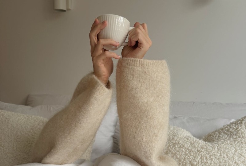
The color has been extensively used in these industries to create understated elegance and sophistication.
It’s often seen in clothing items, such as dresses, blouses, and suits. The color is especially valued for its versatility and ability to complement a wide range of skin tones. It’s also a popular choice for formal occasions, thanks to its potential to exude a sense of refinement and timeless beauty.
When it comes to interior décor, cream is widely used to create a classic and elegant look. Interior designers can incorporate the color into various elements of the room, such as walls, furniture, and accessories.
Cream-colored walls or furniture can provide a neutral backdrop for other items in the room, allowing them to stand out and make a bold statement. On fabrics, such as curtains and upholstery, it can add a touch of sophistication to your space.
Cream looks exceptional when used in luxurious materials like silk, satin, and cashmere. These fabrics enhance the color’s elegance and richness, creating a luxurious and indulgent feel. And as already highlighted, cream-colored fabrics are also popular in bridal wear as they symbolize innocence.
Interior designers may also choose to mix cream with other shades to create dynamic moods in the room. The color pairs well with both cool and warm tones, making it a flexible option for various projects.
Creating and Mixing Cream
There’s a lot to consider when it comes to creating and mixing the elegant shade of cream. One major aspect is how you can combine various colors to achieve the desired hue.
There’s also the element of color theory. Color theory plays a crucial role in understanding how different pigments blend together to create the right shade.
To achieve this hue, start by blending white with a warm shade, such as yellow or beige. The creamy undertones will give it a soft and subtle appearance, making it highly versatile.
To create warmer shades, artists and designers often mix cream with other warm colors like light brown or pastel yellow. This combination adds more depth and richness, making it suitable for a variety of applications.
Blending different pigments in varying proportions is key in terms of achieving tonal variations, ranging from a light ivory to a darker beige. Experts recommend carefully measuring and mixing different pigments to achieve the desired hue.
This process often involves trial and error, as the proportions of each pigment can greatly affect the final result. Additionally, the choice of pigments used can impact the cream undertone produced.

Conclusion
The allure of the color cream lies in its ability to surpass trends. From the soothing ambiance it imparts to spaces to the subtle grace it lends to fashion and design, cream remains a perennial favorite. Understated and effortless, it combines flawlessly with any shade, making it a nifty choice for every creative.
Regardless of taste, this hue is bound to be a steadfast companion to ensure your projects will always exude beauty and charm. Cream is proof that sometimes, the most enduring statements are made in the quietest tones.

