
Last Updated on August 22, 2023
Just because a color is unassuming doesn’t mean it can’t have a big impact. Tan is a wonderful example of a hue that could go from trendy to traditional any time. This classic tone acts as a bridge between nature and contemporary design.
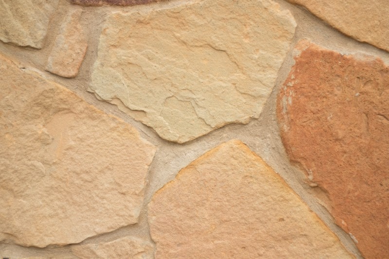
Like the soft caress of sun-kissed sand, the tan color is warm and versatile, inviting us to explore its quiet elegance. From the serene landscapes that inspire artists’ palettes to the timeless ease it lends to interiors, tan dances on the threshold between earthy authenticity and understated class.
If you’ve been considering adding tan to your palette but you’re having some doubts, this article is for you. We’ve prepared a definitive guide to the tan color by exploring its history, meaning, and symbolism.
Tan Color Composition
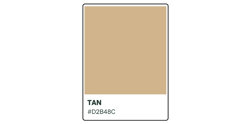
This soft, pale shade of brown is a neutral yet highly versatile color that’s both handsome and refined. It has the hex code #D2B48C and RGB values of R: 82.4, G: 70.6, B: 54.9. These values perfectly capture the essence of tan – comfortable, peaceful, and homey.
Most importantly, tan’s hex code allows you to clearly define the color across various visual spectra. Besides, it makes it possible to reproduce the color for use in different chromatic applications.
However, simply knowing tan’s hex code isn’t enough. You’ll also need to appreciate the impact of its different shades to effectively utilize these hues in design. By carefully selecting the appropriate shade of tan, designers can enhance the desired mood and message of their creations.
Other Shades of Tan
The first step in exploring the different shades and variations of tan is to understand how to prepare the color. This soft, light-brown hue can be achieved by combining white paint with varying amounts of brown paint. The amount of either color used determines the specific shade of tan you achieve.
Tan encompasses a wide range of shades, including Brandy, Desert Tan, Tan Brown, and Windsor Tan. Each shade has its own unique undertones, with each tone associated with specific feelings and emotions.
Different tan shades offer a versatile palette that can be used in various design projects. You can find them in pretty much any industry, from fashion and interior design, to branding, graphic design, etc.
Colors That Complement Tan
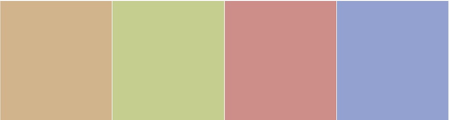
When exploring tan’s complementary colors, consider ceil as one of its possible matches. Ceil is a powdery, medium-light shade of blue. Its delicate hue will pair nicely with tan’s warm, earthy tones.
When it comes to analogous colors, Sherwin Williams Dancing Green and Resounding Rose will complement tan beautifully. With Dancing Green’s pastel tint and the gentle, blushing air of Resounding Rose, the possibilities are endless.
Together, these colors can elevate rooms, enhance dresses, and impress on web design.
Origin and Derivation of the Color Tan
The color’s origins can be traced back centuries ago when humans first took an interest in tannum.
Tannum is the substance used in the process of making leather (tanning). The extraction process involves treating animal hides with tannins, which are naturally occurring compounds found in tree bark and other plant materials.
These tannins bind to the collagen fibers in the hides, making them more durable and resistant to decay. As a result, the leather takes on a light brown color, which we now refer to as tan.
Like most colors, tan has had vast cultural significance. The color has appeared in numerous cultures throughout history, enjoying a myriad of applications.
Ancient civilizations recognized the practical benefits of tan-colored leather and began using it for clothing, footwear, and other items. Tan color was also used in architecture. It’s conspicuously visible in the wooden structures and fireplaces of ancient homes.
Over the years, tan came to be associated with comfort, stability, and reliability. The color was highly prized as it represented the durability and longevity of tanned leather.
As you might expect, the use of tan evolved over time. The color became popular in fashion, with tan-colored clothing symbolizing simplicity and elegance. It was also incorporated into interior design, creating warm and inviting spaces.
In recent years, tan has been embraced mainly for its versatility and ability to complement a wide range of colors. That explains its widespread presence in other design areas, such as product, logo, website, and even app design.
Tan also enjoys smashing popularity for its muted appearance. This beautiful shade of brown can fit into any space or setting without producing visually overwhelming effects.
The Symbolism of Tan Color

Dependability, stability, and solace: this is what the tan color radiates. It’s warm, soothing, and fosters familiarity. Due to its versatility, tan could be found in almost anything – from art, fashion, to design.
In the realm of fashion, tan’s adaptability shines—serving as a neutral foundation or a nuanced accent. Its frequent companions are natural materials like leather and suede.
Within interior design, tan extends a tranquil invitation. Whether on walls, furniture, or accents, it weaves a cozy embrace. This hue is also a favorite in branding, encapsulating trust and security.
Tan can be seen in many logos and packaging as well, as it resonates with a sense of character and credibility, a silent promise of steadfastness.
Designing with Tan
As previously mentioned, tan reflects warmth, comfort, and sophistication. These qualities makes it usable in various design projects, including interior design, fashion, logo, website, and packaging design.
Tan in Interior Design
There are several ways to utilize tan in interior design. If properly used, the color can help you create a calming and inviting atmosphere. It works well as a neutral backdrop, allowing other elements to stand out.
Tan-colored walls or furniture can add a touch of glow to a space, particularly when paired with accents of complementary or analogous colors. Additionally, this shade of brown can be used in combination with other earth tones to create a natural, organic feel.
Tan in Fashion Design
The color looks beautiful on pretty much any outfit. You can use it as the main color in clothing items like coats, pants, and dresses, or as an accent color in accessories like shoes or handbags. Tan complements a wide range of skin tones, too. That makes it particularly easier to incorporate into different makeup routines.
Tan in Logo Design
When it comes to logo design, tan is most effective at conveying a sense of reliability and simplicity. Logo designers can designate tan as the main color or as a background hue, depending on the desired effect. The color is exceptional at highlighting various logo elements, such as text, shapes, or symbols.
Tan in Web Design
In website design, tan mostly stands out for its ability to create an interactive user experience (UX). Let it serve as a background color to provide a neutral and comfortable browsing experience. You can also use it to accentuate important elements or call-to-action buttons, allowing such key highlights to stand out without being overwhelming.
Tan in Product Packaging
When used in designing product packaging materials, tan is especially effective at conveying friendliness, sincerity, and authenticity. This pale brown undertone can serve as the main color of the packaging materials. Combine it with other shades (e.g., black, dark green, baby blue, etc.) to create beautiful designs that not only attract attention but also communicate the desired message.
Conclusion
In the vast palette of colors, Tan stands as a versatile and grounding force, connecting us to the beauty of the natural world. Its warm subtlety offers a canvas of tranquility, allowing other hues to shine while exuding a sense of comfort and timelessness.
From interiors, clothing, to web design, and art, tan’s understated elegance speaks volumes, reminding us of the serene power that lies within simplicity. This unassuming shade invites us to embrace the earth’s embrace, and find solace in its neutral warmth.