Last Updated on November 20, 2023
Variety is the spice of life, but at the same time, we want to use what works. That is why Cooper Black is such a legendary typeface, for years it has been the bedrock of quality advertisement.
However, over time it has become overused and fallen in and out of fashion. In this short and sweet article, we look to outline what Cooper Black is, how it rose to popularity, and then sprinkle in a range of alternatives that we are sure you will love.
What is Cooper Black?
If you are interested in typefaces at all, then you probably know exactly what Cooper Black is. Created in the early 1920’s, it is a rounded slab typeface that has made appearances on magazine covers, food labels, packaging, and advertising both online and in print.
Most commonly associated with advertising from the 1960s and 70s, the design lends itself to a retro look and is the perfect groovy and vintage typeface. However, it should be noted that seeing as it has reached such popular heights, there are now a large range of Cooper Black alternatives available that look just as good, but have modern or unique twists. Below we have a large selection of more than 20 of them.
The History of Cooper Black
https://www.youtube.com/watch?v=Zu91meda2I8
Designed by Oswald Bruce Cooper in 1921 and then released in 1922 by the Barnhart Brothers and Spindler type foundry, this infamous typeface lends itself to old style serifs and considering that it has extra bold weighting, it stands out from older types even more.
Influences by various arts and art movements, it is a heavier variant of the Coper Old Style that was popular in the 20s and 30s, and from the 1960s onwards, it became THE advertising font to have.
In the 60s, the font quickly sprung in popularity and became the choice typeface for manufacturers, companies and printing systems as a result.
Cooper Black also has a storied history in pop culture, and from its use on the cover of the Beach Boys 1966 album ‘Pet Sounds’ to its appearance in the opening credits of Winnie the Pooh and Everybody Hates Chris, it is safe to say that the design is versatile and timeless. Even today, 100 years on, the typeface continues to either be used, or as you will see below, be imitated to great effect.
FAQs on Cooper Black
What is Cooper Black Used for? Typically, Cooper Black font is used for newspapers, magazines, and print media alike. Its rounded edges and stylish curves have become a feature of its success and it makes an headline stand out.
Is Cooper Black a slab serif? It is a rounded serif, and became the Cooper Black that we known today in 1922, over 100 years ago!
Is Cooper Black a ‘Retro’ font? Yes, considering the fact that it was created in the 1920’s, you could certainly call it ‘retro’.
Was Cooper Black overused? Like any top trend, after a while, everyone started using Cooper Black and as a result, it lost its touch. In saying that, vintage and retro designs have come back into style and because of this, it has regained some popularity. There are alternatives available however. Read on to find more than 20 of them below.
Is Cooper Black a serif or a typeface? Cooper Black is an ultra-bold serif typeface that is ideal for display on a number of projects.
Roca Font Family

Versatile, easy to use, and full of life, this font is ideal for anyone looking to replicate the success of Cooper Black, but use something a little different.
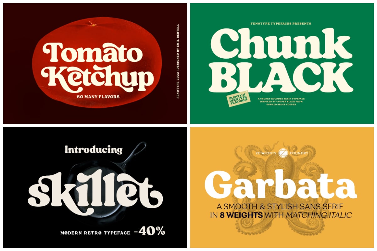
Chunk Black Retro Serif

A little chunkier than others, this font will certainly make any headline ir subheading stand out.
Black Cream – Voluptuous Soft Serif

Smooth and retro in its design, Black Cream has nearly 40 ligatures and 2 separate fonts for your convenience.
Recoleta

With 14 different font varants concluded in this package, Recoleta is a great choice for any modern design concept.
Tomato Ketchup Retro Serif Font

Fun, retro, and cool, Tomato Ketchup might have an unusual name, but it is a perfectly good typeface and a great alternative to Cooper Black.
Blood Orange Vintage Serif

Unique in its design, Blood Orange is ideal for headers for any project large or small.
CA Edwald

A typical retro design, the shadow underneath the lettering adds depth and we love the versatility that it brings.
Skillet Serif Typeface

A modern retro typeface that comes at a great price.
Peach Crush Serif Typeface

Smooth, stylish, and of course, vintage in its design, Smooth Peach is perfect for anyone hoping to create something eye-catching.
Mayonez Black Italic

A stylish and retro italic, Mayonez is a perfect Cooper Black alternative because it is versatile, legible, and is so easy to edit.
Garbata 17 Fonts

With 8 different weights included, Garbata is one of the most feature packed and versatile fonts on the list, with a range of different combinations to choose from, you can mix and match weights to create something special.
Bugaki

With regular and italic variations available, Bugaki is a gorgeous font that will make your print or media promotion look professional.
Ropers

A bold and cool serif typeface.
Ranille

Classy, elegant, and above all, simplistic. Ranille is the perfect Cooper Black alternative.
Hornbill

With nearly 20 styles to choose from within this package, Hornbill is an excellent typeface for projects large or small.
Regards

Beautifully vintage, yet wonderfully modern. Regards strikes a great balance between the two that we find to be perfect.
Megusto

A fine miz of rounded and squared sides, Megusto takes what workd from Cooper Black and adds its own unique twist.
Dubbo

With 5 weights available in the package as well as a host of ligatures and alternates, dubbo is a perfect font for those looking add something different to a design.
Marleigh Retro Serif

This retro serif typeface is far from a simple ‘copycat’ of Cooper Black. With multilingual support, ligatures, and alternates available. Marleigh is the whole package.
Retro Sick

Bold, bouncy, and rounded. A very eye-catching typeface.
Chinook

A stunning display font, Chinook is versatile enough to be used in any project or design.
Rolla

A soft and perhaps unassuming typeface, Rolla is ideal for anyone looking to make an impact and have their headline, subheading, poster, flyer, or media promotion look slick and professional.