Colors have been around for thousands of years. According to historians, the first pigments were invented some 40,000 years ago when artists mixed soil, burnt charcoal, animal fat, and chalk. This combination produced five colors – black, white, red, yellow, and brown.
Humans became increasingly fascinated with colors as time went by. Celebrated artists like Leonardo Da Vinci and Pablo Picasso are known to have experimented with numerous pigments in creating some of the most magnificent paintings in history.
Today, scientists believe that the human eye can distinguish at least ten million different color hues. Some of these are basic pigments while others are lesser-known shades.
In this article, we look at one exquisite variation of the orange color known as burnt orange.
Introducing Burnt Orange

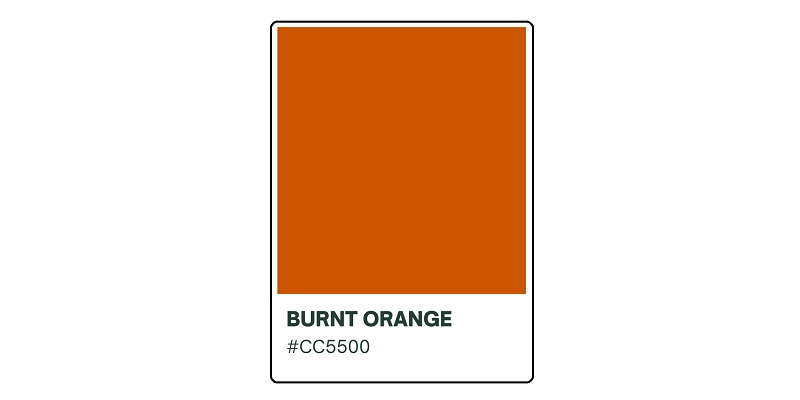
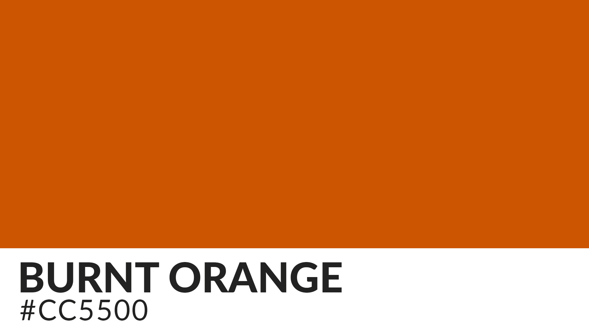
Burnt orange is a medium to dark shade of orange with a deep reddish undertone. The color is also described by the ISCC–NBS System of Color Designation as a deep reddish shade of orange, which may or may not contain dark brown tones. It has a hex code of #CC5500.
However, it’s worth noting that the exact definition of burnt orange remains largely contested. Among the most common arguments is whether the color includes blue pigments or not.
Colors That Make Up Burnt Orange
The burnt orange color consists of four major pigments – red, yellow, green, and blue. Red and yellow are the most dominant hues in burnt orange. However, it’s difficult to make them out because they exist as basic orange instead of appearing in their discreet forms.
Blue and green are also somewhat difficult to distinguish in burnt orange because they exist as darker shades of basic orange.
Reason It’s Called Burnt Orange

Burnt orange is so named due to its association with fire and flames. Note that a flame can have different colors depending on its temperature and the materials being burned. However, most flames appear as red hot or orange.
Red hot flames occur when materials burn from a temperature between 977 and 1,830 degrees Fahrenheit. On the other hand, orange flames typically burn at temperatures between 2,010 and 2,190 degrees Fahrenheit.
The variances in flame temperature do not have any significant impacts when it comes to burnt orange etymology. That’s because both red and orange are major constituent elements of burnt orange.
Origin and History of Burnt Orange
Burnt orange has been around in the mainstream media for slightly over a century. The color was officially named in 1915.
Burnt orange has been widely linked with the University of Texas at Austin, an association that did a great job at elevating the color’s popularity. More on that later on.
Meaning and Symbolism of Burnt Orange

Burnt orange evokes feelings of warmth and happiness. Like most shades of orange, this pigment can infuse joy into any occasion, including the very somber ones.
That makes it an excellent choice for your upcoming social gathering. Whether you’re planning a family get-together or a corporate dinner party, you’d want to spare a thought for burnt orange.
Burnt orange also gives a feeling of comfort and security. This shade of orange can help diffuse tensions in your environment by dispelling fear and uncertainty. Donning burnt orange attire to your maiden date might be a proactive way of making your love interest feel comfortable in your presence.
Similarly, the pigment would be an ideal choice for decorating the interiors of psychiatric hospitals. It helps the patients settle comfortably into their surroundings and can be instrumental in jump-starting their recovery process.
Pride is another important quality represented by burnt orange. Choosing burnt orange as the theme color for your occasion is a subtle way of telling everyone that you’re proud of how everything has panned out. Note, however, that there’s a fine line between pride and arrogance.

While burnt orange helps you celebrate your achievements, you’d want to be careful not to come off as overly conceited. You can balance these qualities out by mixing the pigment with other hues.
Some people associate burnt orange with childishness or youthfulness. The color can be used to convey innocence, naivety, or youthful energy. That explains its wide usage in a variety of baby and teen products, such as clothing and toys.
Burnt orange is also a color of the seasons. Fall and Halloween are the most popular seasons associated with this pigment. That’s because the majority of tree leaves turn from green to orange during fall as a result of the steady decline in chlorophyll production.
Furthermore, most Halloween pumpkins appear in orange color, with a decent number spotting burnt orange. So, if you lead such a busy lifestyle that you often lose touch with time, running into burnt orange frequently is your cue that fall or Halloween is around the corner.

Last but not least, burnt orange resonates with passion and romance. That’s especially considering the pigment’s association with fire. You could drape your bedroom in burnt orange as a discreet gesture to your partner that you’re strongly feeling their vibe. The color might also make a great background for romantic greeting cards.
Notable Usage of Burnt Orange

Burnt orange has long been associated with institutions of higher learning in the United States. The University of Texas at Austin is probably the most famous institution known for its extensive usage of the burnt orange color. The pigment is one of the variations that has appeared on the university’s brand identity for decades.
But how did the University of Texas fall in love with burnt orange?
Orange and white made their debut in 1885 during UT’s inaugural baseball match against Southwestern University. The team subsequently tried out several other colors for the next fifteen years, including gold, white, orange, maroon, and even royal blue. It eventually settled on orange and white in 1900 following a vote by the university’s students, faculty, staff, and alumni.
However, the bright orange and white originally used by UT had certain drawbacks. The white color stained easily while the orange color eventually faded into a yellowish hue due to repeated washing.
Initiatives began to change the bright orange and white palette into a more durable shade. These efforts led to the birth of burnt orange.
Burnt orange was extensively used from at least 1925 until the Second World War when its usage stopped due to the unavailability of the dye. During this period, the pigment was famously known as ‘Texas orange.’
For nearly two decades, the University of Texas reverted to its original bright orange and white color palette. The university would again reintroduce burnt orange in the 1960s. The color then became so synonymous with the University of Texas that in 1966, the institution trademarked its own hue of burnt orange named Pantone.
Auburn University and Virginia Tech (VT) also use burnt orange as their school color. However, it’s important to note that the University of Texas at Austin and Auburn University have slightly different definitions of the burnt orange color. Therefore, the burnt orange appearing on the logos of the two institutions may have subtle differences.
Outside of academic institutions, the burnt orange color has also found its way into sporting outfits. The National Hockey League (NHL)’s San Jose Sharks use burnt orange for its jerseys, albeit as a secondary color. The pigment also appears on the jerseys of the National Football League (NFL)’s Cleveland Browns and the Chicago Bears.
Burnt orange has also been used in coloring certain cylinders. The pigment is particularly associated with cylinders filled with the refrigerant 4-407C.
In 2019, burnt orange was named one of the top color trends for that year by Etsy. The pigment beat the rusty orange color that had enjoyed a long prominence in the previous years.
Although no longer a part of its branding materials, the University of Montana widely used burnt orange prior to 1996. Oklahoma State University also had a fairly long love affair with the pigment and used it for its jerseys from 1973 until 1983.

Like most shades of orange, burnt orange has also found its way into the interiors of many homes worldwide. The pigment was especially popular in interior design during the 1970s.
There are numerous other reputable organizations that once used or are still using burnt orange in their branding materials. That’s a clear indication of the pigment’s efficacy.
In the art world, notable uses of burnt orange include on Vincent van Gogh’s 1889 oil painting titled ‘Self Portrait’ and Edgar Degas 1878 oil painting ‘L’Étoile.’
How to Create Burnt Orange
The best way to make burnt orange is to familiarize yourself with the procedure for creating the basic orange color. You’ll also need to know how to use other colors and neutrals to gradually alter basic orange into magnificent hues.
We already pointed out that burnt orange is primarily a combination of red, yellow, blue, and green. But as you shall find, green usually occurs in this pigment only in trace amounts. Sometimes, it’s totally non-existent.
Below is a procedure on how to create a stunning shade of burnt orange;
i. Mix equal parts of red and yellow to form the basic orange color.
It’s prudent to begin with smaller quantities of both colors. You can then add the pigments to the mixture depending on the amount of burnt orange you wish to create.
Also, you can alter the shade of your basic orange by adding more of either red or yellow. More red will deepen the color while more yellow will lighten it up.
ii. Add blue to your basic orange color in a drop-wise manner.
Note that blue is a cool color. As such, it’s highly effective in creating darker pigments of warm colors. Adding blue to basic orange drop-wise prevents the final color from becoming too dark.
You could also experiment with neutral colors – black and white – to achieve the desired effects. Use white to achieve a lighter burnt orange and black to darken it. Gray and brown are other earth tones that you could use to tweak a burnt orange shade further to your liking.
What to Pair with Burnt Orange
Burnt orange is one of the most flexible and versatile colors. The pigment can pair easily with many other colors to create spectacular artwork.
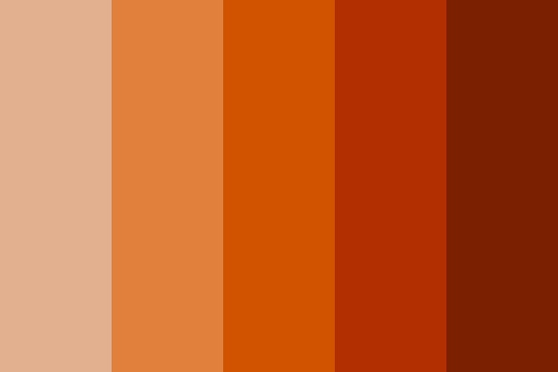
Dark blues and grays are among the top colors that burnt orange pairs easily with. This shade of orange also tends to blend well with peach and mint green. Other colors you could mix with burnt orange include warm white, fuchsia, dusty rose, indigo, and pale blue.
Final Word
Burnt orange is the quintessential color of fire and flames. The color can inject life into any dull setting and elevate everyone’s mood.
Burnt orange also carries other deeper meanings besides its association with warmth and passion. Its long usage by numerous academic and sporting outfits is proof of how remarkably this pigment can transform your brand’s visual identity.

