Last Updated on August 17, 2023
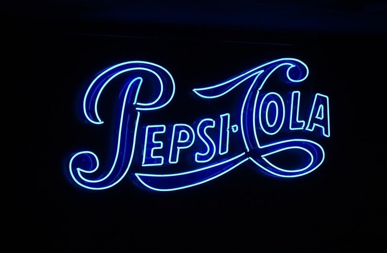
PepsiCo is a company that manufactures the carbonated soft drink, Pepsi. The Pepsi drink was developed by Caleb Bradham in 1893. It was originally called Brad’s Drink before its name changed to Pepsi-Cola in 1898, and eventually to Pepsi in 1961.
Pepsi mainly comprises carbonated water, high-fructose corn syrup, caramel color, sugar and other natural flavor-enhancers. The drink also contains considerable amounts of caffeine, citric acid, and phosphoric acid.
There are also several variants to the original Pepsi drink. Examples include Diet Pepsi, Pepsi Vanilla, and Pepsi Zero Sugar.
Pepsi Font
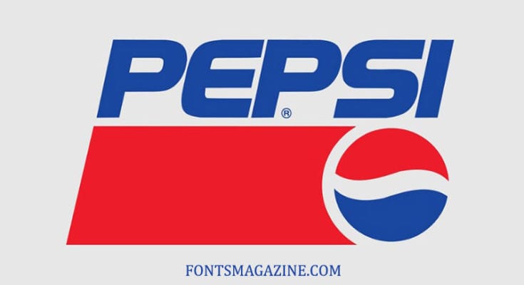
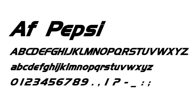
The font used on the Pepsi logo title is a popular sans-serif typeface simply known as the Pepsi font. The font was designed by Jakub Degorski.

Pepsi font is available in one regular style. However, the font comes in tons of advanced features, such as 80 unique glyphs and 266 stunning characters. Examples of those characters include;
• UPPERCASE
• Lowercase
• Numerals
• Mathematical Operators
• General Punctuation
• Spacing Modifier Letters
• Basic Latin
• Latin Extended-A
• Latin Extended-B
• Latin-1
• Greek and Coptic
• Geometric Shapes
• Letterlike Symbols
One reason to consider Pepsi font for your design projects is that the font is remarkably clear and bold. That speaks volumes about its legibility and ability to convey your brand’s appeal.
Besides its boldness and clarity, Pepsi font is also reasonably versatile. You can use the font in all manner of design projects, including on the label of food products, books and stationery, movies, video games, and t-shirt printing. The font is also perfect for using on your business cards, invitation cards, and campaign posters.
It’s worth noting that the Pepsi logo has undergone at least 10 major redesigns since the company’s inception. Many of these redesigns include changes in the brand’s logo font.
As we’ve already indicated, Pepsi was originally known as Brad’s Drink. During this period, the log was a blue wordmark printed against a white background. The font used for the logo was a bold and fairly ornate.

In 1898, Brad’s Drink rebranded to Pepsi-Cola. The logo’s main color changed to red. Another significant rebranding point was the elongation of the serifs and mid-height letter spikes in the original font. The new logo looked more wavy and eye-catching.
The Pepsi logo would undergo a couple more changes over the next century. These changes mainly targeted the logo’s lettering, color scheme, and font.
The current Pepsi logo, seemingly having been redesigned in 3D, is the most stylish and elegant. It sports a sans-serif font in slanted style, completed with a red stripe and the company’s iconic swirls in white, blue, and red beneath it.
Where to Download the Pepsi Logo
You can download the original Pepsi font from the Font Meme website. Other websites to download the Pepsi font include DaFont and The Fonts Magazine.

If you’re looking for a font that’s similar but not identical to the original Pepsi font, you can always use a font generator. Most websites that let you download the Pepsi font also have provisions for generating a customized font.

