Ever looked at an internet meme and wondered what it would be like to change the font into something…different? Even if you did, you’d probably get a cringe reaction. That’s because people expect certain things to look a certain way – even memes.
So before you pick Comic Sans or Helvetica on your meme generator, let’s dabble a little into the reason why memes have that one particular font.
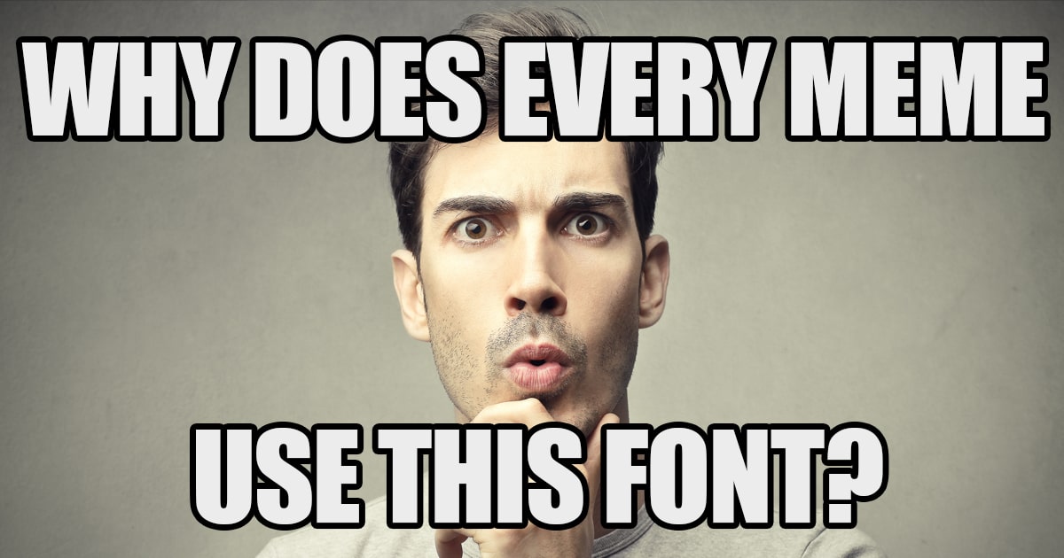
Who Haz the Meme Font?
In this Vox Almanac video, presenter Phil Edwards gives a short but sweet explanation as to why Impact is the font of choice for cool memes.
Designed by Geoffrey Lee in 1965, Impact was created to fill a need for type that looked industrial while maintaining efficiency during printing. In the 60s, posters, magazines, and books were still printed using metal blocks. Because the font was bold and condensed, it allowed as much ink on paper as was possible. And with very short ascenders and descenders for each letter, it saved space.
As the name suggests, Impact was created ‘to have an impact’. And it did. During the 60s, it was used extensively on headlines, titles, ads, and posters. It rivalled popular European industrial sans serifs of that time. By the 90s, it dominated internet forums as it came as one of the 11 core fonts from Microsoft.
One of its first uses in a ‘meme’ was in an image macro of a cat with the caption: ‘I can haz cheeseburger’. And well, let’s just say that the format stuck.
Even if you’re not making a meme, having the Impact font around can be pretty useful. It’s big, bold, and flexible, after all. Microsoft users rejoice because it comes pre-installed in the apps. For Mac or Linux users, you can download the Meme Font for free from WFonts. For the italic version, check out Fonts Geek. Enjoy!