Pepsi is a carbonated soft drink developed and manufactured by PepsiCo. The drink was first introduced in 1893 by Caleb Bradham. It was originally known as Brad’s Drink before changing its name to Pepsi-Cola in 1898 and eventually to Pepsi in 1961.
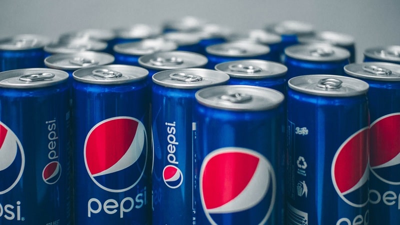
Pepsi has experienced a gradual but steady growth rate to become one of the world’s most well-known soft drink brands. The drink is now available in several variants. These variants differ primarily in their ingredients, particularly the flavors used.
Examples of products under the Pepsi umbrella include Diet Pepsi, Crystal Pepsi, Pepsi Twist, Pepsi Wild Cherry, and Pepsi Lime. Others are Caffeine-Free Pepsi, Pepsi Vanilla, Pepsi-Cola Made With Real Sugar, Pepsi Zero Sugar, and Pepsi Next.
Pepsi’s expansive growth rate is largely attributed to the company’s logo. This post looks at the Pepsi logo’s design, meaning, and how the graphic image has changed through time.
Pepsi Logo Appearance
Shape and Color
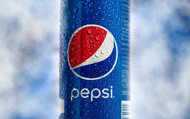
The current Pepsi logo is popularly christened Pepsi Globe. Pepsi Globe combines red, white, and dark-blue colors inside a spherical shape.
The red color sits on the upper part of the sphere and the dark-blue color on the lower part. In between the two colors is a white swirl. The shape formed by these three colors looks a lot like a human smile.
Another noteworthy element of the Pepsi logo besides the smiley face is the brand’s name written in small letters. The name commonly appears underneath the graphic image. However, some Pepsi products also have the brand’s logotype set on the left-hand side of the graphic image.
Lastly, it’s important to note that red, white, and dark-blue aren’t the only Pepsi colors. The brand also utilizes other colors to a lesser degree. For instance, Pepsi’s caffeine-free drinks use a golden shade color.
Pepsi Font
Pepsi uses a customized italicized Roman typeface known as Pepsi Light. Pepsi Light is the font that the word “Pepsi” appearing on the brand’s logo is set in. The font was developed in 2008 by Gerard Huerta.
Pepsi Logo Symbolism
Pepsi is one of the many globally-renowned brands that utilizes the image of a smile on its logo. The use of a smiley face makes Pepsi look less formal and more approachable. It depicts the brand as friendly and trustworthy, and one whose primary mission entails putting a smile on its clients’ faces through its products.
Also, the colors Pepsi uses on its logo have different meanings. The dark royal blue mostly resonates with “cool” and was adopted to portray Pepsi drinks as cooler than those of its competitors, including its longtime rival Coca-Cola.
Some Pepsi products also sport a lighter shade of blue. This color is associated with coolness and freshness.
Red was most likely utilized to evoke strong emotions of love, whereas white is a sign of purity. Lastly, the golden shade found in some Pepsi drinks like caffeine-free products is associated with energy and balance.
Pepsi Logo History
The current Pepsi logo was developed in 2008 by The Arnell Group, who reportedly received $1 million for the job. However, Pepsi has conducted more than ten major redesigns to its logo throughout the brand’s history.
1893 – 1898
![]()
Pepsi’s first logo was made up of blue serif lettering. The wordmark was set against a white background and enclosed inside a thin ornate rectangular frame.
1898 – 1905
![]()
Pepsi’s original logo was first redesigned in 1898, following the brand’s name change to Pepsi-Cola. The new logo represented the ingredients in the new brand. It featured cursive red lettering, which appeared with elongated and curved lines.
1905 – 1906
![]()
In 1905, Pepsi redesigned its logo to resemble the casual design of its then-fiercest competitor, Coca-Cola. The lettering appeared in bold and was set in red color.
A long curved tail emerged from the letter “C,” connecting the lines of the letters “P” and “C.” The tail also underlined the entire wordmark, creating a double loop pattern.
1906 – 1940
![]()
In 1906, Pepsi added the inscription “Drink” to its logo. The inscription was placed right above the letter “C.” Another major change was making the band’s wordmark more legible by implementing thicker lines. The entire logo was also slightly slanted, depicting motion and progress.
1950 – 1962
![]()
1950 marked the introduction of the prototype to be used in the next-generation Pepsi logo. The prototype was an image of a metal bottle cap colored in blue, red, and white.
Although Pepsi’s wordmark had previously appeared in blue, 1950 is the year the brand officially adopted color blue for its graphic image. The wordmark retained its appearance. However, it was now set on the white section of the cap and not just floating freely in space.
1962 – 1973
![]()
During this period, Pepsi-Cola dropped the word “Cola” from its logo. This was an apparent sign that the brand had achieved such tremendous success that it no longer had to be associated with its rival Coca-Cola.
The remaining “Pepsi” inscription was in ALL-CAPS and utilized a simple sans-serif typeface. Only the letter “S” appeared slightly modified.
1973 – 1987
![]()
Pepsi switched to the Globe Logo in 1973. The new logo cap had no ridges. Besides, Pepsi’s logo appeared in a colored background for the first time.
The circle with a bold white outline was set inside a white-framed rectangle. Red occupied the left part of the frame and light blue occupied the right section.
1987 – 1991
![]()
In 1987, Pepsi dropped the white frame from its logo and enlarged the wordmark. The font also became smoother and sleeker. The letter “P” was stretched out, “E” adopted rounded corners, and “S” became longer.
1991 – 1997
![]()
For the first time in Pepsi’s logo evolution, the globe and the wordmark became separated. The sphere appeared on the bottom right of the logo, whereas the “Pepsi” lettering stretched across the logo’s top. The wordmark was also italicized and set in blue.
1997 – 2003
![]()
Pepsi carried out yet another upgrade to its logo in 1997. The company replaced its blue wordmark on a white background with a white wordmark on a blue background. The red color also disappeared from the background.
2003 – 2006
![]()
Pepsi’s new logotype was set in gradient colors, making it look glossy and vivid. The globe became larger and more conspicuous. Also, both the globe and the word mark featured light blue outlines that made them stand out against the background.
2006 – 2008
![]()
The most remarkable change to Pepsi’s logo in 2006 was the placement of the brand’s wordmark underneath the emblem. Another major change was implementing blue color and thick white outlines on the logo. Besides, the designers incorporated glistening water drops in a bid to make the emblem look more realistic.
2008 – 2014
![]()
Pepsi’s logo was drawn in 2D in 2008. The inscription also changed from UPPERCASE to lowercase. Another major change was on the globe. It featured a thin double outline, with a white line striking it diagonally.
2014 – Present
![]()
The most recent upgrade to Pepsi’s logo happened in 2014. The 2014 logo became more minimalistic. Most notably, the emblem was placed on the left side of the logotype and the frame was removed.
Pepsi has undertaken multiple redesigns to its logo over the 100+ years the brand has been around. As the brand continually experiments with newer ingredients, there’s no telling when it will carry out the next upgrade to its current logo.