Last Updated on December 28, 2023
As with many shades of blue, cerulean has a rich history and deep symbolism. This iconic hue was designated as the Pantone Color of the Year in 2000, symbolizing calmness amidst changing times of the new millennium.
The color has been widely used in the fashion industry, featuring conspicuously in the outfits of renowned fashion designers. It has also appeared in the works of famous artists throughout history. But cerulean isn’t only a fashion favorite.
This article shall offer a comprehensive understanding of the history, symbolism, and practical applications of cerulean color.
What Color Is Cerulean?

Cerulean is a shade of blue that sits midway between azure and dark sky blue. Thanks to its deeper and darker hue, the color has been an integral part of art and design for years. Its symbolism ranges from positive (such as peace and serenity) to negative (such as nostalgia and melancholia).
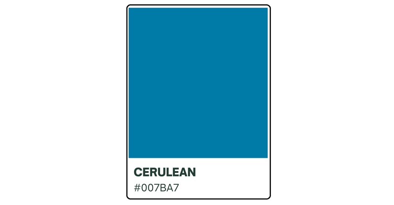
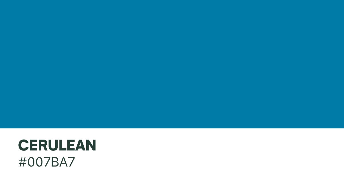
Cerulean closely resembles the color of the sky and is associated with a range of cool feelings, including peace, lightness, and serenity. It has the hex code #007BA7 on the RGB scale, which consists of 0% red, 42% green, and 58% blue.
On the CMYK color scale, cerulean consists of 100% cyan, 26% magenta, 0% yellow, and 35% black. And on the HSV scale, the color has a hue of 196°, 100% saturation, and 65% brightness.
What Colors Complement Cerulean
This captivating color finds complementary partners in a range of hues. White enhances its crispness, creating a fresh aesthetic, while silver or gray adds sophistication and neutrality. For warmth and contrast, gold or brass can be paired with cerulean.
The combination of peach or coral introduces a bit of glow. Lime green offers a vibrant and refreshing contrast, particularly in contemporary designs. For a classic and rich pairing, deep navy adds depth. These complementary options allow for a diverse and visually appealing palette when working with cerulean.
Origin of Cerulean

The history of cerulean dates back to ancient times. The name “cerulean” derives from the Latin word caerleus, meaning ‘dark blue’ or ‘sky blue.’ The color has been used by various cultures throughout history, including the ancient Egyptians, Greeks, and Romans.
In ancient Egypt, for example, cerulean was used in religious art to represent the sky and the heavens. Ancient Egyptians also used the color to depict gods and goddesses, conveying their divine nature and connection to the celestial realm.
Its historical significance also relates to its usage in literature over the years. The color has appeared in various poems and literary works, often used to communicate peace or sadness.
In architecture, cerulean has appeared in traditional buildings and structures. The color has notably been employed in the design of temples and palaces, symbolizing spirituality while also inviting a peaceful aura into these buildings.
In many cultures, cerulean garments were worn to signify elegance, grace, and status. The color’s deep, rich tone also added a touch of sophistication to traditional attire.
The historical origins, cultural significance, and deep symbolism of cerulean makes it one of the most outstanding pigments. The color’s versatility allows it to be paired with many other shades, creating beautiful masterpieces.
Cerulean Color and the Sky

It’s no surprise that the cerulean hue has a striking resemblance to the sky. That similarity explains why the color resonates with vastness and tranquility.
The celestial inspiration behind cerulean is evident in its deep and dark blue hue, which closely resembles the color of the sky. This natural connection to the firmament can have a profound psychological impact on individuals, especially in terms of evoking mental relaxation.
You can paint your bedroom wall cerulean to help you relax after a hectic day. The color may also suit romantic outfits as it banishes anxiety, allowing romantic partners to settle comfortably into their environment.
The natural connection between cerulean and the sky also adds to its symbolism. It represents peace amidst chaos, considering that there’s a lot going on in the firmament that’s not readily visible to our eyes.
Remember that cerulean is also incredibly versatile and can help to create various moods and atmospheres. This shade of blue blends seamlessly with many other hues to produce sophisticated and harmonious combinations.
Overall, the resemblance of cerulean to the sky, alongside its psychological impact and cultural significance, cements the color’s position as one of the most iconic shades of blue.
Psychological and Emotional Symbolism of Cerulean Color

We’ve already pointed out that cerulean is associated with a range of emotions. The color’s darker hues mostly resonate with peace, while its deeper tones evoke melancholy and nostalgia.
The emotional impact of cerulean is rooted in its resemblance to the sky. The color aptly captures the essence of peace and serenity which comes with gazing at the vast expanse above.
This association with tranquility has made cerulean a popular choice in spa and wellness settings. The deep shade of blue has been linked to healing properties, understandably due to its ability to reduce anxiety and promote relaxation.
In literature, cerulean is often used to describe the melancholic and introspective moods of characters. Many authors have used the color to evoke a sense of longing and sadness. Cerulean’s association with nostalgia further adds to its emotional depth, as it helps individuals reminisce on past memories and experiences.
Cerulean in Art and Design

Numerous artists and fashion designers have embraced cerulean as a versatile color choice for years. Some of cerulean’s most notable appearances in fashion were in 2021, when celebrities such as Megan Fox, Sarah Jessica Parker, Gabrielle Union, and Katie Holmes were seen sporting the hue.
The use of cerulean in fashion trends underscores its ability to add depth and sophistication to garments. To elevate the color’s appearance, you might want to pair it with compatible shades. Fortunately, cerulean blends well with white, creams, beiges, and even orange.
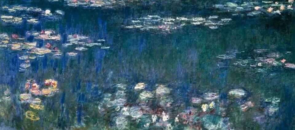
In addition to fashion, cerulean has also made its mark in the world of art. Prominent artists, such as Claude Monet, Édouard Manet, and Paul Signac incorporated cerulean into their paintings. While these painters were undoubtedly fascinated by cerulean’s beauty, they most likely added the color to their palettes to invite a sense of calm into their artworks.
Cerulean has also found its place in interior design. Interior designers love the color for its ability to bring a sense of airiness and lightness to a room. Regardless of how it’s used, cerulean can appeal to the senses while still maintaining a cohesive and harmonious atmosphere.
Design Tips for Using Cerulean

One way to create harmony with cerulean is by designing with monochromatic schemes using different shades of blue. This not only highlights the beauty of cerulean but also creates a sense of depth. Aside from using different shades of blue, this adds a layer of complexity and sophistication to the overall composition.
Another way to pair cerulean is with neutral pigments. These colors provide a calming backdrop for cerulean, allowing it to take center stage. The combination of cerulean with neutrals is perfect for creating a peaceful atmosphere.
If you’re looking to add a pop of color, you might consider incorporating cerulean accents with orange. The combination of cerulean’s cool tones with the warmth of orange creates a vibrant contrast. The resultant hue can add a touch of excitement to a design, making it more visually engaging.
Remember that cerulean may also help to evoke nostalgia and melancholy. When the idea is to create a sad or somber mood, the best approach would be to blend cerulean with other darker shades like burgundy. This can be particularly effective in storytelling or creating a sense of reminiscence.

Conclusion
This calm and soothing color reminds us of clear skies and peaceful waters, making us feel relaxed. It’s more than just a pigment – it also holds several meanings, such as contentment, nostalgia, or melancholia.
The cerulean hue is impactful yet calming. From paintings to interiors, cerulean brings peaceful vibes that are unmatched.

