Last Updated on November 9, 2023
People love their Kindle for many reasons, but mainly because it’s portable, accessible, and can store thousands of book titles. It’s the ideal choice for all book lovers. Despite its benefits, lots of folks can’t get past the few disadvantages of using the device, including screen glare and readability issues.
Aside from adjusting the lighting on your Kindle, another thing you can do to customize your reading experience is to change the font. That’s right – a good font can help reduce eye strain, make the story more immersive, and create an overall enjoyable experience.
We’ve laid out the best Kindle fonts so you can get started today. Check them out below.
What Is Kindle?
Whether you view yourself a traditional or contemporary book lover, a Kindle can be one of the best investments you ever make. Also known as an e-reader, it’s a device that allows users to read e-books, newspapers, and magazines.
These tablet-like devices come with adequate storage space to accommodate millions of texts. They offer instant access to your favorite books without needing a trip to the nearest library or lug around a hardbound while on vacation.
Amazon Kindle is probably the most popular e-reader. So much so that the term “kindle” is used almost exclusively with reference to the company’s line of e-reading devices. However, there are other popular alternatives such as Kobo, Nook, Tolino (favored in Europe), and Sony Digital Paper.
How to Choose the Best Kindle Font

There are thousands of fonts you can add to your Kindle device. But that doesn’t mean you should check into any font foundry and pick the nearest typeface available.
First, assess a font’s legibility before adding it to your e-reader. Avoid overly bold or chunky typefaces as these can exert undue strain on your eyes.
Aesthetic appeal is another key consideration. Beautiful typefaces can elevate your reading experience by their sheer gorgeousness. Such fonts may also stimulate your desire to interact with your e-reader more often.
Lastly, establish a font’s appropriateness for a book’s genre and plot before adding it. As mentioned, fonts can leave a lasting impression.
For obvious reasons, do not pick distorted or weird fonts as they are difficult to read and would be impractical. Try sophisticated serifs for classic books, and maybe grotesque fonts for sci-fi, contemporary, and literary works.
Best Fonts for Kindle
1. Bookerly
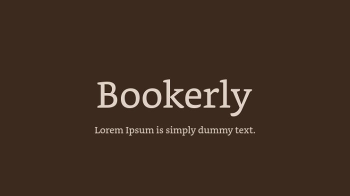
Amazon Kindle is the most popular e-reading device. So, it’s unsurprising that the company behind this e-reader also has its own recommended font, such as Bookerly.
Bookerly is the standard typeface for Amazon Kindle. The font was created by Amazon’s in-house designer, Dalton Maag, for use exclusively on its e-readers. It stands out for its clean texture and incredible legibility.
2. Bitter HT
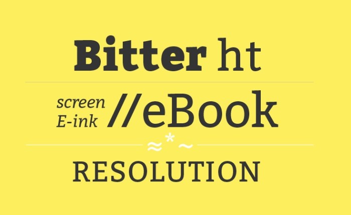
Bitter HT is a slab-serif font that was developed primarily to enhance the e-reading experience. It’s a top recommendation for avid Kindle readers craving an enriching experience.
It was designed by Sol Matas and originally published by Huerta Tipográfica. It comes in 18 different glyphs. There are versions suitable for headlines, subheadings, and body text.
3. Atkinson Hyperlegible
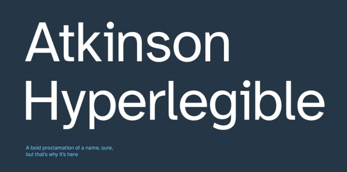
Atkinson Hyperlegible is a Kindle font whose design takes inspiration from certain preexisting grotesque sans-serif typefaces. The font was designed by Applied Design Works and released via the Braille Institute.
All individual characters in Atkinson Hyperlegible have unique shapes. That makes the font suitable for Kindle readers who’re partially visually impaired.
Download Atkinson Hyperlegible
4. Caecilia
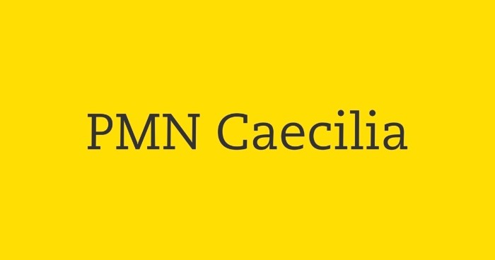
Caecilia is an ultra-modern slab-serif font family developed by renowned graphic designer Peter Matthias Noordzij. Noordzij drew the first sketch of this typeface in 1983 while still a college student in The Hague.
The font was later published in 1990 by Monotype Corporation. The pack contains 8 different styles with matching weights, from standard light to heavy italic.
5. Sabon

Sabon is an old-style serif typeface created by German-born typographer Jan Tschichold. The font was jointly released in 1967 by three foundries – Monotype, Linotype, and Stempel.
Tschichold designed Sabon based on the classic Garamond typeface. He intended to adapt the font to modern printing technology. Later variations subsequently emerged, including digital versions that can be used on Kindle devices.
6. Literata
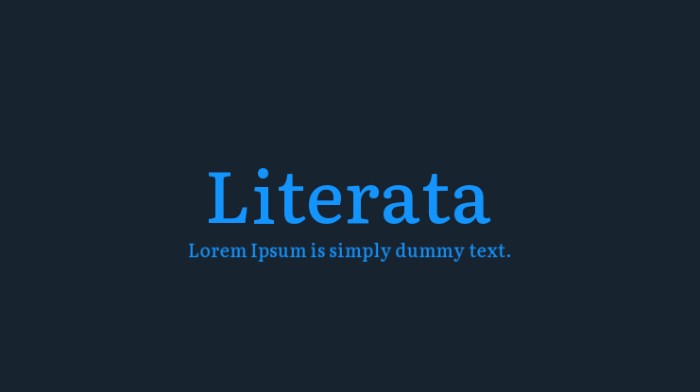
While many fonts on this list are Kindle-specific, Literata by TypeTogether comes in digital and print versions. The font was designed exclusively for e-book reading.
Literata is a Google font. It was commissioned by the tech giant for use on Google Play Books. As with all Google fonts, you can download and useit for free on different e-reading devices.
7. Rockwell

Monotype Corporation has revolutionized the global font market by releasing thousands of unique typefaces. A notable mention is Rockwell, a geometric slab serif font released in 1934 and which has come to be associated with digital displays.
Rockwell sports a clean texture that allows you to read long-form texts on your kindle without suffering from eye strain.
8. Avenir Next

Adrian Frutiger‘s Avenir Next is another font worth adding to your e-reader. Designed in 1987 and released the following year by Linotype, this font’s crowning feature is its ability to blend humanist and geometric elements while still delivering on clarity and legibility.
It’s an excellent pick for reading e-books with modern or futuristic themes. There are up to 24 different styles to pick from.
9. Lexend Deca

If you’re looking for a font to improve your e-reading proficiency but are averse to common typefaces, then you might want to give Lexend Deca a try.
Lexend Deca is one of the fonts in the Lexend family, which consists of six other styles. The typeface was designed based on Shaver-Troup Formulation, making it another excellent pick for partially visually impaired Kindle users.
10. Raleway
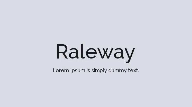
Ask any seasoned Kindle user to name their most preferred fonts and you can be sure Raleway will feature on the list.
Raleway is a sans-serif typeface family originally designed by Matt McInerney and subsequently expanded into different weights by Pablo Impallari and Rodrigo Fuenzalida. Most Raleway users love the font for its ability to maintain high legibility across different sizes.
11. Georgia
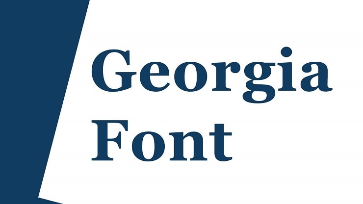
Georgia is one of the most popular serif typefaces for Kindle devices. The font was developed by Matthew Carter in 1993 for Microsoft.
The fact that Georgia was designed primarily for Microsoft’s digital display outputs explains why it appeals to many e-readers. There are four different styles to choose from, depending on your desired levels of optical clarity.
12. Vollkorn
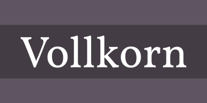
Summing up our list of the top Kindle fonts is a dark, grainy serif typeface by Friedrich Althausen.
The name comes from the German word for wholemeal, which was also used to describe ‘Brotschrift’. This term meant the small fonts that were commonly used for everyday purposes during the times of manual typesetting.
Vollkorn comes in six different weights. The font looks exceptionally great in small points, making it perfect for paragraphs as opposed to titles and subheadings.
How To Add Fonts to Your Kindle Device
Many Kindle e-readers come with prebuilt fonts. However, it’s also possible to add your custom fonts to the device by following these procedures;
i. Identify the fonts you want to add on your Kindle.
You can access fonts right on your device or download them from the internet. Google Fonts, DaFonts, and Font Squirrel are among the popular websites where you can download Kindle fonts.
Take note that fonts come in different formats. Most Kindle devices support only three: OpenType (OTF), TrueType (TTF), and TrueType Collection (TTC).
ii. Connect your Kindle to your computer and open it using Finder or File Explorer.
iii. Head to the “Fonts” folder.
iv. Drag and drop your desired font files to import them onto the e-reader.
v. Carefully disconnect your Kindle from your computer.
To use the font, open an e-book and tap the top of the screen. You’ll then need to open the “Display Settings” menu by tapping on the “Aa” button. Finally, hit “Font” and “Font family,” then pick your desired font from the collection.
You can hit “Font family” again to go a step back and configure the selected font further. Among the adjustments you can implement here include changing the font’s size and boldness. Alternatively, click anywhere on the screen to exit the menu.
Final Word
Picking a new font for your Kindle offers the flexibility to optimize your reading experience. This makes it more enjoyable, accessible, and tailored to your preferences. Whether for practical reasons or aesthetic choices, font selection can significantly impact how readers engage with their e-reader.
Go ahead and try one of our font suggestions today!

