Last Updated on March 14, 2023
If you’ve ever picked up a King James bible, or noticed the headlines of earlier versions of Esquire or Vogue, then you may have noticed a particular font. Sabon is known for being quintessentially a book text typeface. But that hasn’t stopped designers from reviving it for web use today. Find out why.
Origins of the Name

Made by the German-born designer Jan Tschichold, this old-style serif is based on the roman type of by Claude Garamond, but with a specific utilitarian concept.
During the 1960s, some German printers were looking for a font that could be used for manual or hot metal typesetting machines, at the same time, maintain a 16th century traditional appeal. They required all weights to have the same width but a narrow ‘f’. This is to accommodate Linotype machines.
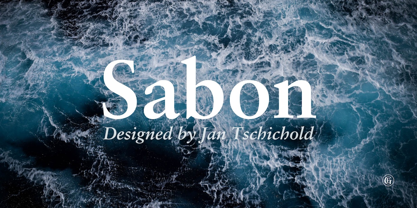
As a well-known book designer, Tschichold, was given the task. He seemed well-suited for it, having lived in Leipzig some time before, and having worked on a unified layout design for Penguin Books. The term Sabon was eventually given to the resulting typeface, named after printer Jacques Sabon, who also worked on Garamond types.
How Sabon Is Used Today
The typeface was released jointly by the Linotype, Monotype, and Stempel type foundries in 1967. As a faithful, organic book typography rooted in tradition, it’s become the preferred font by publishers and editors.
Aside from biblical and religious text, Sabon was also used in editorials and university logos. There were also books that used it for its cover and body text. Get the font bundle from Adobe Fonts or CuFonts.
Faithful Sabon Font

Those who remain dedicated to Sabon has since created revivals and digital versions, among them Sabon Next. This version contains italics and some ornaments to add dimension to your works. This is more suited for the Web than the typical Sabon font. You can download Sabon Next from MyFonts or from Microsoft Fonts.