It can be very difficult to imagine that we used to live without Google. Today, it’s definitely more than a search engine. We use its services to help us send messages, attend online meetings and classes, find books and affordable tickets, as well as store data.
Let’s add fonts to the list of things Google helps us get for free.
What are Google fonts?

Launched in 2010, Google Fonts is a catalog where designers and developers can find web-safe typefaces for their projects. Back then, it wasn’t easy to find a good font, especially one that works well for digital entities such as websites or apps. People were often limited to whatever was available from their computers.
With the introduction of Google Fonts, everyone can gain access to web-ready fonts that are not only functional, but also clean, beautiful, and readable. They can be sorted by category (serif, sans serif, display, handwriting, monospace), language (up to 135 languages supported), or properties (slant, width, thickness, etc.).
Should your small business website use Google fonts?
One of the best advantages of using a font from Google is that they’re FREE for commercial use. If you want to use custom fonts, you’ll pay for a commercial license, which can be costly, particularly for those running a small business or online store.
Afraid that your brand may look like everyone else’s? Google Fonts has an enormous library of font families. From serifs, display, to sans serifs – there’s a font you’re bound to fall in love with. Designers and developers keep adding new variants as well, so their collection just keeps on growing.
Another awesome thing about choosing a Google font? They’re easy to use. Google also provides valuable information: from the creator, license, available glyphs, to pairings, so you understand more about the font you’re about to put on your website.
You can download the fonts immediately, or import them with a simple code.
How to choose Google fonts
There are three main things to consider before picking a Google font:
- Purpose;
- Readability; and
- Font Pairing.
Purpose. The first question any designer should ask is: how and where am I going to use this font for? You don’t want to choose a Google font for making wedding invitations or party posters. Rather, it’s typically recommended for those who are just about to set up a Shopify store or launch an Android app.
Readability. Most, if not all, Google fonts are readable – so you won’t have a problem there. Still, go back to point 1 and think about your purpose. If you’re going to publish a book or set up a blog for instance, serifs could be your bestfriend because they make longer texts easier to read.
Font Pairing. Lucky for us, the Google repository includes font pairings (just scroll to the bottom). Definitely a no-brainer and super handy for beginners. For example: if you click on Bebas Neue, Google will recommend Roboto, Montserrat, Lato, and Open Sans to complement it.
Best Free Google Fonts
With 1,052 font families – and counting – the Google catalog is a massive free source for typefaces you can quickly and easily use when any need arises. Don’t be afraid to browse and experiment. As always, listen to your gut.
Here are some of the best Google fonts you’ll want to keep in your toolkit.
1. Work Sans

Wei Huang took inspiration from early grotesque typefaces, giving it features that make great displays on both web and print presentations.
2. Rubik

This 5-weight font family by Philipp Hubert and Sebastian Fischer feels right at home whether used in print or display.
3. Alegreya

Chosen as one of the 53 ‘Fonts of the Decade’ at the ATypl Letter2 competition in September 2011, this is your go-to font for a classy, calligraphic look.
4. Source Sans Pro

This Paul D. Hunt design was the first open source sans-serif made to work great in user interfaces.
5. Roboto

A mechanical skeleton and largely geometric forms meet friendly and open curves in this natural-looking grotesk.
6. Roboto Slab

A derivative of the popular Roboto typeface made with readability in mind thanks to natural widths normally found in other humanist and serif fonts.
7. Poppins

Designed by Johnny Pinhorn, this popular design tool has been considered one of the best geometric sans serif typefaces with an international appeal.
8. Archivo Narrow

High-performance presentations are ensured using this sans-serif from Omnibus-Type that looks great whether used in print or digital media.
9. Playfair Display

This brainchild of Netherlands-based type designer Claus Eggers Sørensen harks back to the age when printing technology was gradually departing from written letterforms.
10. Karla

This grotesque sans-serif is an expansive typeface that delivers an Indian feel to a wide range of projects it works perfectly with.
11. Lora

A typeface made by Cyreal combines calligraphic brushed curves with contemporary driving serifs to build an optimized look on either screen or print.
12. Crimson Text

If you’re looking for a Garamond-esque font that keeps the tradition and grandeur of old-style typefaces, this fantastic Sebastian Kosch design is what you need.
13. Montserrat

Julieta Ulanovsky created this typeface as an artistic action to rescue the fading practice of urban typography, which you can now grace your projects with.
14. Lato

Lukasz Dziedzic made this typeface seem ‘transparent’ when used as body text, but becomes stylistic when utilized in larger sizes.
15. PT Sans

Made to commemorate Peter the Great’s creation of Russian civil type, give projects a unique vibe that few other typefaces dare to match.
16. Cardo

This high-quality design from David Perry was made to satisfy the need of classicists, Biblical scholars, medievalists, and linguists for a true Old Style font.
17. Open Sans

This version of Steve Matteson’s creation contains the complete 897 character set, with a bonus of excellent readability on print, web, or mobile interfaces.
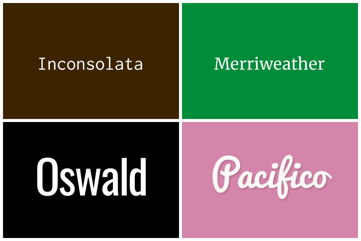
18. Inconsolata

Raph Levien’s monospace font is made for printed code listings, with a little more attention to detail given than the usual ‘programmer fonts’.
19. Raleway

Matt McInerney started this typeface as a single thin weight, until it expanded into a 9-weight family thanks to Pablo Impallari and Rodrigo Fuenzalida.
20. Anonymous Pro

This family of 4 fixed-width fonts is inspired by Anonymous 9, a Macintosh freeware bitmap font developed in the mid-90s.
21. Merriweather

A very large x-height, mild diagonal stress, sturdy serifs, and open forms make this typeface pleasant to read on screens.
22. Abril Fatface

This part of the 18-style Abril typeface uses titling weights reminiscent of classic Didone styles, giving a neutral but strong display presence.
23. Ubuntu

This sans serif font designed by Dalton Maag uses OpenType features made for maximum clarity on desktop and mobile screens.
24. Oswald

This reworking of the classic font has been redrawn to be better used on standard digital screens, which is continually updated as proof of its versatility.
25. Exo 2

A technological or futuristic feel without dropping elegance is captured in this 9-weight geometric sans serif that works for small to intermediate-size texts.
26. Bitter

Optimized for the pixel grid, this Huerta Tipográfica typeface focuses on our everyday interactions with texts on screens, by making it easy on the eyes.
27. Cabin

Modern proportions, optical adjustments, and a few elements of the geometric sans makes a truly modern take on a humanist sans serif.
28. Pacifico

This Vernon Adams creation is an original and fun brush script that brings about the joy and waves of 1950s American surf culture.
29. Barlow

Visual styles of the California public are represented in this slightly-rounded, low contrast grotesk type family principally designed by Jeremy Tibby.
30. Zilla Slab

This font has represented Mozilla and is used for their wordmark, headlines, and other visual designs, carrying a friendly but sophisticated look.