Did you know that the name of an electrifying yellow-green color is named after a liqueur? Chartreuse, an energetic hue, is known for its vibrancy – evoking a sense of freshness, vitality, and liveliness. It is a popular choice in fashion, design, and branding, often selected to make a bold impact and attract attention.
Fortunately for you, we’ve gone ahead and prepared a detailed guide to all the frequently asked questions about this striking pigment.
What Color Is Chartreuse?
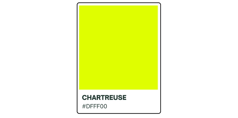
Chartreuse is a color nestled halfway between green and yellow on the color wheel. So, you could describe it as yellowish-green or greenish-yellow. The color has the hex code #DFFF00.
Chartreuse is actually one of the most abundant pigments in the natural world despite being considerably difficult to describe. Just take a walk across lush or wooded gardens and you’ll interact with numerous plant species whose leaves look exactly like a 50-50 blend of green and yellow.
There’s also a decent chance that you’ve actually interacted with chartreuse in your kitchen in the last couple of days. That’s because the color is fairly represented in common fruits like green apples, limes, avocados, pears, and even pistachio nuts.
Shades of Chartreuse
1. Green Chartreuse/Chartreuse Green
Green chartreuse is the most common shade of chartreuse. This color theoretically contains equal amounts of green and yellow. But in terms of visual appearance, it stands out for its higher depth of green than yellow.
2. Yellow Chartreuse/Chartreuse Yellow

Yellow chartreuse is the direct opposite of green chartreuse. The two colors constitute the most abundant shades of chartreuse. As you might expect, yellow chartreuse is characterized by its higher concentration of yellowish tints.
3. Bright Green

This shade of chartreuse is found almost one-third of the way between green and harlequin on the traditional color wheel. The color received widespread recognition following its association with the Viridian Design Movement, a design concept inspired by bright green environmentalism.
Another interesting fact about bright green is that the color isn’t considered a natural pigment. Rather, its appearance depends mainly on an object’s light-handling properties.
4. Lime Green

Lime green is widely regarded as a distinct shade of green. However, the color is technically within the chartreuse family. Lime green is the color of the skin of lime fruits and many cultivars of the Samara fruits.
5. Reseda Green

Reseda green, also known as reseda chartreuse, resembles the appearance of the leaves of Reseda odorata plant, commonly known as mignonette. Note that this specific shade of chartreuse can also appear in tints ranging from darker to lighter to almost translucent ones.
6. Rifle Green

This shade of chartreuse derives its name from the distinct color worn by the riflemen in different regiments. The color was first described in the mid-1800s.
Where Did The Color Chartreuse Get Its Name?
Alongside other popular colors like Champagne and Burgundy, it has its meaning steeped in a French-originated alcoholic beverage. The chartreuse color derives its name from its near-striking resemblance to the greenish-yellow color of a French liqueur known as chartreuse.
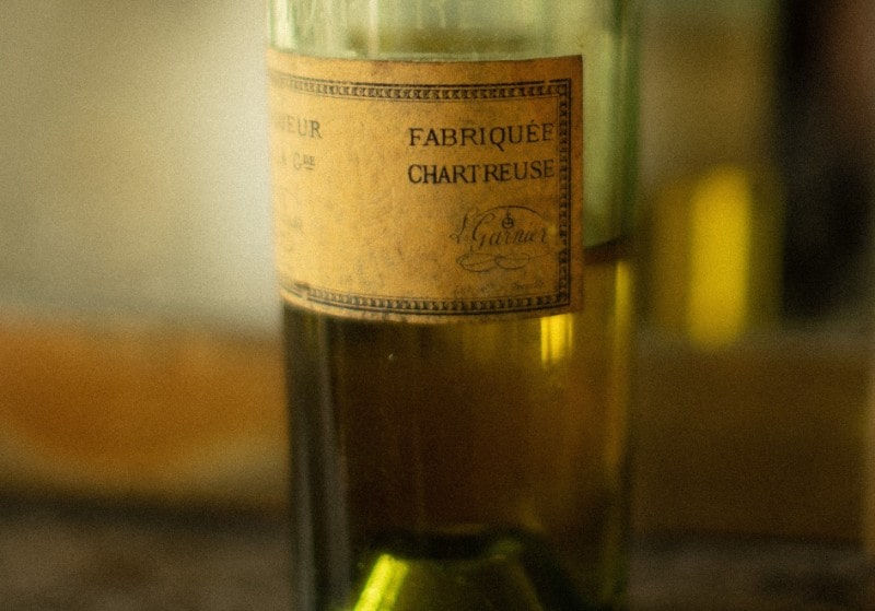
Chartreuse is a French herbal liqueur that has been produced by the Carthusian monks since 1737. The beverage is prepared following strict adherence to the instructions set out in a manuscript passed down to the monks by François Annibal d’Estrées in 1605.
The chartreuse liqueur comes in two varieties, namely green and yellow. The two variations differ in their alcohol content and taste. However, each can contain as many as 130 herbs, flowers, and plants.
The name “chartreuse” is French for ‘charterhouse,’ which simply translates to a Carthusian monastery. The word was first adopted as the name for the greenish-yellow herbal liqueur before it came to be associated with the chartreuse color. The beverage was named after the Grande Chartreuse monastery found in the Chartreuse Mountains located in southeastern France.
What Is The History of Chartreuse?
The chartreuse liqueur traces its history back to 1605 when French diplomat and soldier François Hannibal d’Estrées allegedly discovered a secret recipe for an elixir of life. D’Estrées brought his discovery back to Paris monks, who sent it to the La Grande Chartreuse abbey. The recipe was first used to produce the chartreuse liqueur in 1737.
About sixty years later, subtle modifications to the recipe led to the creation of green chartreuse. Seventy-five years after the creation of green chartreuse, Frère Bruno Jacquet tweaked the recipe yet again to produce yellow chartreuse.
The first documented use of the word “chartreuse” as a color name in English was in 1884. This was after the word appeared in a British fashion newspaper.
Chartreuse’s popularity began to rise steadily since then. The color’s association with an alleged elixir of life made it a favorite of many artists and designers. By the late 1800s, chartreuse was a common pigment in silk and velvet fabrics. The color would soon make its way to paints, wallpapers, and kids’ toys.
Its Meaning and Recommended Application
This color blends green’s soothing properties with yellow’s energizing effects. Therefore, this color can be an excellent choice if looking to synergize the emotional attributes of both green and yellow.
Chartreuse is widely associated with the blossoming of spring. That speaks to the color’s ability to imbue energy and enthusiasm into its surroundings.
While green is famous for its soothing properties, chartreuse’s brighter hues resonate more with bubbliness. In the 1980s when this color became noticeable in fashion runways, it was mostly associated with bold and courageous women.

However, note that darker shades of chartreuse can cheer you up while still injecting a degree of serenity into your designs. Chartreuse also symbolizes creativity. Using this color as the main theme during your next brainstorming session is a clever way to unlock your creative imagination.
It resonates with optimism too. The color generally appeals to positive people. But in the same breath, chartreuse may attract people that are struggling to find balance in their life, just as the color usually teeters between green and yellow.
The chartreuse color is also a mark of timeless beauty. Although not as elegant as some yellowish colors, such as gold, chartreuse can still make your designs look exceptionally sophisticated.
How to Prepare Chartreuse
The chartreuse color was originally made using arsenic at a time when the health hazards of this chemical element had not come to the fore. But after multiple studies found arsenic to be deadly, it was time for paint manufacturers to experiment with other recipes. Today, the easiest way to prepare chartreuse is by using green and yellow.
The fact that it’s an even mixture of green and yellow means that you need equal amounts of the two colors to create true chartreuse. Varying the quantity of green or yellow will consequently result in different undertones. And depending on the percentage of either pigment used, you might actually end up with an entirely different shade.
So it’s important to determine the specific shade of chartreuse that you wish to make. Then, in addition to the paint ingredients and a mixing bowl, have a color chart as your point of reference. The below procedure might help you prepare a basic chartreuse color;
i. Purchase green and yellow paints from your local art store.
ii. Put together other essential art supplies, such as a color mixing bowl and paintbrush.
iii. Use green as your base color and add it first to the color mixing bowl.
iv. Add equal amounts of yellow to the green paint to create a basic green-yellow color.
While the idea is to mix equal amounts of green and yellow, experts recommend adding yellow in small amounts while continuously stirring.
v. Tweak the green-yellow color formed into your desired shade of chartreuse.
You can use different colors to create various chartreuse undertones. However, white is the most preferable. You could also experiment with varying amounts of green or yellow depending on the final tint you want.
Notable Uses of Chartreuse throughout History
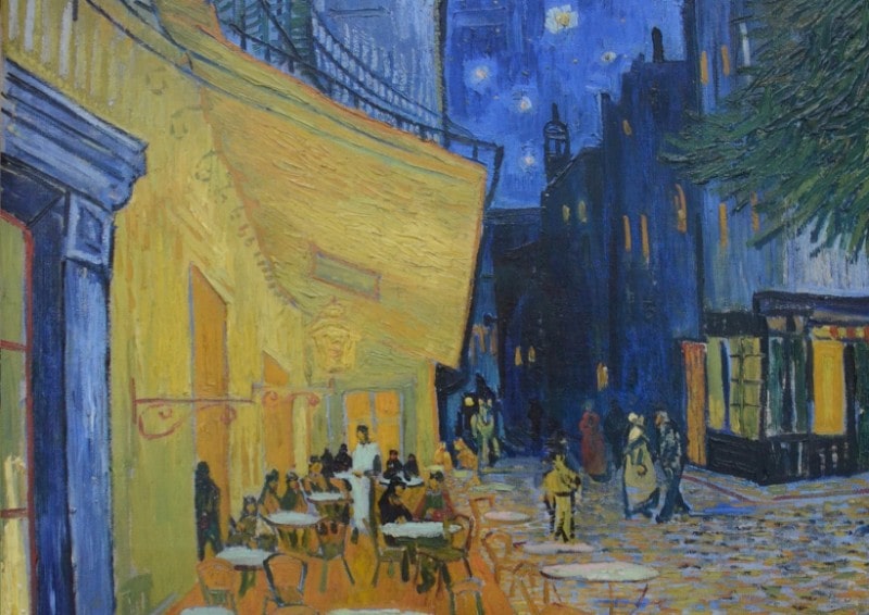
Different shades of chartreuse have appeared on numerous famous paintings throughout history. Vincent van Gogh is one of the noteworthy artists who used chartreuse extensively throughout their paintings.
Van Gogh’s 1888 oil-on-canvas painting titled ‘Café Terrace at Night,’ uses varying shades of blue, violet, and chartreuse. The painting is found in Kröller-Müller Museum in Otterlo, Netherlands.
‘The Starry Night’ completed in 1890 is another major painting by Van Gogh that features the chartreuse color. This particular painting is housed at the Museum of Modern Art in New York, United States.
This pigment also appears to have captured the imagination of yet another famous painter – Thomas Wilmer Dewing. Dewing’s 1890 painting titled ‘Summer’ uses various shades of chartreuse to depict two female figures chilling out in a grassy landscape. The painting is available for public viewing at the Smithsonian American Art Museum, Washington D.C., United States.
How Is Chartreuse Used Today?

Chartreuse has long been used as the main color of fire engines in various countries, including in many parts of the United States. The adoption of chartreuse as the primary color of fire engines was due to research findings by ophthalmologist Stephen Solomon.
According to Solomon, chartreuse’s vibrancy can enhance night-time visibility far more than the colors traditionally used on emergency vehicles, such as fire engine red.
Solomon supported his findings with the Purkinje effect, which refers to the tendency for the peak luminance sensitivity of the human eye to incline toward the blue end of the color spectrum in dim conditions. This phenomenon makes reds appear darker than other colors with a decrease in light intensity.

This hue is also among the most common colors in safety vests. Again, this has everything to do with its ability to boost visibility, in this case for employees working around traffic.
The chartreuse color has also found its way to botany as well as the cinematic industry.
Xanthophytes are a class of yellow-green freshwater algae in the Heterokontophyta division. And in the 1960 Universal film ‘Chartroose Caboose,’ a bright chartreuse green train features prominently.
Summary
The color’s somewhat conflicting personalities explains why it has continued to intrigue artists and designers for decades. And since it’s an even mix of two popular pigments, there’s no limit to the number of colors that chartreuse can go with.

