Last Updated on August 21, 2023
Taco Bell is an American fast-food restaurant chain established on March 21, 1962, by Glen Bell. The restaurant chain was founded in Downey, California. However, the company has had its headquarters in 1 Glen Bell Way, Irvine, California, since 2009.
They are famous for serving a wide variety of Mexican-inspired food, such as tacos, nachos, burritos, and quesadillas. The restaurant chain also features various novelty and specialty items, as well as value menu items.
Taco Bell is a subsidiary of Yum! Brands, Inc. (formerly Tricon Global Restaurants). Yum! Brands, Inc. operates as Yum China within China. The restaurant chain has enjoyed tremendous commercial success since its establishment 60 years ago.
As of December 2018, Taco Bell was serving upwards of two billion customers annually. It also boasted over 7,000 restaurants spread across major cities worldwide.
But like any successful enterprise, Taco Bell wouldn’t be where it is today if it weren’t for its aggressive marketing campaigns. The brand is widely recognizable worldwide, thanks to its bell-themed logo.
But what’s the meaning behind Taco Bell’s logo and how has the symbol changed through time? Read on to find out.
Taco Bell Logo Appearance
Logo Shape
![]()
Taco Bell’s iconic bell symbol has been part of the company’s brand identity for several years.
The bell on Taco Bell’s logo appears slanted to the right, as though it’s in a ringing mode. The bell is set on a purple square that features a rounded top. In some versions, the bell also features outlines of different colors.
Besides the bell image, Taco Bell also uses its brand name on its logo. The restaurant chain’s wordmark commonly appears underneath the bell design. It’s usually UPPERCASED and executed in two levels.
Logo Colors
Taco Bell’s logo utilizes three colors, namely – white, purple, and black.
![]()
White is mainly used for the height of the bell, as well as for the bell’s clapper. White is also the background color where the entire Taco Bell logo – both the bell design and the wordmark – appears in.
Purple is used for the square design where the bell is set. The square shape features varying shades of purple. You’ll realize that the color appears bolder on the lower and left-hand side of the square but gets duller as you approach its upper-right section.
Lastly, black is used for the wordmark.
Logo Font
Earlier versions of Taco Bell’s logotype appeared in what looked like the same quirky, futuristic font that Dell used on its older logos. However, the bell’s wordmark has changed its font several times.
At first glance, the Taco Bell brand name appears in what looks like Helvetica. But it’s actually the Akzidenz-Grotesk font.
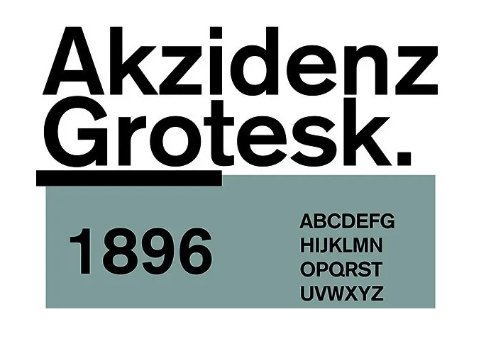
Akzidenz-Grotesk is a sans-serif family of fonts originally released in 1898 by the Berlin-based font foundry Berthold Type Foundry.
Akzidenz-Grotesk fonts stand out for their monoline structures. All letterforms in Akzidenz-Grotesk typefaces generally feature strokes of similar width. That makes letterings executed in this font look minimalistic yet highly legible.
Taco Bell Logo Symbolism
Symbolism of the Bell Design
There are two primary reasons why Taco Bell uses a bell design on its logos.
First, the image of a bell resonates with the company’s name. This same branding technique is evidenced in other successful companies. For instance, Target uses what looks like the traditional archery target for its logo.
Besides representing the company behind it, the bell image also pays tribute to Glen Bell, Taco Bell’s founder. Again, this branding technique isn’t unique to Taco Bell. Numerous established companies use the names of their respective founders on their logos. Examples include Lamborghini, Porsche, Armani, to mention but a few.
Perhaps the only difference is that most of these companies mainly use their founders’ names for their wordmark and not necessarily as the inspiration behind their logos’ graphic image. But the concept is the same nonetheless.
Symbolism of the Square Shape
A square is a symbol of power and protection. The shape also connotes conformity and perfection. That’s because all sides and angles in a true square are equal.
However, the square appearing on Taco Bell’s logo features a rounded top. This quirky design element adds friendly and playful effects to the logo.
Symbolism of the Wordmark
![]()
The bell design on Taco Bell’s emblem represents the company behind the image while also paying tribute to its founder.
But since there could be other companies that would want to use the same image on their logos, it was necessary for Taco Bell to add an extra design element that clearly distinguishes it from others. That’s why the restaurant chain’s full wordmark appears alongside its logo.
The wordmark’s execution in UPPERCASE conveys a sense of professionalism.
Symbolism of the Colors
All colors used on Taco Bell’s logo have their respective symbolism. White resonates with purity, simplicity, and balance, while purple stands for ambition, nobility, and creativity. Black conveys power, strength, and elegance.
It’s highly likely that Taco Bell considered these qualities while choosing the colors. The hues used for Taco Bell’s logo blend to give the emblem a unique, elegant, and friendly design.
Taco Bell Logo History
Taco Bell’s logo debuted in 1962, the same year the fast-food restaurant chain was launched.
![]()
The original emblem was wordmark-based. The logotype was UPPERCASED, executed in blocky serifs, and set horizontally in a square frame.
Also, the logo featured brighter shades of red, orange, green, and yellow. Taco Bell utilized an array of bright colors to capture the attention of its diners. This logo stayed with the company until 1972.
1972 – 1985
![]()
Taco Bell logo’s design changed dramatically in 1972. The company abandoned the previous emblem that featured a logotype and square frame for a standalone wordmark. There were also significant color changes. The bright colors disappeared, giving way to a monochrome design.
1985 – 1994
![]()
1985 saw the introduction of Taco Bell’s iconic bell on its logo. The logo also became colored again. A stylized, blocky wordmark appeared underneath the bell image in two levels. The wordmark utilized a dark color scheme and slightly curved serifs.
1994 – 2016
![]()
The main changes to Taco Bell’s logo in 1994 affected the emblem’s contours and color palette. The pink color became brighter and a golden highlight was visible from the middle of the bell. A square with a rounded top also emerged behind the bell, helping it stand out.
2016 – Present
![]()
The current Taco Bell logo was designed in 2016. Pink and yellow colors disappeared from the logo. The new colors were purple and white for the graphic image and black for the wordmark.
Taco Bell uses one of the most recognizable logos of all fast-food restaurant franchises. The bell not only resonates with the company’s name. It also immortalizes its founder. How many times a week do you stop by at Taco Bell?