Last Updated on July 5, 2023
Levi Strauss & Co. is an American clothing company headquartered in San Francisco, California, best known for its Levi’s brand of denim jeans. The company was founded on May 1, 1853, by Levi Strauss and Jacob Davis.
Strauss and Davis were small-time entrepreneurs who decided to capitalize on the California gold rush of 1848 by supplying overalls to other workers who were drawn to this industrial belt. The overalls business later developed into a full-fledged company dealing in all manner of denim fabrics, with a special focus on the Levi’s brand.
Levi Strauss & Co. has since ruled the denim jeans market for decades. The company’s jeans are famous for their sturdiness, making them suitable for wearing in demanding working conditions. Levi’s jeans are recognizable by a red label commonly printed on their back pocket.
One of the most interesting things about the Levi’s logo is its two-horse design. It portrays how difficult it would be to rip a pair of its jeans. In this post, we dive deep into the Levi’s logo by unpacking the emblem’s appearance, symbolism, and history.
Levi’s Logo Appearance
Logo Shape
![]()
Levi’s uses a fairly simple logo, which features the company’s wordmark set on a red background. The lettering is executed in UPPERCASE, except for the letter ‘e.’ Also, the logotype adopts a solid white color. The red background on which the wordmark is set looks a lot like a bat’s wing.
Logo Colors

Levi’s logo appears in a red and white color scheme. Red is used for the background color and white for the wordmark.
Logo Font

Levi’s uses a custom font for its wordmark. The logotype was likely developed by in-house designers who selected a unique font exclusively for the lettering.
However, the font used for Levi’s wordmark looks a lot like URW Linear Wide Ultra Bold. URW Linear Wide Ultra Bold is an ultra-bold version of URW Linear Wide, a typeface by a font designer called Albert Jan Pool. The font is marked as commercial.
Levi’s Logo Symbolism

Symbolism of the Bat Wing
Levi’s logo resembles the spread of a batwing. Many logo pundits have claimed that the design was inspired by the batman symbol. But according to Levi’s, the batwing mimics the arch stitching commonly appearing in the back pocket of its denim jeans.
The Wordmark
Levi’s wordmark serves the principal purpose of any logotype – representing the company’s brand image. The wordmark features unique letterforms. For instance, all letters are CAPITALIZED except for the letter ‘e.” These quirky design elements add to the logo’s beauty.
Symbolism of the Colors
Although Levi’s white logotype is the defining element of the company’s emblem, the red color used for the batwing background is the most outstanding. Red stands for love, passion, strength, and ambition, whereas white connotes purity, virtue, innocence, and balance.
Levi’s Logo History
Levi’s was founded in 1953 and the company’s first logo appeared the same year. The logo comprised a narrow rectangle with the company’s full name – LEVI STRAUSS & CO.
Although many publications report this version of Levi’s logo as monochrome, the emblem actually featured the brand name in white against a dark grey background. Also, the numbers 16 and 14 could be seen at the opposite ends of the rectangle. Levi’s stayed with this logo until 1892.
1892 – 1925/Present
![]()
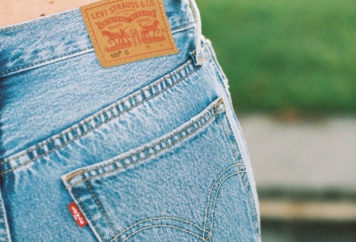
Levi’s most iconic logo of all time emerged in 1892. It’s also arguably the most controversial badge the company has ever used.
Famously labeled the ‘Two-Horse Emblem,’ this logo portrayed two horses (each being whipped by its owner), pulling a pair of jeans in opposite directions. Several wordings appeared above the horses.
On the uppermost part of the logo was the company’s name – LEVI STRAUSS & CO. Beneath the company name was the phrase SAN FRANCISCO, CAL, followed by the wordings ‘ORIGINAL RIVETED’ and ‘QUALITY CLOTHING’ in two levels.
The entire logo was monochrome. Black was used for the drawings and wordings, and white for the background. The Two-Horse Emblem has since been replaced. But it remains one of Levi’s most recognizable emblems of all time.
1925 – 1929
![]()
In 1925, Levi’s replaced its ‘Two-Horse Emblem’ with a simple wordmark-based logo. The new logo featured the words “LEVI STRAUSS.” The lettering was in red and outlined by black, then laid on a thin faint-yellow background.
1929 – 1943
![]()
Levi’s changed its logo yet again in 1929. The company maintained its wordmark-based design. But the logotype changed from ‘LEVI STRAUSS’ to ‘LEVI’S.’ The new wordmark was in solid blue and outlined in white, then set on a red rectangular frame.
Also, the logo included the company’s tagline, America’s Finest Overall. The slogan was in black and appeared inside the red frame, right beneath the ‘LEVI’S’ portion.
1943 – 1949
![]()
Levi’s continued to use its previous wordmark-based design in 1943. However, the logotype was enlarged. The wordmark also adopted a bold, dark blue color and was now set on a yellow frame. The outlines disappeared, while the slogan ‘America’s Finest Overall’ was in faint, light grey color.
1949 – 1954
![]()
The general outline of Levi’s logo remained the same. But the company experimented with a whole new color palette. The wordmark was now in plain, bold white on an orange background.
The tagline ‘America’s Finest Overall’ disappeared and was replaced by the slogan ‘when there’s work to be done wear.’ The new slogan was placed above the wordmark.
1954 – 1968
![]()
Levy’s introduced a vintage logo in 1954, which featured the company’s wordmark executed in white and set on a dark-red background. The letters became sharper and the letter “E” was diagonally oriented. Beneath the wordmark was the phrase “VINTAGE CLOTHING,” also in white.
1969 – 2003
![]()
The batwing design on Levy’s logo first emerged in 1969. The letter “e” in the wordmark also became lowercased. This iteration of Levy’s logo looked nearly identical to the current version, except for the batwing color and the lettering’s height.
2003 – Present
![]()
The only modifications to Levy’s previous logo were changing the batwing color from bright red to dark red and reducing the height of the wordmark. All other elements remained intact.
A logo is the most important element of a company’s visual identity. It appears Levy’s understands this fact, which explains why the brand has continually redesigned its logo to align with its mission and vision.