Oswald is just one of those fonts that look great no matter how and where you use them. Thanks to its versatility, you can recognize it on websites, menus, posters, logos, and ads. But what makes this font so popular?
Oswald Font Beginnings
Created by Vernon Adams and launched in 2011, Oswald is a condensed sans-serif that’s a rework of the Alternate Gothic typeface. Re-drawn for better pixel fit, this font is standardized for a seamless appearance on digital screens. Adams, who also created classic favorites such as Oxygen and Nunito Sans, updated the font until his accident in 2016.
Unlike its predecessor, Oswald maintains its robustness while being more readable in terms of contrast. Oswald is open-source so it’s free for use in personal and commercial projects to this day. It has billions of views and downloads, proof of how well-admired this font has become.
Oswald Font Characteristics and Pairings

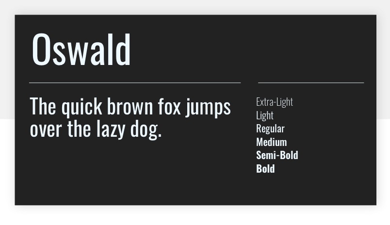
The initial font family come in Light, Normal, and Bold styles. Today however, you can find Oswald in Extra-Light, Medium, Semi-Bold, and Heavy. These look great when applied to titles, headers, logos, or posters. Set as all-caps and pair beautifully with other sans serifs like Roboto, Quicksand, Lato, Montserrat, and Raleway.
Of course, Oswald looks just as amazing when complemented by serifs. Try Sentinel, Century Schoolbook, Merriweather, Garamond, as well as more unconventional scripts such as Templar, Aurora, and Bellany. Experiment with sizes and positioning until you get your desired result.
As an open-source typeface, developers and designers are continuously improving on it to bring more updates to the public. For instance, Kalapi Gajjar and Alexei Vanyashin added more language support and Cyrillic characters in 2016. Other improvements include tightened spacing and kerning, as well as many glyph refinements.
Feel free to download the set from Google Fonts. For other variations, such as Heavy Italic and Stencil, visit Font Squirrel.

