Last Updated on September 28, 2023
Jeep isn’t the fastest or the most affordable car. But when it comes to producing vehicles that can conquer the most unforgiving terrains, Jeep is the indisputable master. The company manufactures some of the world’s most powerful automobile engines that its cars are almost synonymous with off-roading.
Although Jeep continues to face stiff competition from other renowned car manufacturers, the company remains the go-to vehicle for all-terrain cruising. We can almost declare the brand ‘the king of the jungle’ in the automotive world.
But Jeep’s story didn’t begin yesterday. The company is close to eight decades old. Besides its powerful engines, another reason behind the company’s meteoritic rise to fame is its high brand appeal, which is largely attributable to its famous logo.
In this post, we delve deep into Jeep’s logo by highlighting its appearance as well as symbolism and history.
About Jeep
Jeep is an America automobile marque owned by the multinational corporation, Stellantis. The company is famous for its luxury vehicles and sport utility cars. Its sport utility cars include both crossovers as well as fully off-road SUVs.
Jeep was founded in 1943 but launched its first officially branded car in 1945. The automaker has been headquartered in Toledo, Ohio, United States, since the release of its first branded product. However, it avails its utility vehicles worldwide, except in Cuba, Syria, North Korea, Iran, and Sudan.
Although currently owned by Stellantis, Jeep has changed hands quite a few times. The automobile manufacturer has been part of Chrysler since 1987. Chrysler acquired Jeep from American Motors Corporation (AMC).
While Jeep cars aren’t as widespread as those of other automobile manufacturers, such as Toyota, the company remains one of the most valuable brands. As of the time of writing (May 2022), the automaker is estimated to be worth $22 to $33.5 billion.
See what else the company is up to by visiting their website.
Jeep Logo Appearance
Logo Shape
The Jeep logo is very simple – it’s simply a wordmark with the company name on it in bold lettering. While this have been accompanied by shapes in the past (as in their logos during 1963 to 1970, and 1970 to 1987, and again in 1993), they’ve kept to their straightforward design for the most part.
Logo Colors

Jeep uses two main colors – dark green and white. Almost the entire car bonnet is designed in dark green. White is used only for the wordmark and the background where the grill and two rounded figures are set.
Logo Font
The “Jeep” logotype appearing on the company’s badge is set in the Helvetica Bold typeface.

Helvetica Bold is a bold style of Helvetica, a sans-serif typeface created in 1957 by Max Miedinger and Eduard Hoffmann. The font was initially published by the Haas Type Foundry but has since been reissued by other foundries, including the Mergenthaler Linotype Company.
Also known as Neue Haas Grotesk, Helvetica was developed based on famous 19th-century German and Swiss fonts, such as Akzidenz-Grotesk. The typeface is noted for its high x-height, unusually tight kerning, and the termination of strokes on both vertical and horizontal lines. These features combine to give Helvetica a dense and solid texture.
Although originally designed in the regular style, Helvetica has since been expanded into several other styles and weights. That includes the Helvetica Bold that Jeep uses for its wordmark. Other famous Neue Haas Grotesk styles include Helvetica Compressed, Helvetica Inserat, Neue Helvetica, Helvetica Now, and Neue Haas Grotesk.
Helvetica Bold is available on Fonts Geek, CoFonts, among many other font websites.
Jeep Logo Symbolism
Symbolism of the Wordmark
The word “Jeep” is deeply rooted in military history. Before 1940, the term had been used by the United States military as slang for new recruits or vehicles. But when the Willys MB (also known as World War II jeep) went into mass production in 1941, the name ‘Jeep’ became widely associated with the automobile company.
But how did Jeep settle on its name?
Several theories have been advanced to explain how the name “Jeep” came about.
One such theory suggests that the word “Jeep” derives from the military term General Purpose (GP). However, this theory further clarifies that the initials ‘GP’ didn’t exactly stand for “General Purpose.” Instead, the ‘G’ represented a government contract vehicle, whereas the ‘P’ indicated that the vehicle was a ¼ ton light reconnaissance car designed with an 80-inch wheelbase.
Another theory indicates that the word “Jeep” is an acronym for ‘just enough essential parts.’ Proponents of this theory believe that the company may have settled on the name to signify the simplicity and reliability of its automobiles.

Symbolism of the Colors
According to color psychology, green symbolizes fertility, nature, renewal, and action. On the other hand, white stands for purity and innocence.
However, the dark green color on Jeep’s logo was likely inspired by the company’s rich history with the United States army. The white color may have been selected merely for balancing effects. White blends with dark green to create a charming and elegant logo.
Jeep Logo History
Jeep did not have a logo for a period of time after the company’s establishment. Instead, only the “Jeep” wordmark and the “Bantam. Willys. Ford” tagline appeared on its vehicles.

The badge utilized a red and black color palette, and was executed in two levels. The upper level was the word ‘Jeep,’ set in red CAPITALS and written with the letter ‘J’ was enlarged. Underneath the word “JEEP” was the tagline ‘Bantam. Willys. Ford,’ set in black.
The decision to operate without a logo was likely inspired by the fact that Jeep vehicles were so popular during World War II that the company’s utility cars needed no introduction.
After operating without a real logo for a few years, Jeep eventually introduced its first logo in 1945.
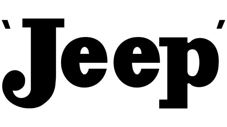
It was still a wordmark-based badge, only that the tagline underneath the word “Jeep” disappeared. Also, the logotype became lowercase, whereas the color palette changed from red and black to black/monochrome. Jeep used this logo until 1963.
Below is how the company has altered its design over time:
1963 – 1970
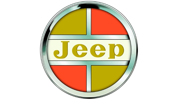
In 1963, Jeep’s logo appeared in a circle, with thick silver framing. The logo was split into four equal segments. The segments were colored in gold and red, with silver lines separating the primary colors.
1970 – 1987
Jeep reverted to the sans-serif typeface logo it had used before. The main difference was that this time around, the letters were a combination of UPPERCASE and lowercase.
Another major change was the incorporation of a geometric shape formed by a red triangle whose upper right corner touched the vertically placed bright-blue rectangle.
1987 – 1993
During this period, Jeep’s wordmark appeared within a solid black square designed with curved corners. Above the logo was a white pentagon displaying an internal star.
1993 – Present
In 1993, Jeep removed all the fancy elements from its previous logo and went for a minimalistic design of a car bonnet. The company also changed its color palette to dark green and white. This version has remained unchanged to date.
Final Word
While most car manufacturers use complex geometric images for their logos, Jeep settled for a minimalistic image depicting a vehicle bonnet. This design technique gives Jeep automobiles a visual edge over cars by other automakers.

