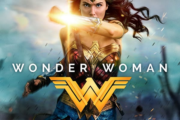
Wonder Woman is a 2017 American superhero film starring Gal Gadot, Chris Pine, Robin Wright, and Danny Huston, among other Hollywood A-listers. The film is based on the iconic DC Comics character of the same name. It was directed by Patty Jenkins and produced via a joint venture between Atlas Entertainment and Cruel and Unusual Films.
Wonder Woman follows Diana, Princess of the Amazons (Gal Gadot). Diana is a trained warrior who was raised on a sheltered island paradise. She meets an American pilot (Chris Pine), through which she learns of raging conflicts on the outside world.
The princess must now step out of her protective shelters to fight alongside men in a war poised to end all wars.
Wonder Woman Font

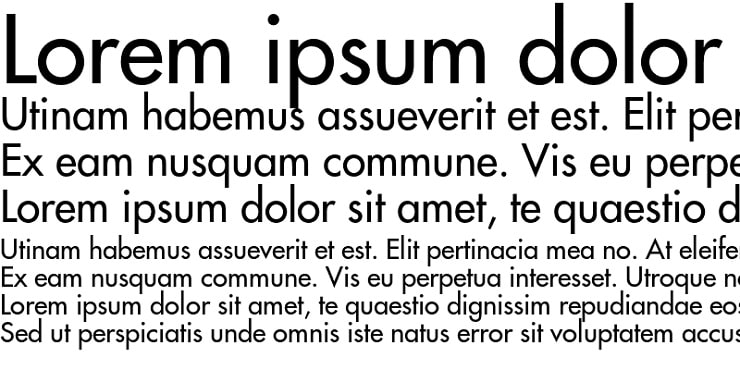
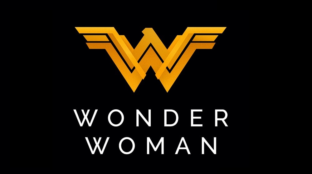
The font used on the official posters of the Wonder Woman film is Futura Std Medium, a standard medium version of the popular Futura typeface.
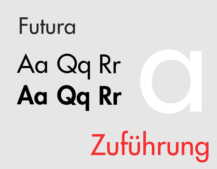
Futura is a geometric sans-serif typeface created by Paul Renner and initially released to the general public in 1927. The font was designed as part of Renner’s contribution to the New Frankfurt project.
Futura was modeled based on geometric shapes. The typeface was likely inspired by the Bauhaus design styles that were popular around the 1920s. As a geometric-inspired font, one notable feature with Futura is the letter “o,” which looks much like a zero (0).
Although designed by Paul Renner, Futura was officially developed as a typeface by the Bauer Type Foundry. Bauer’s main inspiration was to develop a font that would compete with the Erbar typeface released a year earlier by Ludwig & Mayer.
Bauer, alongside its American distribution agency, played an important role in marketing the Futura typeface. Futura gained widespread recognition as a modern font with futuristic elements.
Futura Features

Futura features notable geometric elements like near-perfect circles, squares, and triangles. Paul Renner created this font based on low-contrast strokes of near-even weight. The font’s lowercase letters are characterized by tall ascenders, which tower above the cap line.
Another notable feature of Futura’s lowercase letters is the implementation of near-circular, single-story forms, especially for the letters “a” and “g.”
Futura’s UPPERCASE letters are just as stunning as the typeface’s lowercase characters. The uppercase letters are designed in proportions that resemble those used in classical Roman capitals.
And while Renner took charge of designing Futura Regular, the font’s original version has spawned several variations over the years. Examples include Futura Extra Bold and Futura Extra Bold Italic, both designed by Edwin W. Shaar. There’s also Futura Bold Italic attributed to Tommy Thompson.
Other popular Futura versions include Futura Black, Futura Condensed, Futura Demibold, Futura Display, and Futura Inline. Not to mention Futura Std Medium used on the Wonder Woman logo.
Where to Download Futura Std Medium Font

Futura Std Medium is available for download on the DaFont Free website. You can also get the font from Fonts Geek, AZ Fonts, and Mais Fontes.
Futura Std Medium, as with all other Futura versions, is generally free for personal use. However, you may need a commercial license before you can use the font for business purposes.

