Last Updated on October 9, 2023
Taco Bell is an American chain of fast food restaurants established in 1962 by Glen Bell. The company was founded in Downey, California. However, it moved its headquarters to Irvine, California, in 2009.
Taco Bell is owned by Yum! Brands, Inc. The restaurant chain is famous for serving Mexican-inspired dishes, including tacos, burritos, nachos, and quesadillas.
Taco Bell Font
Taco Bell has not only earned a reputation for its yummy Mexican-inspired dishes. The restaurant chain is also famous for undertaking routine upgrades of its logo as part of the company’s efforts to maintain its market dominance. One notable aspect of the Taco Bell’s logo that has changed significantly is the font.
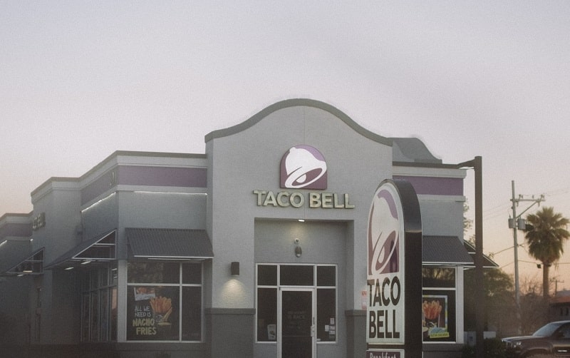 For several years, the Taco Bell emblem used a typeface that looked quite similar to the one used on the old Dell logo. However, the company made sweeping changes to its visual appeal, resulting in the emergence of a whole new typeface.
The font currently appearing on Taco Bell’s brand image is rather unique and may have been created exclusively for use by the restaurant chain. However, various elements of the typeface appear to have been inspired by the Akzidenz-Grotesk Bold font.
Akzidenz-Grotesk Bold is a bold variant of Akzidenz-Grotesk, a grotesque sans-serif typeface family originally released in 1898 by Berlin-based Berthold Type Foundry.

Akzidenz-Grotesk Features
Akzidenz-Grotesk shares numerous features with most sans-serif typefaces. The font sports a monoline structure whereby all strokes of individual letters have the same width. The monoline design helps bring out a sense of simplicity.
However, letters printed in Akzidenz-Grotesk may differ depending on their size and case. For instance, the letter “g” is single-story, a sharp contrast from the double-story design of the same letter in many earlier sans-serifs.
Akzidenz-Grotesk Applications
The designers of Akzidenz-Grotesk intended for the typeface to be used for commercial print purposes. That pretty much explains the “Akzidenz” reference, which translates to ‘a trade’ with respect to commercial transactions.
Since it was created primarily for commercial purposes, Akzidenz-Grotesk will suit projects like billboard advertisements, business card printing, and company logo designs. The font would also be suitable for product labeling, apparel branding, and store signage.
Akzidenz-Grotesk is also one of the many 19th-century fonts that can be applied to both display and fine print projects. As a display font, Akzidenz-Grotesk can help bring out the visuals in graphic designs (as is the case with Taco Bell and other famous logos), headers, subheaders, and keywords. And as a fine print font, the typeface will equally look stunning in body text.
Where to Download Akzidenz-Grotesk Bold Font
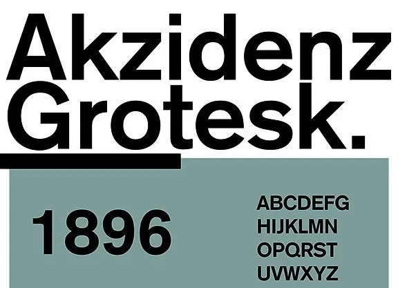
Akzidenz-Grotesk Bold and other Akzidenz-Grotesk styles can be downloaded from several websites. You can find the font on Fonts Market, Fonts Free, Mais Fontes, etc.
Akzidenz-Grotesk Bold is free for personal and commercial usage, which isn’t surprising considering that the typeface was developed primarily for commercial prints. However, it’s always prudent to read the download links carefully to establish any cost implications. Note that some websites may charge a small download fee.

