Last Updated on November 20, 2023
Blue is technically the most abundant pigment in the natural world. That’s if you consider that up to 71% of the earth is covered in water and water bodies generally take on bluish hues. Although, in the interest of full disclosure, the blue color observed in oceans isn’t due to natural pigmentation but a phenomenon known as Rayleigh scattering.
The fact that blue has been present in the natural world for millions of years explains our fascination with this color. Shades of blue were among the earliest pigments created by humans. In this post, we discuss one such color – Prussian blue.
What Color Is Prussian Blue?
The most common application of the word “Prussian blue” is with reference to a dark blue pigment produced via the oxidation of ferrous ferrocyanide salts.
The pigment has the chemical formula FeIII 4[FeII (CN) 6]3 and is alternatively known as ferric ferrocyanide, ferric hexacyanoferrate, iron(III) ferrocyanide, and iron(III) hexacyanoferrate(II).
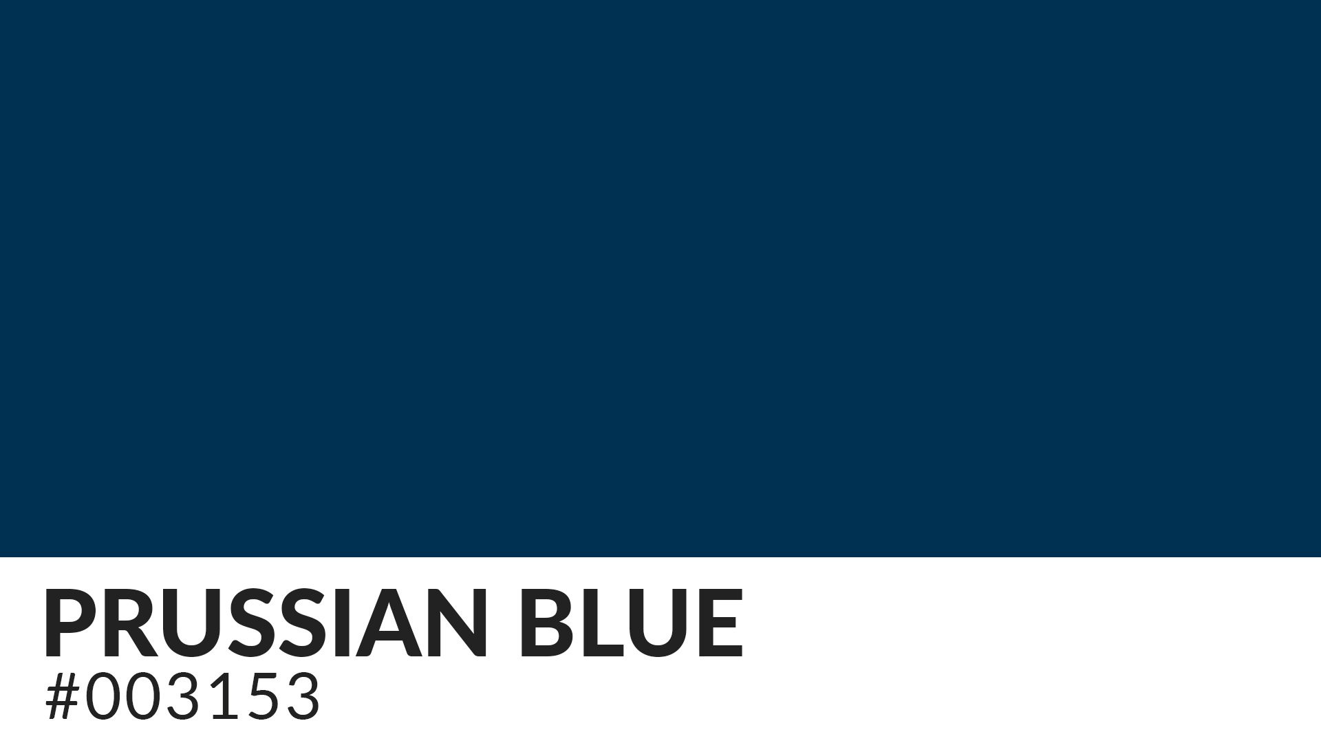
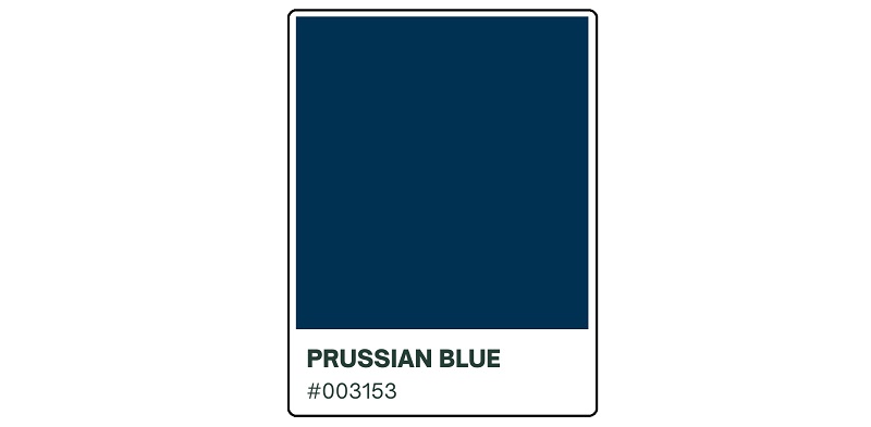
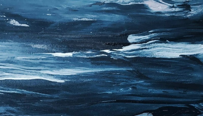
Although more commonly associated with the natural pigment of ferric salts, Prussian blue also denotes a dark blue color with the hex code #003153. The color goes by many other names, including Paris blue, Parisian blue, Berlin blue, Brandenburg blue, sarum blue, and midnight blue.
Which Colors Look Like Prussian Blue?
Blue is one of the most diverse colors, with tons of shades and tones. Therefore, it’s not uncommon to find many blue undertones being erroneously passed for Prussian blue.
It’s important to understand the core differences between these shades to ensure you’re working with true Prussian blue and not merely a lookalike. Below are some colors that look strikingly similar to Prussian blue but are entirely different;
1. Winsor Blue

Winsor blue may look identical to Prussian blue at first glance. Both colors are intensely rich in pigment, fairly transparent, and offer excellent tinting abilities.
However, a closer examination reveals noticeable differences. Winsor blue is deeper and leans more towards black. It may also have red or green undertones.
2. Turnbull’s Blue

Turnbull’s blue shares the same chemical formula with Prussian blue. So, as an artist who also possesses reasonable chemistry knowledge, you might intuitively think that the two colors are identical.
However, Turnbull’s blue results from the reaction of ferrous salts with ferricyanide while Prussian blue is the product of treating ferric ions with ferrocyanide. This slight variance in the production process translates to considerable differences in appearance between the two colors.
3. Ultramarine Blue

Both ultramarine and Prussian have nearly the same amount of depth and saturation. These shades of blue would look identical if it weren’t for their different undertones.
Prussian blue gravitates more toward green while ultramarine inclines toward purple on the color wheel.
4. Cobalt Blue

Cobalt blue is lighter and less intense than Prussian blue. However, natural cobalt blue pigments have proven more stable than Prussian pigments. That explains their historical application as a coloring agent in paints, ceramics, and jewelry.
You can look at Prussian Blue as the intermediate shade between cobalt blue and ultramarine.
5. Phthalo Blue

Phthalo blue, also known as phthalocyanine blue, is a brilliant shade of blue also commonly used as a coloring in paints and dyes. The natural pigment comes from copper phthalocyanine (CuPc) ores. Phthalo blue is considerably lighter than Prussian blue.
6. Cerulean Blue

Cerulean blue is another bright shade of blue commonly confused with Prussian blue. This color ranges in appearance from azure to a darker sky blue. It stands out for its brilliance due to higher refractive properties. That said, cerulean blue is paler than Prussian blue.
7. Navy Blue

Navy blue features less intensity than Prussian blue. You can describe it as a slightly darker blue-magenta shade.
Is Prussian Blue the Same As Persian Blue?

Prussian blue and Persian blue are distinct colors despite their near-similar pronunciations. Persian blue is a term for a group of colors that range from a bright medium blue to a medium grayish blue to a dark blue.
Origin of the Name Prussian Blue
The word “Prussian” derives from ‘Prussia.’ Prussia was a German kingdom and state on the southeast coast of the Baltic Sea from around the 1200s to the 1900s.
The kingdom’s prominence peaked in the 18th century after it became one of the five great European empires, alongside France, Russia, Austria, and the United Kingdom. It’s during this period that the Prussian color also achieved widespread recognition as it was the predominant uniform coat color worn by the artillery and infantry regiments of the Prussian Army.
The name “Prussia” itself has no specific etymological origin. The word first appeared around the Middle Ages and is attributed to the pagan tribes that inhabited the lands adjoining the Baltic Sea between Lithuania and Pomerania.
These tribes would later be conquered in the 1200s by the Roman Catholic Order of the Teutonic Knights, who subsequently organized the region into a fiefdom of Poland.
History of the Prussian Blue Color
Natural Prussian pigments have been around for thousands of years. However, the popularity of synthetic Prussian blue peaked in the 18th century.
It was first created in 1704. That makes it the first synthetic blue pigment produced by humans since the invention of Egyptian Blue by ancient Egyptians. Interestingly, the pigment’s creation was by accident rather than design.
There are numerous accounts on exactly what led to the creation of the first synthetic Prussian pigments. One such account is from German physician George Ernst Stahl (1659 – 1734).
According to Stahl, a pigment manufacturer in Berlin called Diesbach was in the process of producing a batch of Red Lake pigment using crushed cochineal insects, iron sulfate, and potash. However, Diesbach ran out of potash and dashed to local pharmacist Johann Konrad Dippel to purchase the salts.
Dippel sold Diesbach potash that was laced with dried cattle blood in what was interpreted as an attempt by the pharmacist to fleece the pigment manufacturer. When Diesbach tried to use his newly-purchased potash salts, he ended up with a deep blue instead of a red pigment.
Seeing an opportunity to mint more cash, Dippel conducted further experiments on his adulterated potash and went on to commercialize the new pigment under the name Berlin Blue.
The crafty pharmacist kept the composition of Berlin Blue a top-guarded secret, raking in a fortune out of it. It was not until an English chemist reverse-engineered the pigment’s making process in 1724 that Dippel’s little kitty came out of the bag.
From then, Prussian blue became more accessible. The color experienced a tremendous surge in demand following its widespread appearance on famous paintings.
Notable Uses of Prussian Blue throughout History
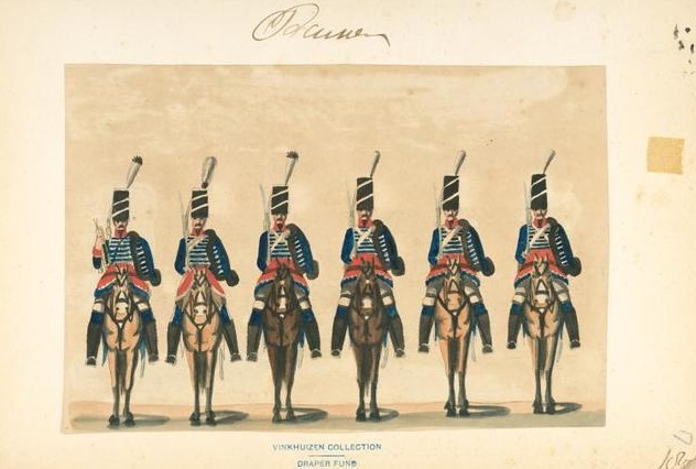
The most prominent use of Prussian blue was on the uniform coat worn by the regiments of the Prussian Army. Other noteworthy applications of the color include;
• On Giovanni Antonio Canal’s 1725 painting ‘The Stonemason’s Yard’ (as the color of the sky)
• On the ‘Kajikazawa in Kai Province (1830)’ illustration from the landscape prints series ‘Thirty-six Views of Mount Fuji’
• On Edvard Munch’s 1893 painting ‘The Scream’ (as the background color)
• On Pablo Picasso’s 1904 painting ‘La Célestine (La femme à la taie) (La Celestina)’
• In blueprints
• In the pharmaceutical industry
Meaning of Prussian Blue
As it’s a shade of blue, Prussian conveys most of the qualities and emotions associated with the blue color.
The pigment stands for strength and stability. The color’s stability is the main reason behind its incorporation into the Japanese Aizuri-e. Before the emergence of Prussian blue, the Aizuri-e prints predominantly appeared in indigo ink.
It is also calm and peace-loving. The color doesn’t thrive in chaotic environments and is best suited for residential interiors. However, note that due to its brilliance, this shade of blue may be overpowering if used alone or in excess.
The Prussian blue color may also resonate with health and vitality. The color (and by extension the dark blue chemical pigment produced via the oxidation of ferrous ferrocyanide salts), has a special place in the pharmaceutical industry.
For instance, oral Prussian blue is considered an antidote for some types of heavy metal poisoning and radioactive exposure. The World Health Organization (WHO) also has Prussian blue in its ‘List of Essential Medicines.’ Besides, the pigment inspired the naming of prussic acid or hydrogen cyanide, which is obtained from it.
Blue is the color of trust and honesty. Its shades, including Prussian, would fit well within themes that revolve around loyalty. Some people also consider the color blue in general to be dull and boring. However, Prussian is more likely to inject energy into its surroundings due to its intensity.
How to Make and Mix Prussian Blue
Prussian is an undertone of blue, a primary color. Primary colors are considered independent in the sense that you cannot mix other colors to obtain them.
However, mixing some phthalo blue with a little burnt umber might yield Prussian. A good place to start is with the ratio of five-parts phthalo blue and two-parts burnt umber.
Add both colors to a mixing bowl and stir for a few minutes until the mixture is uniformly combined. You can add tiny shades of either pigment depending on your desired effects. Since Prussian looks quite similar to several shades of blue, you’ll need a color chart to compare the results at every stage.
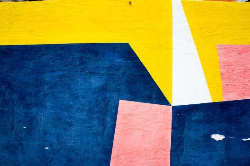
Prussian blue blends well with many colors. It all depends on the specific visual or emotional effects that you intend to convey. Pair it with neutrals like beige to evoke a sense of calm and serenity, or with yellow to stimulate energy and happiness.
This, and shades of green can look incredibly refreshing. These combinations would be perfect for nature-themed paintings or wall art. You might also use Prussian blue alongside black to imbue a touch of elegance into your projects. Or Prussian with orange for charming contrasts.

Final Word
The Prussian blue pigment has continually appeared in the palettes of renowned artists over the years. Its remarkable intensity and tinting abilities are the reason it’s a top choice of artists and graphic designers worldwide until today.