Deere & Company, more popularly known as John Deere, is an American corporation founded in 1837 by John Deere, which manufactures different kinds of equipment and machinery.
John Deere deals in the manufacture of agricultural machinery, lawn care equipment, forestry machinery, heavy-duty equipment, diesel engines, and drivetrains used in heavy equipment. The company also offers financial and consultancy services.
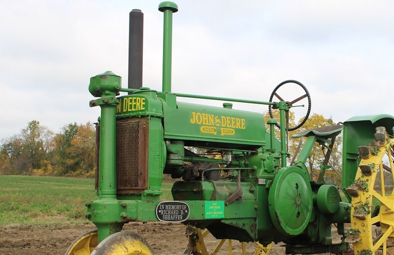
John Deere Font
The John Deere logo has undergone several upgrades and modifications since the company’s inception.
The current logo features a simple, classic silhouette of a yellow leaping deer on a green, curvilinear rectangular background. A yellow line is inscribed inside the green background, further enclosing the yellow deer. Underneath the emblem is the company’s name written in ALL-CAPS.
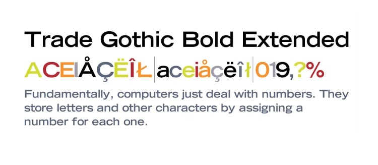
The font used for the lettering on the John Deere logo is unique and was likely created by in-house designers. However, it’s very similar to Trade Gothic Bold Extended, a Bold Extended variant of the popular Trade Gothic typeface.
Trade Gothic is a sans-serif typeface designed in 1948 and published by Lionotype Font Foundry. The font is characterized by its beautiful irregular characters, a feature that distinguishes most 19th and early-20th century gothic fonts from other sans-serif typefaces that came later, such as Univers and Helvetica.
But that’s not the only defining feature of this popular gothic typeface. The font also stands out for its inconsistencies in appearance of certain digital versions. Unlike most fonts where the bold weights tend to be more condensed than the regular weight, the opposite seems to be the case with Trade Gothic.
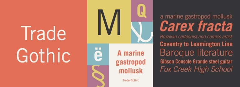
Although Jackson Burke contributed immensely to developing the Trade Gothic font, including the original weight and a couple of styles, Linotype has done much of the work in coming up with the font’s digital versions. One such digital version is Trade Gothic Next, released by Linotype in February 2009.
Trade Gothic Next is a redesign by Tom Grace and Akira Kobayashi. When creating this font, the two designers focused on removing the typographical inconsistencies found in the original Trade Gothic family. They also reworked the font’s terminals and stroke endings, making the new version look simplistic yet still elegant.
Grace and Kobayashi also implemented some modifications with regard to the kerning. This further enhanced Trade Gothic‘s legibility, especially on digital display surfaces. The newly-redesigned font comes in 17 styles, which include 4 weights and 3 widths.
Other popular digital releases based on the original Trade Gothic font include Trade Gothic Next Rounded released in 2009 and Trade Gothic Display released in 2017. The latter was designed by Lynne Yun of Monotype GmbH and includes 5 styles in 1 weight and 1 width.
Where to Download Trade Gothic Bold Extended Font
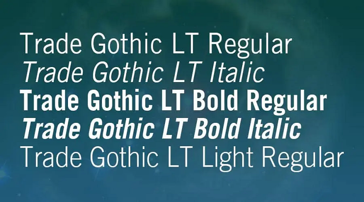
There are several places to download the Trade Gothic Bold Extended font. Examples include Fonts.com and Linotype.
Like other fonts in the Trade Gothic family, Trade Gothic Bold Extended is only free for non-commercial use. Be sure to contact the publisher for a special commercial license before using the font for official purposes.

