The Home Depot, Inc. is a US-based company that deals in home improvement products and services, including tools, construction materials, and home appliances. The company was founded on February 6, 1978, by Bernard Marcus, Arthur Blank, Pat Farrah, and Ron Brill.
Home Depot is currently the world’s largest home improvement retailer. However, the company tailors most of its services to North and Central America. It mainly serves the United States (including its territories like the US Virgin Islands), Canada, and Mexico.
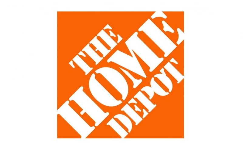
Home Depot Logo and Font

The Home Depot maintains a simple logo which only includes the company’s name, capitalized and set on an orange background. The letters in the company’s name are drawn in the shape of crates, as a handy reminder of the main tools of trade The Home Depot uses in its operations.
But while The Home Depot logo may sound simplistic, it features an excellent color and font choice that gives it a higher brand appeal than many of the company’s competitors.
Orange is a color associated with plenty of positive vibes. The color resonates with warmth, joy, and sunshine. It also exudes creativity, success, growth, freedom, change, and determination.
According to The Home Depot, the incorporation of the orange color into the brand’s logo was to help stimulate activity and inspire the company to scale new heights every day. The orange color would also make the retailer’s apron-wearing employees appear visible in the stores so they can be readily accessed by customers needing help.

However, the Home Depot’s vibrant logo color has achieved far more than it was intended for. And so has the font.
The font used for The Home Depot logo is known as Stencil D. Stencil D is a fancy and stylish typeface designed by Gerry Powell and published by Bitstream.
Just like its main purpose on The Home Depot logo, Stencil D would be suitable for using on design projects where the main idea is to grab the attention of potential clients. That ranges from store signage to campaign posters and billboard advertisements.
Stencil D would also make a great font if used on car wraps, music album covers, and movie covers. Other design projects that will look stunning with the Stencil D font include apparel branding, invitation cards, and book covers.
Perhaps it’s due to that versatility that Stencil D has been adopted by numerous artists and brands besides The Home Depot. The font appears on the cover of the collaborative studio album, ‘Rebirth of a Nation,’ by American hip-hop collective Public Enemy and rapper cum producer Paris.

Stencil is also the main cover font on the debut album ‘Recess’ by Skrillex, the 1989 film Born on the Fourth of July, and the 1997 film Con Air.
The Stencil D font family includes several weights, such as;
• Stencil D Regular
• Stencil D Outline
• Stencil D Rounded
• Stencil D Condensed
• Stencil D Solid
• Stencil D Only Shadow
• Stencil D Relief
Each style includes UPPERCASE and lowercase letters, digits 0 – 9, basic punctuations, and special characters like currency signs.
Where to Download the Stencil D Font

Stencil D can is available for download from the Font Meme, Delta Fonts, and AZ Fonts websites. Fonts Geek is another great website to download Stencil D.
The font is only free for personal use. Commercial usage may require purchasing a license from the creator or publisher.