Last Updated on September 28, 2023
The gray color has long been associated with mystery. That’s mainly because it’s neither too black nor too white despite comprising both pigments. Phrases like “gray area” only lend more credence to the color’s mysterious nature.
And while most people see gray as one distinct pigment, the color actually boasts numerous shades and hues. This article looks at one of the most common variations of gray – taupe.
Introducing Taupe
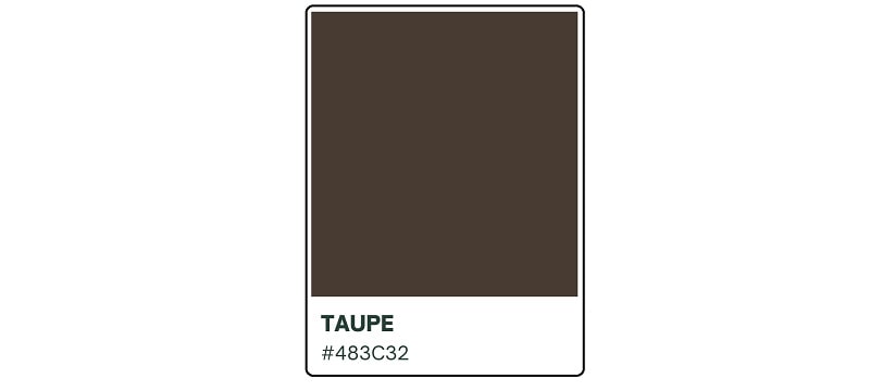
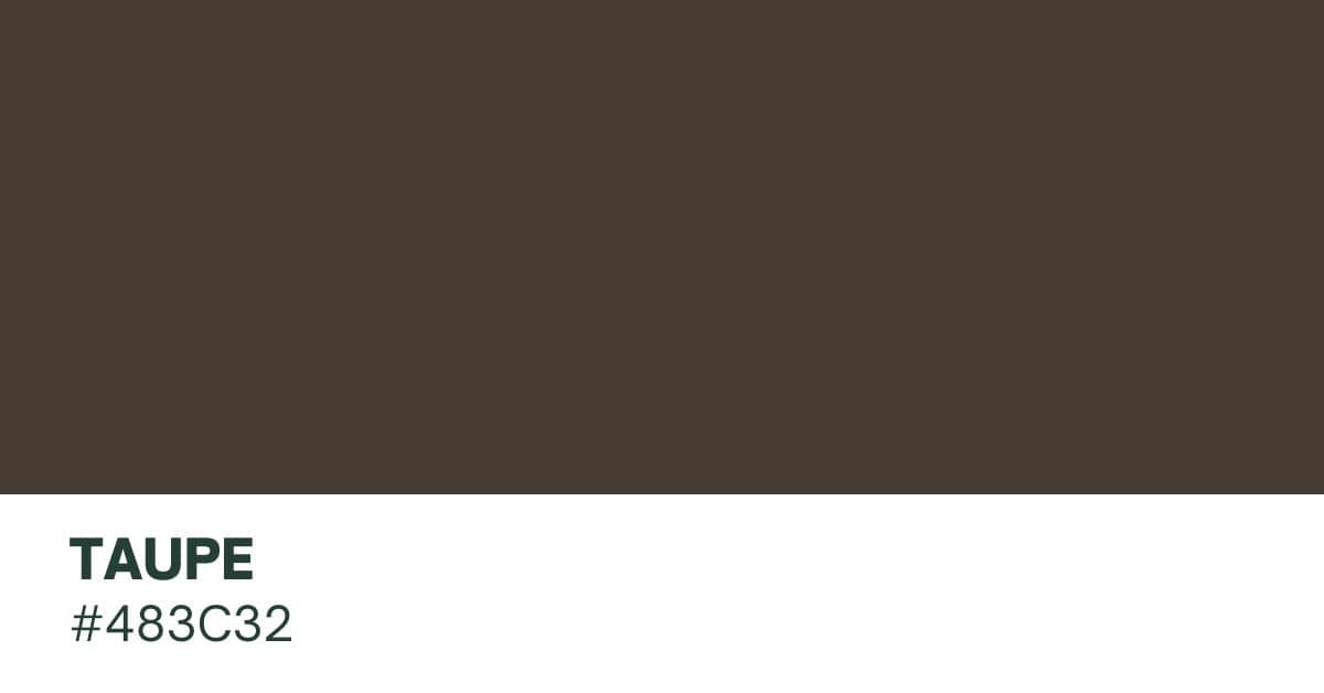
Taupe is a dark gray-brown color with the hex code #483C32. The pigment is widely considered to be the intermediate shade between gray and dark-brown. As such, it shares the physical and psychological attributes of both colors.
The word “taupe” may also be used contextually to describe a variety of pigments that range from dark tan to brownish gray.
What Colors Constitute Taupe?

The fact that taupe is a shade of gray and brown implies that the color is made primarily of these two pigments. But that’s not all.
Remember that gray is the result of combining black with white while brown is a product of the three primary colors – red, blue, and yellow. So, while gray and brown are the most visible hues in taupe, the pigment also contains decent amounts of black, white, red, blue, and yellow.
Is Taupe More Gray Or More Brown?

This is one of the frequently asked questions by color enthusiasts with regard to the taupe pigment. Unfortunately, the answer is never clear-cut. It all depends on how you perceive the color.
Most people view taupe as a shade of gray because that’s what their eyes immediately pick up. Some may also consider the pigment as a shade of brown, especially if its brown undertones are fairly conspicuous.
These mixed opinions have led many color enthusiasts to come up with diverse descriptions of taupe. In addition to the color’s standard definition of dark gray-brown, some people may also define it as a brownish-gray, grayish-brown, or even warm gray.
Intrinsically, however, basic taupe contains equal amounts of both gray and brown.
Is Taupe The Same Thing As Greige?

Taupe and greige may look identical at first glance. But the colors are quite distinct from each other. Greige is a portmanteau of gray and beige. It’s an equal combination of both pigments.
Both taupe and greige are neutrals. However, taupe leans more towards the warmer tones due to the presence of brown, which is considered a semi-warm color.
Is Taupe The Same Thing As Khaki?

Khaki is another color that has often been confused for taupe. In fact, many people comfortably use the two words interchangeably.
But while taupe is a grayish-brown color, khaki is a light brownish-green color. The presence of visible green shades in khaki is the primary difference between this color and taupe.
Is Taupe A Warm or Cool Color?
Warm colors typically have red, yellow, or orange undertones while cooler ones have blue or green undertones. Where does that leave taupe?

Well, this is another area where the taupe color draws its mystery. It’s difficult to immediately pinpoint whether this pigment is warm or cool. That’s because it derives from gray (a true neutral color) and brown (a warm-to-neutral color).
However, since the majority of taupe hues tend to be more grayish than brownish, it’s easy to see why many color experts classify taupe as neutral. Neutrals are created by combining colors located directly opposite one another on the color wheel, otherwise known as complementary colors.
Neutrals stand out for their desaturation. Although they’re the product of mixing two complementary colors, neither of the individual colors overpowers the other in a neutral shade.
Shades of Taupe
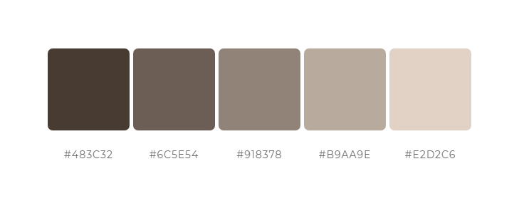
1. Gray Taupe
Gray taupe is a darker shade of taupe noted for being more gray-brown in color. The pigment also has a pink undertone. It blends well with other shades of gray, as well as with warm colors.
2. Dark Taupe
Dark taupe is the original taupe color mentioned in ‘A Dictionary of Color.’ However, the current definition is a darker shade of taupe, typically one that contains more gray than brown.
3. Light Taupe
Light taupe should be the direct opposite of dark taupe. The color has a lighter appearance that makes it look a lot like dark tan.
4. Brown Taupe
This shade of taupe is so dark that it almost appears brown. The color is also known as taupe brown or medium taupe.
5. Mauve Taupe
The term ‘mauve taupe’ was first used in the English language to denote a color in the mid-1920s. It’s a darker reddish-gray color which leans more towards pink than gray.
6. Rose Taupe
Rose taupe is a desaturated shade of red. The pigment is classified within the taupe family despite its conspicuous reddish undertones.
7. Purple Taupe
Purple taupe is a deeper and darker shade of grayish-magenta. It’s one of the most beautiful shades of taupe due to its warmer vibes compared to other taupe variants.
8. Sandy Taupe
Sandy taupe technically belongs in the orange or brown color family. The reason this pigment is also classified as a shade of taupe is its dark-brownish undertones.
How Did Taupe Get Its Name?
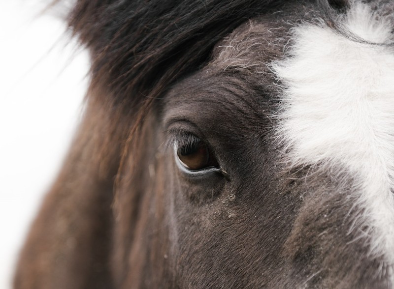
The word “taupe” derives from the French noun ‘taupe,’ which in turn derives from the Latin word ‘talpa.’ Both words denote the mammal mole.
According to ‘A Dictionary of Color,’ the first application of the word “taupe” as a color in the English language was in the early 19th century. However, the Oxford English Dictionary places the earliest citation of the word at 1911.
The word “taupe” was originally used exclusively for the French mole. However, the color’s application expanded in the mid-20th century to include a variety of other shades.
It could no longer be associated exclusively with the French mole (or moles in general) considering that these mammals can also take on a range of other colors. These include black, tan, brown, and even red, pink, or blue. Taupe acquired an additional description – any color that ranges from dark tan to brownish gray.
What Is The Origin and History Of Taupe?
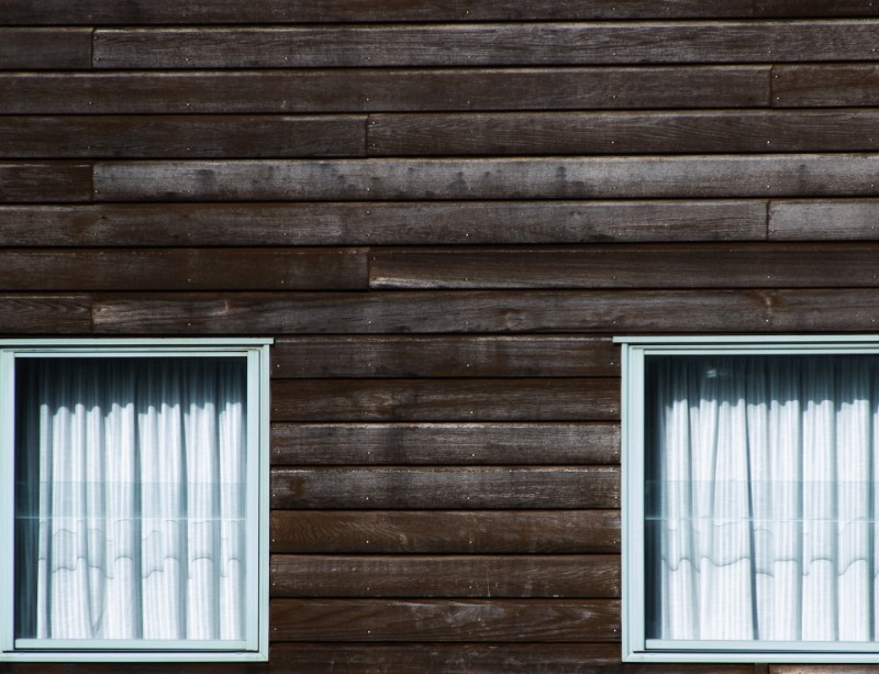
This shade is not a very old color, perhaps because it’s so difficult to define. The pigment’s history began around the 19th century when it first appeared in the mainstream English language.
Even then, it was not until the mid-20th century that taupe’s popularity began to skyrocket. The color shot further onto the limelight in the late-20th century after artists and painters came up with different shades.
Meaning and Symbolism of Taupe
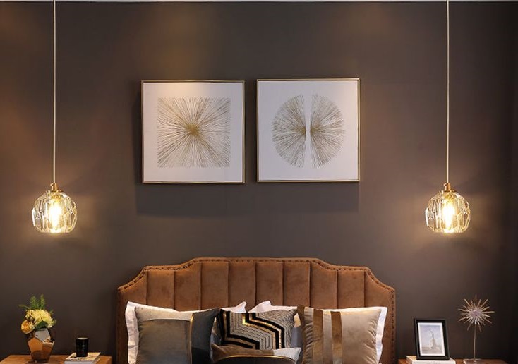
Taupe is considered a mysterious yet timeless color due to its neutral hues. Like all neutral colors, taupe can suit practically any occasion or design. The pigment works best when used as the background as opposed to an accent color.
It’s one of the few pigments that are unshaken by passing fashion trends. And that means it never goes out of style. Despite being a neutral color, taupe can still instill a sense of sophistication. The color derives its complexity from its association with both gray and brown – two of the most ambiguous colors.
It also conveys modesty. Again, this has everything to do with its neutral nature. It’s neither overbearing like warmer tones nor diminishing like cooler tones. The hue is associated with authenticity and practicality. That’s interesting considering that it’s one of the most difficult colors to define.
People who prefer taupe tend to be loyal and dependable. Just like the color, such individuals do not easily bend to the whims of passing fancies.

The taupe color also tends to appeal to down-to-earth people. It’s the right pigment to use if you want to create chic designs without necessarily making them the center of attention.
Taupe can also convey panache. You can invite this color into your designs if you wish to strike the right balance between modern and vintage. When you consider that the color sits between two different pigments, that subtle variation can produce dramatic effects.
Some people also associate taupe with fertility and versatility. That’s understandable considering the pigment’s diverse applications and its numerous shades.
On the other hand, taupe may have negative connotations. People who gravitate towards this color may be perceived as boring, introverted, conservative, or overly guarded. And while darker taupe shades may echo elegance and dependability, they can also be too depressive and foreboding.
Besides, too much taupe can make a design appear dull and uninspiring. That’s why it’s always best to mix the color with other shades. You can designate one pigment (preferably taupe) as the background color and the other as the accent.
How to Make Taupe
As taupe is an intermediate color between gray and dark-brown, the easiest way to prepare the color would be to use a gray and brown color palette. This should result in basic taupe, which you can then fine-tune as required.
Unfortunately, gray and brown colors may not be so easy to come by. No need to fret, though. You can always begin with the primary colors.
i. Add a small amount of red, blue, and yellow to a color mixing palette in equal portions.
ii. Stir the mixture gently using a paintbrush or palette knife. This will produce a dark-brownish color.
iii. Combine equal amounts of black and white to a different color mixing palette.
iv. Stir the black-and-white combo gently to create gray.
v. Add the gray color to a third palette and slowly introduce the dark-brown color.
vi. Stir until you achieve your desired shade of taupe.
NOTE: Adding more gray will darken the taupe while more brown will lighten it. However, this depends on the shade of brown you were able to create using the primary colors. A dark brown hue will most certainly create darker shades of taupe.

You could also add a dash of black and white to darken or whiten your taupe color, respectively. The same effects would be achieved by blue or red.
Wrap Up
Taupe is one of the most abstract and ambiguous colors. But if properly deployed, the color can add a slice of magic to any design it’s added to. For more stunning visuals, consider pairing taupe with softer, warmer colors like yellow, orange, pink, and olive.

