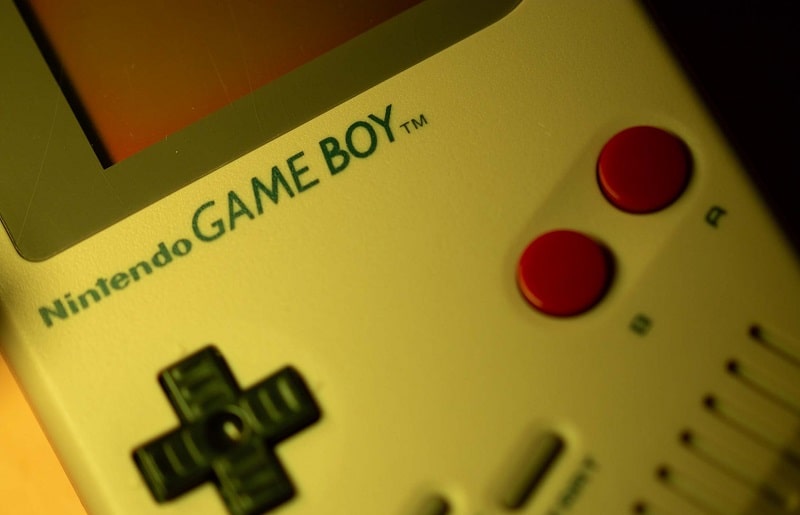
Game Boy is an 8-bit handheld game console created and manufactured by Nintendo.
Game Boy is the first handheld console in the famous Game Boy family. The console was first released on April 21, 1989, in Japan. It was then released in North America in September the same year and eventually in Europe on September 28, 1990.
The Game Boy family was discontinued on March 23, 2003. However, the family has since sold over 100 million units.
Game Boy Font
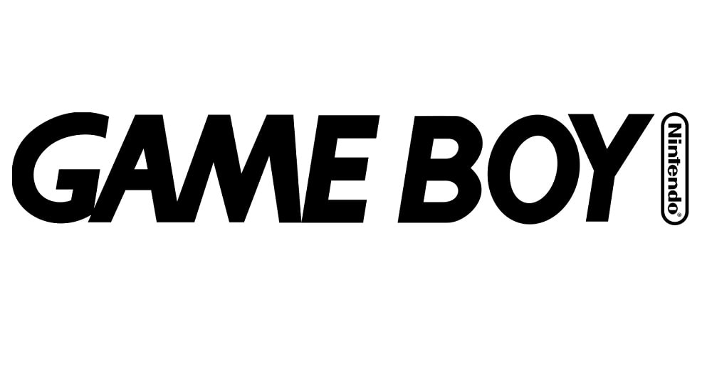
The Game Boy logo features the words “GAME BOY,” with Nintendo’s oval logo located to the right. This logo is designed in Gill Sans Bold Italic, a font in the Gill Sans family.

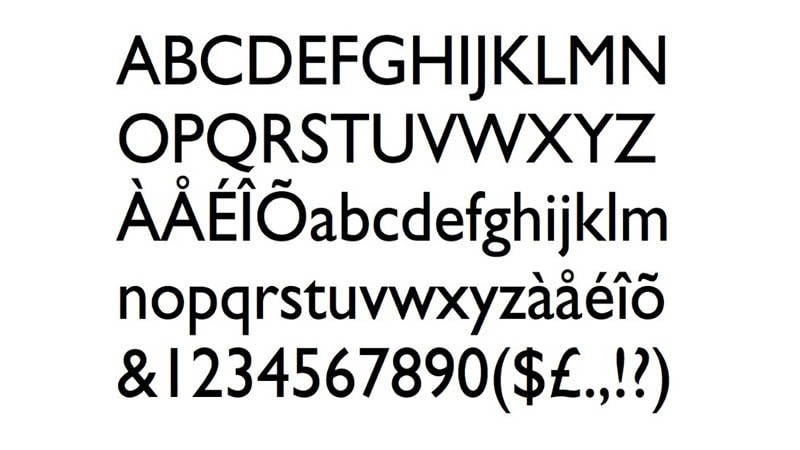
Gill Sans is a humanist sans-serif typeface created by British designer Eric Gill in 1926. The font has been published by Monotype Imaging since 1928.
Gills Sans was designed based on Edward Johnston’s 1916 typeface known as Underground Alphabet, the primary font for the London Underground rapid transit system.
While still a budding artist, Eric Gill worked closely with Edward Johnston in Johnston’s earlier design works. It’s during this time that Eric’s interest in font making increased. He went on to work on several minor design projects before officially launching his design career.
Eric Gill started working on the Gills Sans typeface in the mid-1920s. The font was designed in 1926 before being formally published by Monotype two years later.
Gill Sans’ original versions featured a set of titling UPPERCASE characters. However, lowercase letters followed shortly after.

According to Eric Gill, his aim was to create a font that blended elements of Edward Johnston’s Underground Alphabet typeface and Roman inscriptions. The end product was a typeface that looked both modern and classical.
Gill Sans was released to a considerable positive reception. Just a year after its publication, the font became the primary typeface for the London and North Eastern Railway (LNER).
LNER used the font on all its branding materials, including posters, publicity documents, and timetables. The font would also be adopted by other notable brands and corporations, including British Railways and Penguin Books.
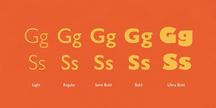
Like most typefaces, Gill Sans comes in multiple variations. Gills Sans Bold Italic especially stands out for its smooth blend of compact and wavy elements.

Gills Sans Bold Italic is incredible legible and comes in a texture that makes it suitable for use on virtually any design poster. The font is particularly suitable for male-oriented branding, thanks to its muscular appearance.
Other notable font variations in the Gills Sans typeface include Gill Sans Ultrabold, Gill Sans Condensed, Gill Sans Heavy, etc.
Where to Download the Gill Sans Bold Italic Font
There are multiple places to get your hands on the Gill Sans Bold Italic Font. You can download the font from Font Empire, or Mais Fontes.
However, note that like most fonts in the Gill Sans family, Gill Sans Bold Italic is mainly free for personal use. Remember to contact Monotype corporation if intending to use this font on commercial projects.

