Making your own fonts is an exciting way to let your creative juices flow by putting your graphic design skills to the test. It doesn’t matter whether you’re a professional graphic designer or pursuing font creation as a hobby. There’s a sense of pride and fulfillment that comes with being able to change the typographical outlook of your website or operating system.
Now, most systems come with pre-installed fonts. However, the only way a font can truly suit your style and taste is if you directly contribute to its creation.
In this post, we shall unpack how to create your own fonts as well as highlight some of the top font generators you can use for this project.
Niche Lingo
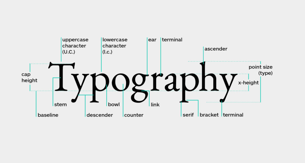
Before you can even think of embarking on any font creation process, the following are some of the terms to familiarize yourself with;
• Baseline – This refers to where all your letters sit. It’s a surface (visible or imaginary) where the bottom of each letter is designed to rest.
• Overhang – Overhang refers to the rounded bottoms of certain letters, such as B and O, which dip right below the baseline.
• Cap Height – A line that delineates the height of most capital letters.
• X-Height – This is the exact opposite of Cap Height, and refers to a line that delineates the height of some lowercase letters. It’s mostly noticeable in the letter “x”, hence the term.
• Ascender Height – Ascender Height usually rests just above the Cap Height, and limits the tips of some lowercase letters like “k”.
• Descender Height – This refers to the length of descending marks from certain characters, such as “q” and “y”.
These are some of the terms that every beginner must acquaint themselves with. If you’re a seasoned font maker, you’re probably already familiar with even more technical terms that are commonly used in font generation.
However, you don’t need to rack your brains trying to memorize these terms. Like any hands-on project, the most important thing is the practical aspect of it.
Letterform Sketching
Making your own fonts practically requires starting from the basics. Most professional-grade fonts that you see out there were designed from scratch.
i. So, start by sketching out your letterforms.
By this time, we expect that you, at least, have some rudimentary handwriting or drawing capabilities. Also, you should already be acquainted with the various font styles, such as bold, italic, underline, small caps, and CAPS.
ii. If everything looks good so far, try to draw a simple baseline grid on a piece of paper, using your pen or pencil.
iii. Using a ruler, ensure that the lines are perfectly straight, proportionate, and symmetrical.
However, don’t stress yourself too much trying to find the ideal ratios between X-height and Cap Height, as that largely depends on your best judgment. The conventional wisdom is to experiment with different dimensions until you find something that looks proportional.
Remember that this is the most crucial stage of your font-creation project, so there will be lots of trials and errors. At times, you may need to make drastic changes to your fonts or even delete them altogether and start anew. It’s all part of the learning process.
iv. Finish your letterform sketching by adding appropriate punctuation marks to your letters, such as a period (.), question mark (?), or comma (,).
Vector Your Letterforms
https://www.youtube.com/watch?v=EvyZp0p9B00
i. After sketching your letterforms, it’s time to transfer them onto a digital platform. A scanner is the most appropriate equipment to use here. If you don’t have one, you can take a photo of the letterforms using your phone.
ii. The next step is to trace your sketches using a font design vector program, such as Adobe Illustrator or a font creation program.
Whichever platform you choose, ensure it takes care of your ratios such that the final output is as close to the initial sketch as possible.
Adobe Illustrator is preferred because it offers some level of automation. It also takes care of the ratios comparatively better than most font generators and is particularly ideal if you’re trying to create a brand symbol or vector logo.
Another excellent selling point of Adobe Illustrator is that it allows you to export your works directly into graphic file formats instead of font files.
iii. If using Illustrator, some of the tools you’ll need include a computer, a pen or pencil, and the initial sketch of the lettering that you intend to vector.
iv. To vector your letterforms, proceed as follows;
a) Download the image from the scanner to your computer.
If you photographed the sketch using your phone, you can transfer it to your computer by directly emailing it to yourself, then downloading the file.
b) Next, open the Adobe Illustrator and then create a new document.
c) Place the downloaded image into the Illustrator document.
In the new Adobe Illustrator document, proceed to the File menu that’s located at the top of the screen and then select the Place command. The shortcut is Cmd+Shift+P (Mac OS) or Ctrl+Shift+P (Windows).
Go to the image file and select it.
Click and drag the image to insert it into your new Illustrator document.
d) Crop your image.
You can crop your image by either right-clicking it for PC and Mac, or pressing Ctrl+Click for Mac, and selecting Crop Image.
After cropping your letterforms, ensure the Image Trace panel is on. To do that, proceed to the Window menu and then select Image Trace. A panel will appear.
Now, adjust the Image Trace settings by selecting the image and clicking Preview that’s located in the Image Trace panel. You’ll have a sneak preview of how the font will appear, depending on the selected settings. Still on the image trace settings, ensure you set Preset to Default, View to Tracing Result, and Mode to Black and White.
e) Expand your paths by clicking on the Expand command that’s found in the Options panel located at the top of the Adobe Illustrator interface.
Essentially, “expanding the paths” refers to separating the shapes in your image for further manual editing where required.
f) Ungroup the shape to allow for ease of editing.
To ungroup the paths, select your image and press Ctrl+Shift+G (Windows) or Command+Shift+G (Mac), then click outside of the image to deselect.
g) You can apply a range of actions to your font, such as adding color to it or tweaking its shape.
Using Adobe Illustrator to vector your letterforms can be a bit technical for some people. Thankfully, there are lots of font generator tools that you can use to create your own fonts.
Most of these softwares function in the same way;
i. You create a letterform.
ii. Upload the writing to the app.
iii. Allow for a few minutes for the app to generate your own font.
Font generators are ideal if you intend to create an .otf or .ttf file. When choosing a font creation software, insist on one that’s compatible with both Windows as well as MacOS and Linux. Also, check on the number of characters the tool supports. Another bonus feature includes the ability to include your own signature.
18 Applications to Create Fonts
The following are some of the top font creation tools that you might want to try;
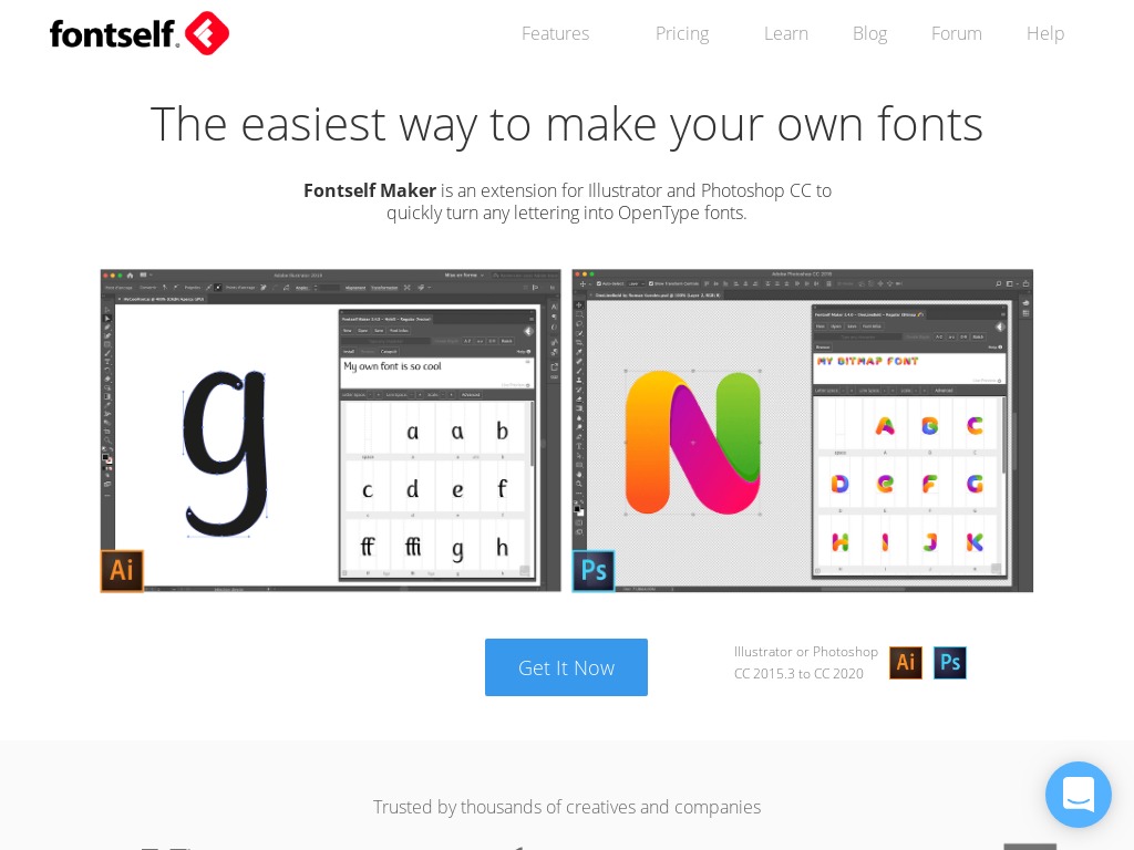
Fontself
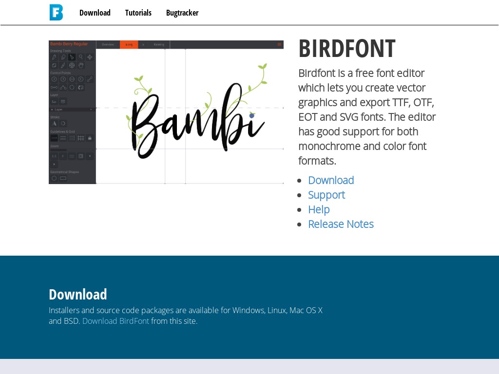
Bird Font
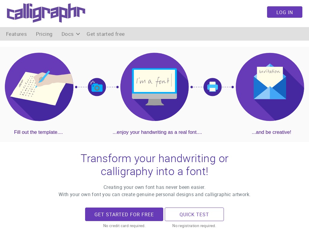
Calligraphr
Font Ark
Fontastic

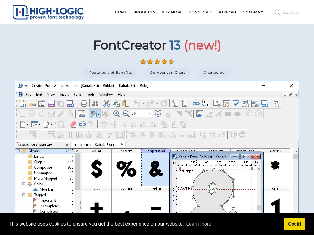
Font Creator
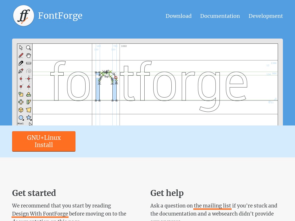
Font Forge
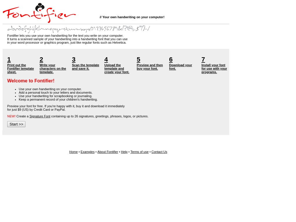
Fontifier
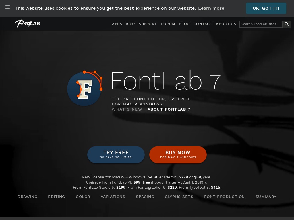
Font Lab Studio
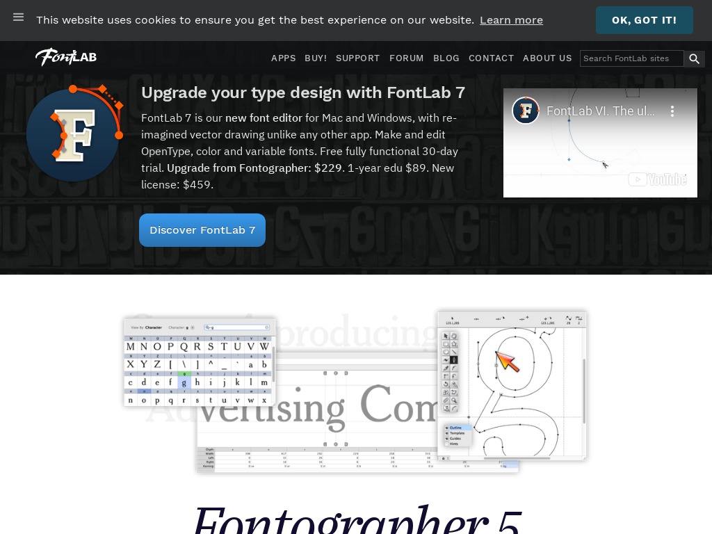
Fontographer
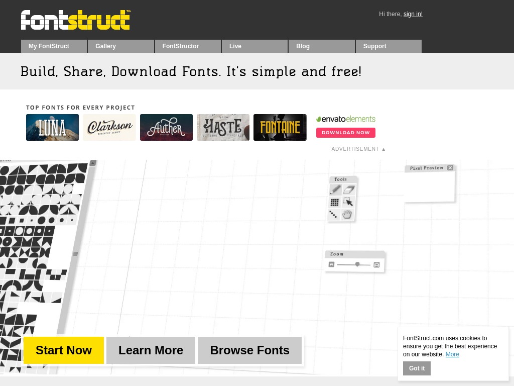
FontStruct
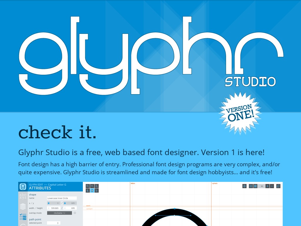
Glyphr Studio
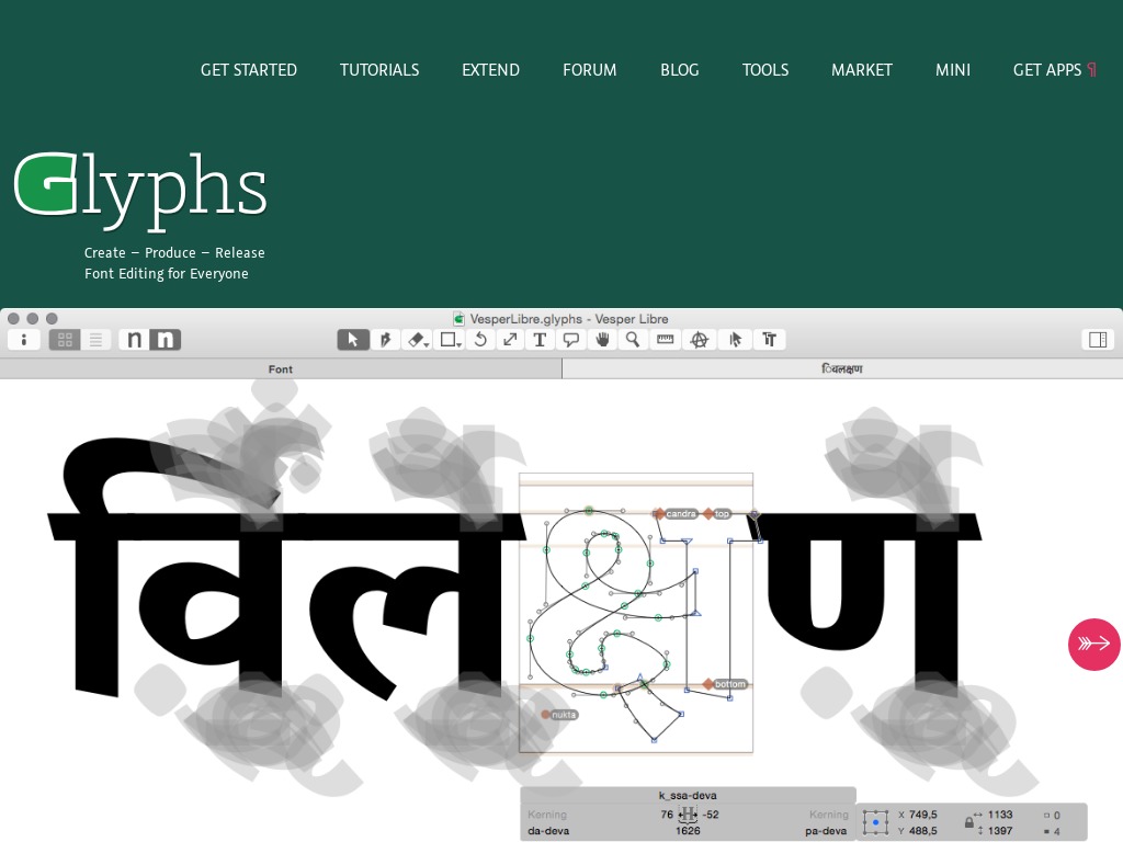
Glyphs App
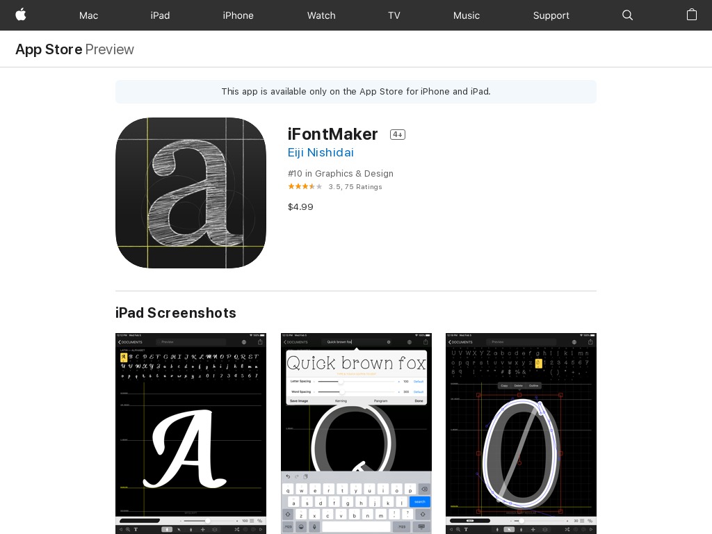
iFont Maker
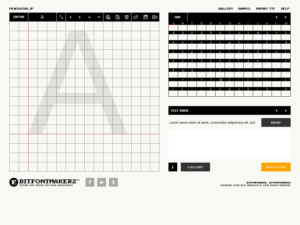
Pentacom’s Bit Font Maker
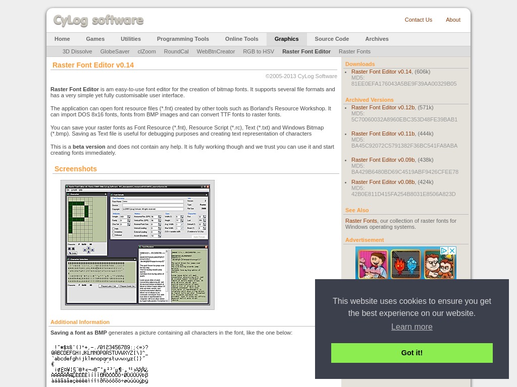
Raster Font Editor
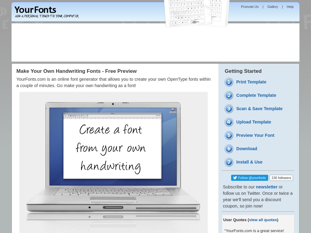
YouFonts
TTFEdit
How to Make a Font (Full Process)
How Making Fonts Changed My Life with Passive Income
How do I develop a typeface?
Advice For Making Fonts With Ian Barnard
https://www.youtube.com/watch?v=qo01jtaCyRg
Conclusion
There goes our detailed guide on how to make your own fonts. The entire guide can be split into either using Adobe Illustrator or a font generator app. And the choice of the right tool to use will come down to your individual requirements.

