For those who grew up with Penguin books, then you also grew up with this font. Gill Sans may look just like any old sans serif – but it’s easily distinguishable thanks to its humanist feel and super versatile lettering.
How Gill Sans Began
Created by British designer Eric Gill in 1926 and released in 1928 by Monotype, this humanist sans-serif was well-known for being on the covers of classic Penguin books.
Many would say that it’s essentially British in tone and concept. But nowadays, it’s used all over the world, in various countries and industries. The project began when Monotype executive Stanley Morison urged Eric Gill to turn his lettering into a full metal type family to rival German sans-serif families that were popular at that time. The result is a successful sans that was widely used in countryside printed guides and retro ads.
Gill Sans Characteristics and Pairings
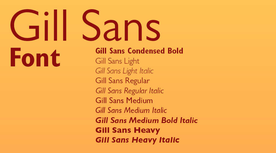
Because the font was based on Roman character shapes and proportions, its capitals may feel a little geometric even if it doesn’t seem to be so. A few letter shapes may appear inconsistent, too. This is most evident with Extra Condensed widths and Ultra Bold style. Still, you can’t go wrong with having Gill Sans in your toolkit.
There is almost nothing this sans serif can’t do. But if you’re wondering what to complement it with, then you can’t go wrong with the serif Joanna Nova, another beautiful creation of by Eric Gill. Harriet, ITC Grouch, Larish Neue, and Publico would also pair nicely. For sans serifs, try Brandon Grotesque and Supria Sans.
Gill Sans Download

One can say that Gill Sans is modern yet retains that ‘old-style’ characteristics reminiscent of traditional serifs. You should find Gill Sans in most Adobe and Microsoft apps. But if you want to explore its many weights and variants, then visit MyFonts. There are also free 15 styles available at CuFonts.