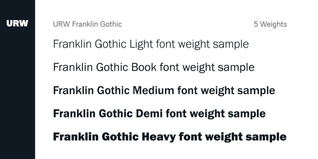
Franklin Gothic belongs to a large family of sans serifs developed by American Type Founders (ATF) in the early years of the 20th century. This classic has aged well. Nowadays, you can spot this font in print and digital designs. It’s commonly employed in headlines than in extended texts because of its ‘newspaper’ vibe.
Franklin Gothic Variants and History

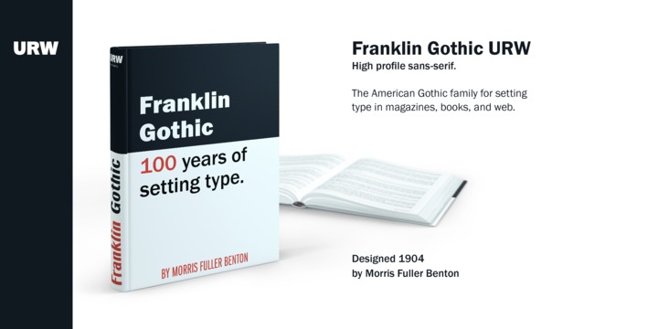
Morris Fuller Benton was credited for its design in 1902. It was named after Benjamin Franklin, one of America’s most prolific printers. Franklin Gothic in itself was an extra-bold sans serif type, which was expanded in the course of 10 years.
The original fonts were Franklin Gothic (1902), Franklin Gothic Condensed + Extra Condensed (1906), Franklin Gothic Italic (1910), and Franklin Gothic Condensed Shaded (1912) – all of these were designed by Benton and issued by the ATF. The foundry added two more variants many years later.
John L. ‘Bud’ Renshaw designed Franklin Gothic Wide in 1952, while Franklin Gothic Condensed Italic was created by Whedon Davis in 1967.
Franklin Gothic Legacy
Franklin Gothic is a respected typeface that’s featured in many prominent media. Time Magazine uses it for headlines and article titles, while The New York Times utilizes the font in several section headlines. The American and Canadian versions of Scrabble have Franklin Gothic for letter tiles.

It has also evident in applications beyond print media, such as in the movie Rocky. Star Wars benefited from the easy-to-read Franklin Gothic Condensed for their subtitles. Another testament to its utility is seen in various company logos, including those for Showtime and Bank of America.
You can buy the entire font family or its individual variants from My Fonts. For the free version, you can get them from Download Fonts. The ATF Franklin Gothic version on the other hand, can be found on Adobe Fonts. If you want the Franklin Gothic Book Regular variant, head on over to Fonts Geek to download them at no cost.
Need a strong typeface for headlines or logos? You can’t go wrong with the bold sans serif, BADGER. For a beautiful handmade outline serif for your business cards, mood boards, and blog headings, check out Viktoria.

