Bloomberg Television, commonly known simply as Bloomberg, is an American-based pay television network that focuses on business and capital market programming. The network was first launched in 1994 under the name Bloomberg Direct.
Bloomberg grew from humble beginnings to become one of the world’s most reputable television networks. Although primarily based in the United States, the network maintains headquarters in other global locations, such as London, Hong Kong, and Mumbai.
Bloomberg Television Font

The text “Bloomberg” on the Bloomberg Television logo is set in a unique font that seems to have been created by in-house designers. However, the typeface looks a lot like Helvetica.
Also known as Neue Haas Grotesk or BW Haas Grotesk, Helvetica is a sans-serif, neo-grotesque typeface created in 1957 by renowned Swiss type designer Max Miedinger in collaboration with Eduard Hoffmann. The font was developed taking inspiration from earlier German and Swiss designs, such as the Akzidenz-Grotesk typeface that was highly popular in the 1890s.
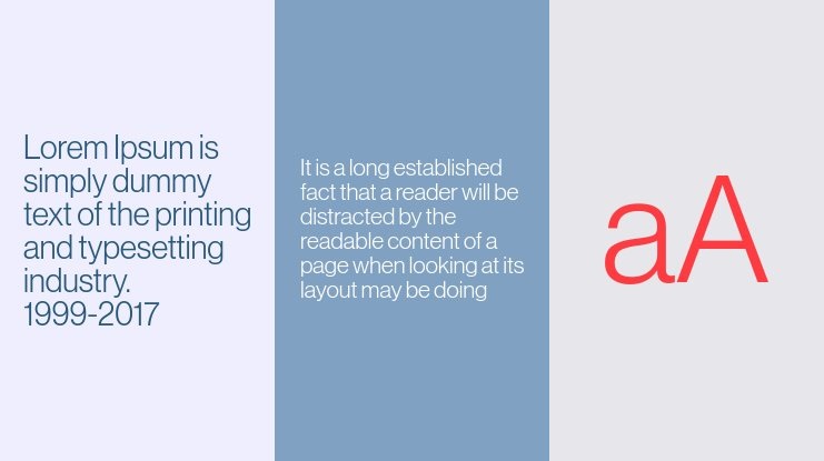
Neue Haas Grotesk was originally released by the Haas Type Foundry (Haas’sche Schriftgiesserei) of Münchenstein (Basel), Switzerland. The font was later licensed and reissued by Mergenthaler Linotype Company, who subsequently renamed it Helvetica in 1960. Following its reissuing by Linotype, Helvetica became a household name in the global typeface fraternity and was considered one of the most popular fonts of the mid-20th century.
The Neue Haas Grotesk font comes with a slew of unique features compared to typefaces developed around the same period. Most notably, the font stands out for its high x-height, abnormally tight kerning, and the termination of strokes on its vertical and horizontal lines. These features jointly make letterforms executed in the Helvetica typeface appear dense and solid, thereby enhancing their legibility.
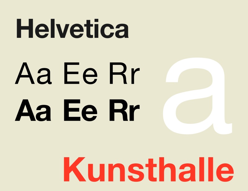
Other signature features of Helvetica include bracketed top flag of the number ‘1,’ concave curve of the stem of ‘7,’ two-storied ‘a,’ square-looking letter ‘s,’ wide capitals of uniform width, and rounded-off square tails of ‘R.’
As with most fonts, Neue Haas Grotesk was originally designed in the regular format. However, different styles and weights have emerged over the years. There have also been numerous sizes and designs created for use along with non-Latin alphabets.
Helvetica’s numerous styles make the font suitable for multiple designs. You can apply it on your company’s logotype, business cards, and branding materials.
Where to Download Neue Haas Grotesk
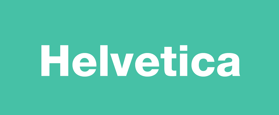
There are multiple places to download Neue Haas Grotesk. You can get it from My Fonts, DaFont Free, and Adobe Fonts. The typeface is also available on CuFon Fonts, Bold Fonts, and Fonts Hub.
Helvetica is generally marketed as free for personal and commercial use. However, you’ll do well to contact Linotype before using this typeface for commercial purposes.

