Last Updated on June 26, 2023
Barbie is a fashion doll designed by American businesswoman Ruth Handler and manufactured by renowned California-based toy giant Mattel, Inc. The doll was launched in March 1959.
Over the years, Barbie (whose full name is Barbara Millicent Roberts) has evolved to become the figurehead of a brand of toy dolls and accessories by Mattel. She has inspired the creation of numerous toys, including other members of her very own family. Barbie also has a boyfriend named Ken, with whom she forms the most popular doll couple in the world.
As of the time of writing, Mattel, Inc. has netted billions in sales from the Barbie doll. In 2020 alone, Mattel sold Barbie dolls and accessories worth $1.35 billion. That’s enough to make the toy Mattel’s largest and most profitable line.
The Barbie Brand
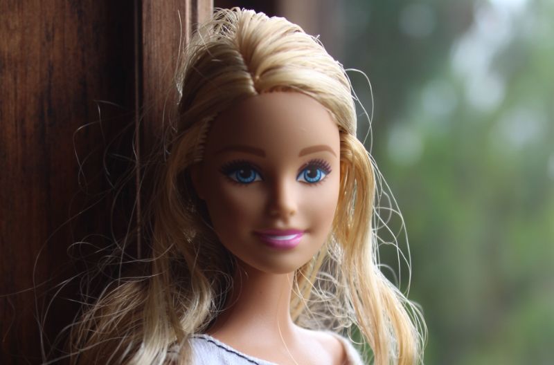
Although Barbie was initially developed as a doll, the toy has grown into a lucrative media franchise. Barbie spawned an eponymous film series that began in 2001. The films were aired regularly on Nickelodeon from 2002 to 2017.
Another noteworthy thing is that countless variations of the Barbie toy have been designed over the years. In fact, Barbie‘s early concept may be quite different from the shape of modern toys. However, all the dolls are called Barbie.
But despite its remarkable commercial success, Barbie has maintained a fairly minimalistic logo throughout the doll’s existence. This post looks at Barbie’s basic logo and how it has helped spur the doll’s growth.
Behind the Barbie Logo Design
Logo Shape
The current version of Barbie‘s logo consists of the brand’s wordmark in a hand-drawn, italic typeface. The wordmark has several distinguishable features.
For instance, the first letter “B” is the only UPPERCASED letter. It’s also the lowest letter in the wordmark.
The letters “a,” “r,” “i,” and “e” are set much higher on the line, while the second letter “b” appears slightly lower than the rest of the small letters. Most notably, all the letters are interconnected.
Logo Colors
The Barbie logo has witnessed several minor tweaks throughout its existence. However, the logo has largely retained its traditional pink color. The only exception is the 1975-1991 version where the shadows in the letters were executed in white, with pink used for the outlines.
Logo Font
Barbie uses a unique and custom font on its logo. This font seems to have been developed for Mattel, Inc. However, there are several typefaces that look like Barbie‘s original font. Examples include Dollie Script and Brush Script.
Dollie Script is a fun typeface designed by Måns Grebäck and initially released in 2013. The font is marketed as free for personal use. It’s currently available only in the regular style.
Brush Script is a typeface developed in 1942 by Robert E. Smith. The font was designed for the American Type Founders. It’s distinguished by its casual connecting strokes, the same feature that’s observable in Barbie’s wordmark.
Barbie Logo’s Symbolism
Symbolism of the Wordmark
Barbie uses a text-based logo, with the brand’s name being the design’s only element. The logo’s designer settled for the simplistic wordmark to draw more attention to the brand.
The utilization of italics makes the emblem stand out even more prominently. Besides, the lowercased letters set horizontally gives the logo a friendly yet elegant look.
And just like the dolls it represents, the word “Barbie” lettering is actually the nickname for Barbara Millicent Roberts.
Symbolism of the Color
Pink is the official feminine color. The fact that Barbie dolls are primarily designed for young girls explains why Mattel, Inc. settled on the pink color. Pink is also associated with youthfulness, gentleness, and optimism. Again, all these attributes make the color suitable for use on the Barbie logo.
Barbie Logo’s History
Barbie’s logo made its debut in March 1959 at the New York Toy Show. The logo stood out for its bright-pink inscription executed in custom cursive, with the letters in the wordmark slightly numbing over the line.
The wordmark was lowercased. Only the first letter “B” was CAPITALIZED and slightly enlarged. The left part of the capitalized letter B was straight, without any curves. These features gave the logo a minimalistic yet exquisite design.
Barbie’s original logo has retained its minimalistic, text-based design. However, the emblem has undergone several modifications and upgrades throughout the years. The first of these upgrades happened in 1975.
1975 — 1991
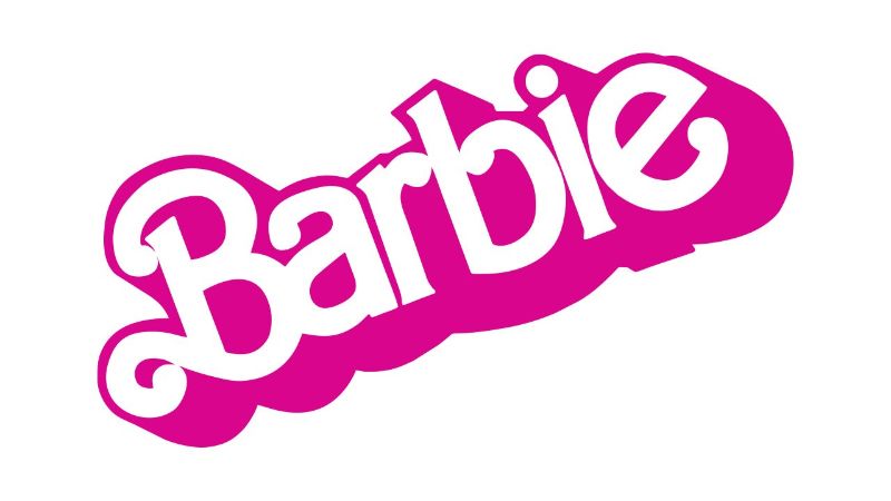
Barbie came up with a new logo in 1975. The new design sported an inscription oriented diagonally and set in a white bold sans-serif typeface. The inscription was outlined in bright pink.
Also, the letters in the logotype featured thick and rounded ends. However, the tails of the capital “B” were curved and elongated.
1991 — 1999
Barbie implemented yet another upgrade to its logo in 1991. The white shadows appearing in the individual letters in the previous logotype were replaced by a lighter and calmer pink color.
Unlike the previous version, the new letters were not outlined but featured smooth sleek lines. However, the brand kept the diagonal orientation.
1999 — 2004
Barbie‘s 1999 logo looked a lot similar to the design’s original version of 1959. The only noticeable difference was that the new version was executed in a lighter pink color and diagonally oriented.
2004 — 2005
In 2004, Barbie adopted yet another logo. The inscription remained the same. But the color looked a lot like fuchsia (more purple than pink).
The design maintained its slanted orientation. However, the angle became smaller, making it look more horizontal than diagonal.
The lowercase letter “b” received a ponytail, adding a touch of elegance to the rather minimalistic logo.
But perhaps the most recognizable change was replacing the dot above the letter “I” with a stylized hand-drawn flower. The five-petal flower also looked like a star.
2005 — 2009
After just one year, Barbie removed the stylized flower above the letter “I” from its logo. The letter reclaimed its traditional dot.
The slightly diagonal orientation was kept. However, the color of the new logo became bolder.
2009 – Present
The current Barbie logo was designed in 2009. The logo retained the light pink color appearing in most of its iterations. However, the design got bigger and bolder. Also, the emblem finally reverted to its original horizontal orientation.
Wrap Up
Barbie‘s logo has a history spanning more than six decades. But while the logo has undergone several modifications, it has maintained its basic text-based design and pink color. That consistency is part of the reason Barbie‘s logo has garnered an incredible amount of fame, particularly among baby doll fanciers.

