Last Updated on August 17, 2023
A logo is usually not the first thing that comes to mind during a company’s nascent years. That explains why a successful brand like Aston Martin operated without an official emblem for about a decade.
However, a logo is the most important element of a company’s visual identity. It plays a central role in influencing the brand’s appeal on its current and prospective customers.
So, no matter how long it takes, there will come a point when a serious startup begins to think in the direction of logo design. It appears Aston Martin understood this important business lesson, which explains why the company came up with its simple yet highly symbolic badge.
In this post, we take a closer look at the Aston Martin logo by highlighting its design, symbolism, and evolution history.
About Aston Martin

Aston Martin Lagonda Global Holdings PLC, commonly known simply as Aston Martin, is an English company that manufactures luxury cars, sports cars, and grand tourers. The company operates from a 55-acre facility located in Gaydon, Warwickshire, England.
Aston Martin was founded on January 15, 1913, by Lionel Martin and Robert Bamford. It was previously known as Bamford & Martin, borrowing from the name of its co-founders.
In 1914, Lionel Martin successful raced up Aston Hill in Buckinghamshire. As a tribute to this outstanding feat, Martin and Bamford decided to rename their company Aston Martin.
Aston Martin rose to international prominence in the 1950s and 1960s as a manufacturer of expensive grand tourers. The company’s popularity was further bolstered by its association with the fictional film character James Bond. This was after the character used an Aston Martin DB5 in the 1964 movie Goldfinger.
Aston Martin has also been associated with royalty. Since 1982, the luxury automobile brand has held a Royal Warrant as a purveyor of cars to the Prince of Wales. And in 2003, the company received the Queen’s Award for Enterprise in recognition of its contribution to international trade.
Here’s a link to Aston Martin’s official website for more insights into the company’s history, operations, and products.
Aston Martin Logo Appearance
Logo Shape
![]()
The current Aston Martin logo features the wings of a bird placed behind a rectangle containing the company’s wordmark. The wordmark is executed in ALL-CAPS.
Logo Colors
Aston Martin uses three colors on its logo – silver, black, and deep green.
![]()
Silver is used for the wing patches and the wordmark. In some versions, the silver color on the wing patches appear white whereas the silver color used for the wordmark looks cream or a light shade of yellow.
Black is used for the wing linings, whereas green is the color for the rectangle where the company’s lettering is executed.
Logo Font
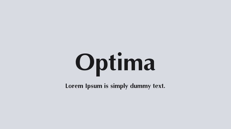
Aston Martin utilizes the Optima typeface. This is the font that the wordmark is modeled in. Optima is a humanist sans-serif typeface created by Hermann Zapf and released by the D. Stempel AG Font Foundry in 1958. The font has since been reissued by other font foundries, such as Linotype.
Although generally classified as a sans-serif font, Optima possesses several serifs. For instance, its letters in the lowercase usually have subtle swellings at their terminals, a feature commonly observed in serif typefaces.
Optima is available for personal use only. However, numerous websites let you download this font in both the Opentype and Truetype file formats. Examples of these platforms include Free Fonts Family, Cufon Fonts, and Dafont Free.
Aston Martin Logo Symbolism

Symbolism of the Wings
Wings are associated with speed, action, gracefulness, and freedom. In the case of Aston Martin, the two wings mainly stand for speed. The automaker settled on this image to portray its cars as superfast, both on the freeway and racetrack.
Symbolism of the Rectangular Frame
The rectangular frame bearing the wordmark symbolizes strength and protection. It was likely incorporated into the badge as a statement that Aston Martin’s automobiles are not only fast but also powerful.
Symbolism of the Wordmark
![]()
The wordmark executed inside the rectangular frame on Aston Martin’s logo simply helps to emphasize the brand behind the emblem.
Symbolism of the Colors
Silver is the color of wealth and luxury. Black stands for power and class, whereas green resonates with fertility and eco-friendlessness.
Collectively, the three colors signify the power, elegance, and sense of prestige that Aston Martin cars evoke, as well as the eco-friendly environment where the company operates in.
Aston Martin Logo History

As already indicated at the beginning, Aston Martin operated for nearly 10 years without an official logo. The company’s debut logo emerged in 1921 and stayed with the brand until 1926.
It featured a black circle on a bronze background, with the initials A and M superimposed. The initials were also in black and were executed in a classic serif font.
![]()
Aston Martin redesigned its debut logo in 1927. This marked the emergence of the wing-like design that has been associated with the company for years. The two wings were cast in bronze. The left wing featured the word ‘ASTON’ and the right wing sported the word ‘MARTIN.’
However, the letter ‘M’ in MARTIN appeared right at the intersection of the two wings, with its stems reaching out to either wing. Also, the letters T were drawn with their arms stretched out and touching the stems of the letter M on either side.
The Aston Martin logo continued to change as follows:
1930 – 1931
![]()
The logo used during this period was a slight modification of the previous emblem. The lettering retained its pattern. However, the wings became angular and the color scheme changed from bronze to silver.
1932 – 1939
![]()
Aston Martin’s winged emblem became a lot similar to the version we know today. The wings were now fully stretched and appeared with feathers for the first time. The logo also appeared with the famous rectangular badge bearing the company’s name.
As for the color scheme, gold was used for the wing patches, grey for the wing linings and wordmark, and black for the background of the rectangular frame.
1939 – 1949
![]()
The only noticeable changes during this period touched on the color palette. Gold wing patches became silver but the black color used for the rectangle remained intact.
1950 – 1971
![]()
Aston Martin’s winged emblem became larger and the feathers somewhat disappeared from the design. The color palette was silver and black.
Also, the inscriptions ‘David Brown’ appeared in a smaller rectangle which was placed above the rectangle containing ‘ASTON MARTIN’ lettering. The new inscription was a tribute to David Brown, who took over the brand during this period.
1971 – 1972
![]()
Almost all the elements of the previous logo remained untouched except for the color palette that changed to gold and black.
1972 – 1984
![]()
In 1972, the inscription ‘David Brown’ disappeared from the Aston Martin logo following the company’s acquisition by Company Developments Ltd. The wing patches appeared in cold grey while the wing linings were in a lighter shade of gold.
1984 – 2003
![]()
The logo became bolder, shinier, and more captivating. Grey, silver, and black were the new colors.
2003 – Present
![]()
The current Aston Martin logo first appeared in 2003. It was basically a refined version of the previous iteration, with a focus on the color scheme. Grey, silver, and black changed to silver, black and deep green.
Final Word
Although Aston Martin’s logo has changed multiple times over the years, the badge has retained its iconic winged emblem. That speaks volumes about the company’s consistency in manufacturing powerful, elegant, and superfast automobiles.