
Last Updated on November 20, 2023
Many chromatophiles (color lovers) would readily admit that gray is one of the most overlooked and underutilized colors.
Grey is assigned minimal cultural and emotional significance compared to other popular pigments like red, yellow, and blue. And the situation isn’t limited to gray only. It applies to many other neutrals, such as beige and brown.
The fact that gray is largely underrated is actually a blessing in disguise. Incorporating this color into your art projects will surely leave heads turning as everyone jostles to take a glimpse of the beautiful effects the pigment imbues. And depending on the colors that you blend it with, gray can become an insatiable food for the eyes.
Although it’s a neutral, gray is also available in a variety of undertones. One such shade is pewter. Let’s get a detailed overview of the pewter color.
Introducing Pewter
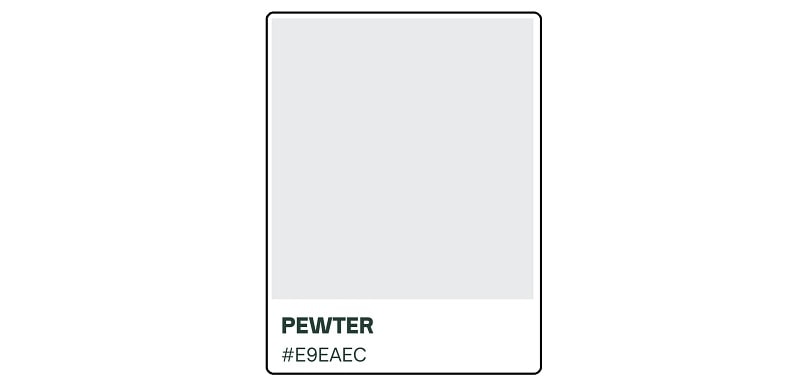
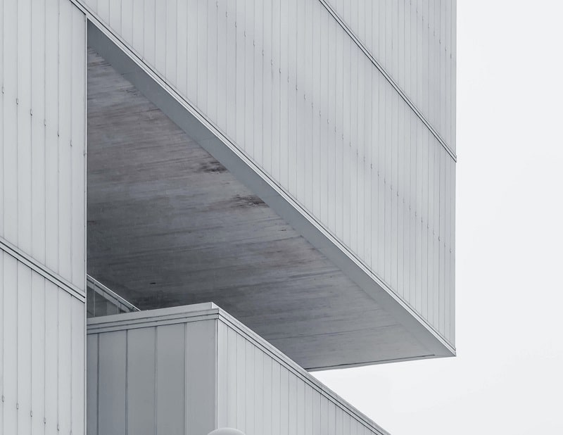
Pewter is a dark shade of gray with the hex code #E9EAEC. The color can also be described as a blend of gray and silver. Although it’s essentially a darker shade of gray, the value and saturation of gray in pewter can vary from fairly light to very dark. Some pewter undertones may appear with blue, green, or beige undertones as well.
The Distinct Colors in Pewter
All gray colors are created by combining black with white. The same applies to pewter. But as already indicated, true pewter is a darker shade of gray. That means it has considerably more saturation of black than basic gray. The pigment may sometimes appear with hints of blue, green, or beige.
Is Pewter a Warm or Cool Color?
True pewter is neither a warm nor a cool color. That’s because it doesn’t contain shades of either warmer colors (red, orange, and yellow) or cooler colors (blue and green). The pigment is rather neutral or achromatic.
However, this gray undertone may warm up or calm down its surroundings depending on any other visible shades besides black and white. Note that blue and green are cool while beige is warmer.
Is Pewter On The Color Wheel?
Pewter is a shade of gray and gray is a neutral color. Neutral colors are technically not found on the traditional color wheel. But being a gray undertone, pewter would sit between black and white on a theoretical color wheel. The pigment would likely be nestled between darker shades of gray like onyx and lighter shades like white smoke.
Popular Shades of Pewter
Pewter may be a gray undertone. But as we’ve just indicated, this color can also have numerous shades of its own. Here are some of those hues;
1. Pewter Green

Pewter green is based on the Sherwin-Williams (SW 6208) color system. It appears more saturated than the regular pewter color and typically features a tint of dark green, giving it cooler effects.
Although pewter is generally not associated with nature, pewter green is a welcome exception. The color can suit nature-themed designs while also helping promote a sense of balance and harmony. It blends well with white and other shades of green.
2. Light Pewter

As the name rightly suggests, light pewter has a lighter saturation. Therefore, the color can help imbue warm emotions into its surroundings despite being inherently a neutral. Light pewter works best when used as a backdrop. Its subtle nature makes it a better choice than other shades of pewter in terms of drawing attention to the subject.
3. Dark Pewter

Dark pewter is the direct opposite of light pewter in terms of color saturation. That means it can also create quite the opposite effects. Thanks to its darker appearance, this shade of pewter would better suit formal or serious designs. The pigment also has a moody vibe and may be used to convey passionate feelings like love and affection.
4. Revere Pewter

Revere pewter is a warmer version of pewter with noticeable brown or beige undertones. You may also describe it as a greige, portmanteau for grayish-orange color. Due to its warmness, revere pewter can be quite revitalizing. The color will also bring out the best in your designs when used in well-lit surroundings.
Colors to Pair Pewter With
Due to its neutrality, pewter can easily blend with both warm and cool colors. It all depends on the specific effects that you wish to achieve. But for optimal visual effects, consider pairing it with lighter colors, such as light gray and cream.
It’s also important to factor in the specific shade of pewter before using it alongside other colors.
Darker shades of pewter have a cooler effect and may be used with warmer colors to create beautiful contrasts. On the other hand, lighter shades have a warmer effect and would contrast better with cooler tones like blue and green.
Origin of the Pewter Name
The hue gets its name from a metal alloy of the same name. Pewter is an alloy consisting of 85 – 99% tin, 5 – 10% antimony, and 2% copper. It usually also contains bismuth and silver. The metal alloy is noted for its incredible malleability. It’s especially used as a hardener in place of lead.
It also stands out for its lower melting point (around 338 – 446 degrees Fahrenheit or 170 – 230 degrees Celsius) compared to many other metal alloys. The actual melting point depends on the concentration of its individual metal components.
But while we know what inspired the naming of the pewter color, the origin of the “pewter” name remains unknown.
Some etymologists believe that the word probably derived from ‘spelter,’ which denotes zinc and was originally used as a colloquial reference for the metal. However, the fact that zinc is not a basic constituent of the pewter alloy makes the analogy between ‘pewter’ and ‘spelter’ all the more confusing.
Origin and History of Pewter
There’s hardly any reference to the pewter color in the past. That means we may never know when the color first became the favorite of artists. However, it’s now abundantly clear that pewter derived its name from the pewter alloy.
Pewter alloys have been used for thousands of years to manufacture various items. The alloy traces its roots back to the Bronze Age, with evidence of widespread usage concentrated around the Near East. The earliest evidence of pewter’s usage was uncovered in an Egyptian tomb and dated back around 1450 BC.
After extensive usage in Egypt, pewter entered the Roman metal market before its popularity eventually spread to the rest of Europe in the Middle Ages. The ore was used in a variety of industries, especially pottery and glass making.
Meaning of Pewter Color
This hue borrows most of its qualities from gray. Gray denotes neutrality. This pigment straddles the middle ground between warmer colors and cooler tones. As such, gray tones like pewter may reflect balance and harmony. These colors can act as a unifier between overbearing emotions and subtle ones.
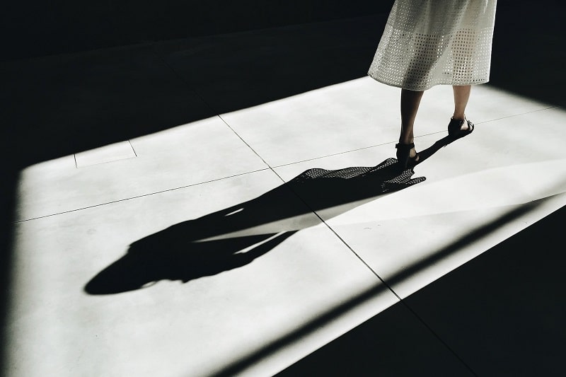
Pewter also symbolizes some seriousness. The color would be appropriate for corporate seminars, state events, and other solemn occasions. You might even don it to a wedding provided that you’re not the bride or groom as then it would look overly inconspicuous.
Choose this shade if you want to inject an aura of mystery into your projects. Themes like ancient civilizations and the afterlife would aptly be portrayed by this shade of gray. Wearing pewter outfits to your next social gathering will also draw attention to you in a rather enigmatic way.
As it’s associated with mystery, pewter is one of the colors to consider for spiritual and supernatural themes. The color isn’t too black, which means you can add it to paranormal designs without the projects coming off as too foreboding.
Despite its mystery-evoking qualities, pewter remains one of the most beautiful shades of gray. The color’s relative scarcity only adds more charm to any painting you use it on. Its darker hues makes it a bit more noticeable than most shades of gray but still modest enough not to be overwhelming.
It may also portray a sense of maturity. That’s due to its association with gray, the color of practicality. As such, the pigment would look great when designing seniors’ outfits. It would also look spectacular when used as one of the visual effects in a coming-of-age film or novel. And since it’s the color of maturity, pewter may also resonate with responsibility.
Lastly, pewter carries a sense of sophistication. That’s due to its ability to uplift your moods or calm your nerves despite being a neutral color.
How to Make Pewter
Like all shades of gray, the easiest way to create pewter is by using black and white. Here’s a brief process on how to go about it;
i. Add equal amounts of black and white paint to a color mixing bowl.
ii. Stir the mixture using a palette knife.
Note: Both black and white come in various shades and you could use any of these undertones to make pewter.
However, it’s recommended to begin with basic hues of black and white. This will allow you to create a medium grayish color. You can then implement any more tweaks to make pewter. Adding more black will change the color from medium grayish to pewter.
In addition to black and white, you could also introduce hints of blue, silver, or raw umber to make your pewter shinier. This will allow you to create a fancier and more versatile shade of the color.
iii. Compare the results against a color chart.
Wrap Up
Pewter is one of the rarest yet most beautiful shades of gray. The color is remarkably easy to add to your designs due to its neutral nature. What’s more, you can choose between the various shades of pewter depending on the actual visual effects that you intend to create.