Last Updated on November 20, 2023
Subaru cars are famous for their high speed, cute design, and signature rumbling noise. Depending on who you ask, the Subaru is the official roadmaster.
Another unmistakable feature of Subaru cars is their star-based logo, skillfully executed in a double-framed oval. The Subaru emblem has been an inseparable part of the company’s journey to success.
In this post, we examine the logo’s appearance, symbolism, and history. But first things first.
About Subaru
Subaru is the automobile manufacturing division of Subaru Corporation (formerly Fuji Heavy Industries), a renowned Japanese transportation conglomerate. The company was founded on July 15, 1953, by Kenji Kita and Chikuhei Nakajima. It’s based in Ebisu, Shibuya, Japan.
Subaru cars are famous for utilizing the boxer engine layout, especially for vehicles with an engine capacity above 1500 cc. The boxer engine layout is a Symmetrical All-Wheel-Drive drive-train layout originally introduced in 1972.
Subaru has experienced changing fortunes throughout its history as an automaker. Although the brand’s popularity still pales in comparison to that of major car manufacturers like Toyota, it still ranks among the world’s most popular automotive companies.
In 2019, Subaru’s production output stood at 665,000. Here’s a link to the company’s official website for more information on its brand history and offerings.
Subaru Logo Appearance
Logo Shape

The Subaru logo comprises a cluster of six grey stars. Five of the stars are of equal size, whereas one star is larger and brighter than the rest. The larger star appears to the left of the smaller ones.
All the stars in the Subaru logo are arranged in the Taurus constellation and set on a double-framed grey oval, which features a bluish background. Beneath the oval design is the company’s wordmark. The wordmark is executed in the UPPERCASE.
Logo Colors

Subaru utilizes three main colors – grey, blue, and black. Grey is the color that the six stars appear in. The outer boundary of the oval frame is also grey.
Note that the grey color used for the Subaru logo isn’t standard. Instead, various elements of the badge appear in different shades of grey, which include graphite, silver, chrome, and metallic. In fact, the grey color looks more white and silvery on most Subaru logos.
Blue is the color for the background or the inner space of the oval, where the six stars are executed. The blue color also isn’t uniform across the entire logo. It ranges from dark blue to light blue, cobalt, and sky blue.
Lastly, black is the color used for the wordmark. The black color used for the wordmark is rather faint as opposed to bold. This design technique was likely implemented to draw attention away from the wordmark and onto the oval design.
Logo Font

The wordmark appearing on Subaru’s official logo uses the Square 721 Std Bold Extended typeface. It is a sans-serif, square font designed by a typographer named Aldo Novarese. The font is published by Bitstream.
Square 721 Std Bold Extended is marketed as free for personal and commercial use. However, remember to contact Bitstream before applying the typeface on your official projects.
You can download Square 721 Std Bold Extended from multiple platforms, including Linotype and the Fonts-com websites.
Subaru Logo Meaning
Meaning of the Six Stars

Subaru’s star-based logo was inspired by the Pleiades star cluster. According to Greek mythology, the Pleiades represent the seven daughters of Titan god Atlas and his Oceanid nymph Pleione. They include Alcyone, Asterope, Merope, Maia, Electra, Taygeta, and Celaeno.
The bigger star on Subaru’s logo is also the brightest, just as it appears in the Pleiades the constellation. According to legend, one of the seven stars is invincible. That explains why the Subaru logo appears in six, not seven, stars.
Also, the six stars symbolize the companies that merged to form the Fuji Heavy Industries (FHI). Note that FHI was created from five different companies. The five stars represent the six companies that created this conglomerate, while the larger star represents Fuji Heavy Industries.
Meaning of the Oval Frame

The oval frame symbolizes the globe. It speaks to Subaru’s ambition of availing its cars to all corners of the world.
The oval shape may also signal dominance and infinity. Subaru may have adopted the geometric shape to convey its vision of dominating the global automobile market through consistent production.
Meaning of the Colors
Blue is associated with security, tranquility, and orderliness. Blue is also the color of the sky and water. And in Japanese culture, the color resonates with mystical powers.
Grey represents neutrality, balance, and mysticism. But as we mentioned, what appears like grey stars on Subaru’s logo may actually look silvery and white. It all depends on the viewer and the surface the logo is printed on.
Collectively, the blue and grey or silvery color palette symbolizes the sight of the Pleiades star cluster as seen in the night sky. Lastly, the black color used for the wordmark symbolizes power, elegance, and aristocracy.
Meaning of the Wordmark

“Subaru” is a Japanese word that means ‘united.’ The Fuji Heavy Industries adopted the term to describe the unity of the Pleiades star cluster, as well as the coming together of five companies to form the FHI conglomerate.
Subaru Logo History
The basic design elements of the Subaru logo have remained unchanged throughout the years. However, there have been numerous slight alterations.
For instance, the six stars were originally silver before turning gold and eventually grey. There have also been changes to the background color, ranging from transparent to red, black, and blue. The following is a brief overview of how the Subaru logo has changed over time:
1953 – 1958
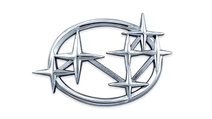
The debut version of Subaru’s logo appeared in 1953 and stayed with the brand for the next five years. The emblem featured six large stars interconnected by short lines and set on an oval frame. All the elements appeared in a consistent style and color, which was silver with a metallic sheen.
1958 – 1959

For a short duration, Subaru’s logo sported a silver-gold color. The stars in this short-lived emblem were also more elongated horizontally, thanks to the stretching of the beams. Also, the oval frame and lines connecting the six stars became thinner, making the stars the highlight of the badge.
1959 – 1970
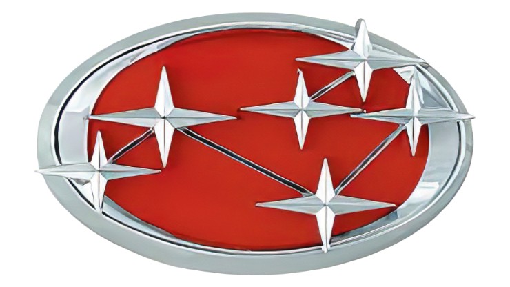
The stars on Subaru’s logo became silvery and now appeared on a red background. Designers also added a thick edging line to the oval and extended its side to prevent the stars from protruding beyond the oval’s boundary.
1970 – 1980
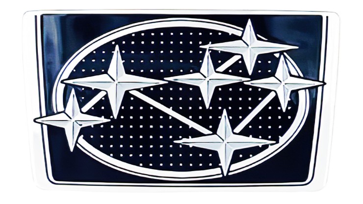
The thick edging previously implemented on the oval disappeared, making the oval look uniform. This also meant that the stars shone beyond the oval’s boundary. Another major alteration was replacing the red background with a dark blue one.
1980

In 1980, Subaru unveiled a two-dimensional version of its logo. This version was strictly meant for use in print and advertising.
The only notable difference between the 1980 logo and its previous iteration was the absence of lines connecting the stars. That’s because the stars’ outlines were already connected. Also, the frame in the new emblem featured white, grey, and black lines.
1980 – 2003
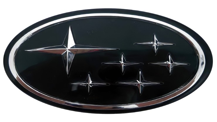
Subaru’s next logo recreated the image of a reflection of stars in the water. To realize this effect, designers made the colors more diverse and intense. The color scheme featured shades of blue as you moved down the oval, from dark blue to light blue.
2003 – Present

The current Subaru logo was unveiled in 2003. The logo was largely a slight modification of the 1980-2003 iteration, with a focus on the stars. The largest star appears lighter on a sky blue background, whereas the remaining stars are darker on a cobalt blue background. Also, the stars became connected in horizontal pairs by their rays.
Final Word
Subaru may not be the most successful automobile manufacturer (that title goes to Toyota and Volkswagen). However, the brand stands out for its unique logo, which has been the subject of discussion by car enthusiasts for decades.

