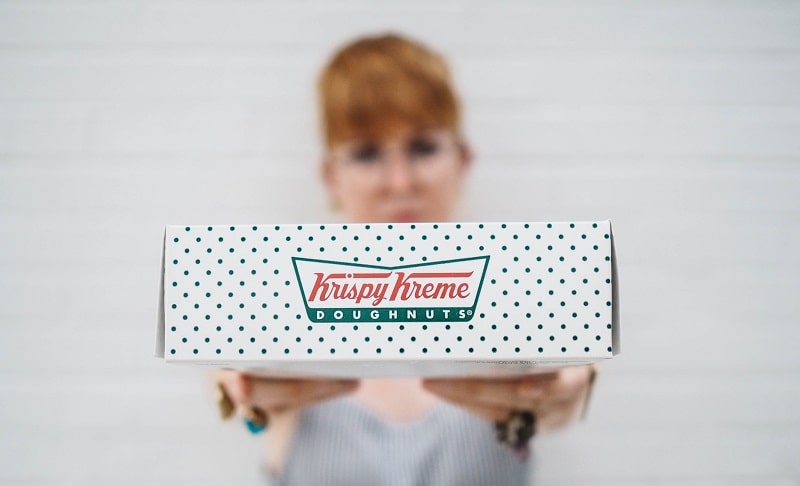
Krispy Kreme, Inc., previously known as Krispy Kreme Doughnuts, Inc., is an American company and coffeehouse chain, founded on July 13, 1937 by Vernon Rudolph.
Between 2000 and 2016, Krispy Kreme embarked on ambitious plans to expand into a public company. However, these efforts proved unprofitable and the company decided to return to private ownership under the Luxembourg-based firm, JAB Holding Company. In July 2021, Krispy Kreme began trading as a public company once again on the NASDAQ.
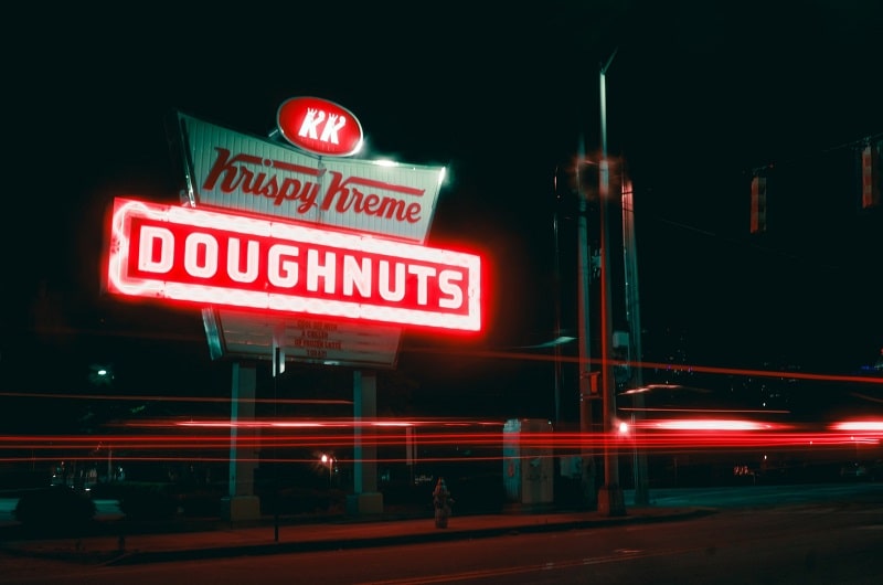
Krispy Kreme is currently headquartered in Charlotte, North Carolina. The company is available in 1,400 locations worldwide. Its offerings include baked goods, frozen beverages, hot beverages, iced beverages, and soft drinks.
Krispy Kreme Font
Krispy Kreme’s logo utilizes two different fonts. The “Krispy Kreme” part was custom-drawn. However, the font looks very similar to Lobster. The bottom part of the logo that reads “Doughnuts” uses a font called Futura Bold.
About Lobster
Lobster is a stunning typeface created by renowned Argentinian designer Pablo Impallari.
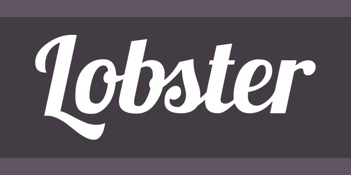
The font is noted for its cool old style and rich texture, which makes it look particularly beautiful on small prints. With its subtle curves, this font is also perfect for using on casual design projects, such as t-shirt branding, wall murals, and homeware designs.
Lobster comes only in the regular style. But this single weight includes tons of glyphs. The font supports UPPERCASE and lowercase letters, as well as punctuation marks, numbers, and symbols.
About Futura Bold
Futura Bold is a bold variant of the popular Futura font.
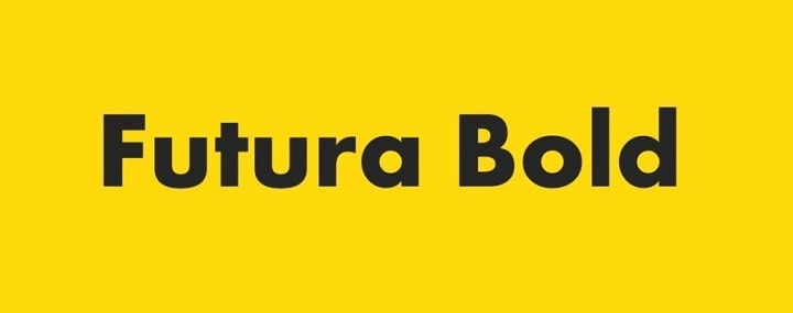
Futura is a geometric sans-serif typeface designed by Paul Renner and released to the public fonts market in 1927. The font was created as part of Renner’s contribution to the New Frankfurt project.
As its description suggests, Futura was developed based on geometric shapes. The font’s geometric imitations are most evidenced by the appearance of the circle, which looks nearly similar to the Bauhaus design styles that were popular around this period.
Bauhaus design styles are famous for their near-perfect geometric shapes, including circles, squares, and triangles. These styles also feature lowercase letters set in tall ascenders, with the UPPERCASE letters appearing identical to the classical Roman capitals.
Although Paul Renner took charge of designing Futura, the font’s development as an official typeface was the work of Bauer Type Foundry. Bauer envisioned a font that would compete with Ludwig & Mayer’s seminal Erbar font of 1926.
Futura has also witnessed numerous upgrades and expansions by other designers. For instance, there are the Extra Bold and Extra Bold Italic weights designed by Edwin W. Shaar, and the Extra Bold Italic style created by Tommy Thompson.
Where to Download Krispy Kreme Fonts
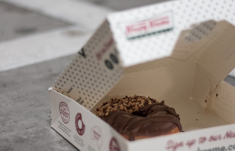
There are multiple places to download Krispy Kreme fonts. It all depends on the specific typeface you’re looking for.
You can head to the Font Squirrel or 10001 Fonts platforms to download the Lobster font. As for the Futura Bold, the Fonts Geek and DaFont Free websites would come in handy.
Both fonts are free for personal use. But you may need a license to apply them on commercial design projects.

