Last Updated on August 21, 2023
Netflix, Inc. is an American subscription-based streaming service and production company launched on August 29, 1997, by Reed Hastings and Marc Randolph.
The company offers a massive library of movies and television shows through distribution deals. It also operates its own film and series productions called Netflix Originals.
Netflix has enjoyed consistent popularity since its launch. As of December 31, 2021, the streaming service had more than 221.8 million subscribers worldwide.

Photo by Venti Views on Unsplash
Netflix’s logo has contributed immensely to the brand’s popularity. This post delves deeper into the logo’s appearance, meaning, and major evolution milestones.
Netflix Logo Appearance
Logo Shape
The Netflix logo features a stylized letter N. The letter is designed in a drop-shadowy, three-dimensional shape that makes it feel as if you can peel it off a page. It consists of wide, elongated lines that appear in different shades of red.
Unlike previous Netflix logos where the company’s wordmark appeared in full, the new emblem features the “N” letter as its only standalone element. Designers implemented a stunning z-axis element in a bid to maximize the letter’s depth without making it look too chaotic. Netflix has stayed with this logo since 2016, which proves that the emblem likely works for the streaming service’s marketing efforts.
Netflix’s “N” design stands out conspicuously regardless of where it appears. The image especially looks stunning on digital displays, such as mobile apps and social networking platforms.
Logo Colors
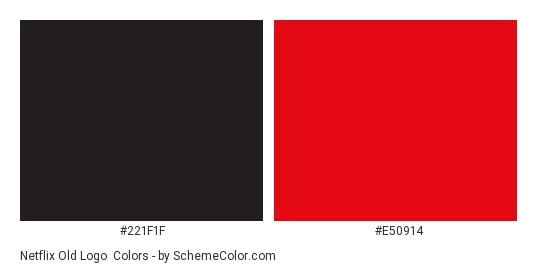
Bright red seems to be Netflix’s favorite color. It’s the main color that the company’s logo appears in.
However, the color may change across various shades of red while streaming and depending on the surface the logo appears on. Netflix also uses black on its logo.
Black is usually used for the background. But just like the red color used for Netflix’s emblem, the background color may also change depending on the context. On some surfaces, the black color changes to white.
Logo Font
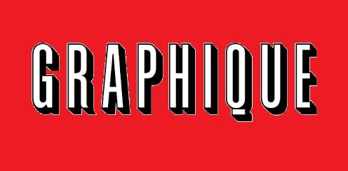
Netflix uses a font known as Graphique. This is the font used for the “N” design on the company’s official logo.
Also known as Graphique Pro, it is a font originally developed by Swiss designer Hermann Eidenbenz in 1945 and subsequently digitized and expanded into additional styles by German type designer Ralph M. Unger. The digital versions are available in about 500 characters, including UPPERCASE and lowercase letters, integers, basic punctuations, etc.
Netflix Logo Symbolism
The “N” Symbol
Photo by Dima Solomin on Unsplash
The “N” symbol on Netflix’s official logo stands for the company’s name. For several years, the streaming service used its full name on its logo before changing to a standalone “N.” The exquisite 3-D design of the emblem allows Netflix to stand out from other companies using a similar graphic image.
But where did the name “Netflix” come from?
Well, Netflix derives from two words – interNET and FLIX (which comes from the word ‘flick,’ a shortened version for film or movie). Based on the origin of the word ‘Netflix,’ it’s evident that the company was founded primarily to offer online streaming services of films.
That might explain why some variations of Netflix’s first logo included the company’s full name and the word .com, set on a movie reel.
Symbolism of the Colors
Photo by Thibault Penin on Unsplash
Netflix uses a red and black color palette. Red is the color of love, passion, excitement, authority, and vitality. Netflix might have settled on the red color to portray itself as an authority streaming service with a mission to fulfill its clients’ love and passion for the movies.
On the other hand, black is the color of power. Again, the choice of this color might have been inspired by Netflix’s intention to project an image of an authority streaming service.
Besides the deeper meaning of red and black colors, the utilization of this color palette also makes Netflix’s logo look beautiful and outstanding. And as we mentioned, Netflix’s logo sometimes switches its background color from black to white. White is mainly used to make the red color for the “N” emblem appear all the more prominent.
Evolution of the Netflix Logo
The current Netflix logo was designed in 2016. It’s considered the second longest-running graphic image Netflix has used since the streaming service was launched in 1997, coming only after the 2000-2014 iteration.
The following is a brief historical timeline of Netflix’s logo since the company’s establishment.
1997 – 2000
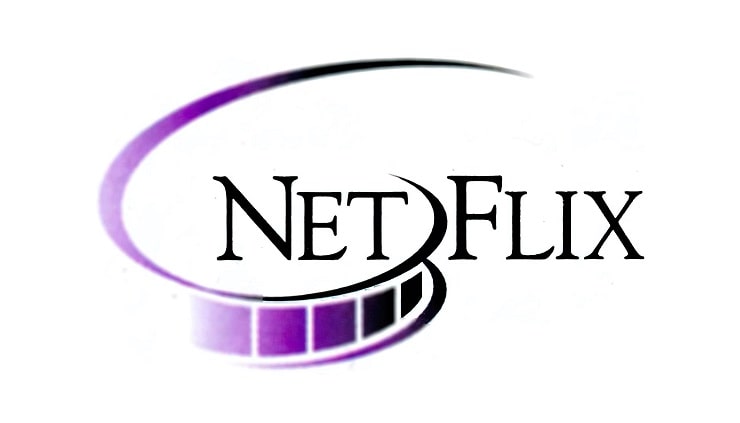
Netflix designed its first logo in 1997, the same year the streaming service was founded. The original logo featured the company’s full name. The name was CAPITALIZED and appeared in a bold, black serif. It was also split into two parts – NET and FLIX.
Underneath the ‘NET’ portion of the wordmark was a gradient cinema reel, which made it obvious that the company was dealing in media content. The reel featured a mix of black and purple colors.
It’s also worth noting that the wordmark on Netflix’s original logo occasionally appeared with the word .com.
2000
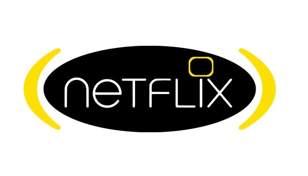
Netflix made the first redesign to its original logo in 2000. This logo was a slight variation from the 1997 version and only stayed with the streaming service for a couple of months. It featured a solid black oval badge. The badge was horizontally oriented and nestled between two rounded yellow brackets.
Netflix’s wordmark appeared in the lowercase, and the logotype was written in thin white lines. A yellow square frame with rounded angles replaced the dot above the letter “i.” The frame looked a lot like a television screen.
Late 2000 – 2014
Netflix changed its logo once again in late 2000. The new design spotted white graphique, CAPITALIZED lettering against a solid red background. The letters in the wordmark were outlined in black. A convex curve could be seen at the base of the logotype, giving the logo a three-dimensional look.
However, Netflix occasionally used a different version of its logo during the same period. The alternative emblem was also CAPITALIZED and had a convex curve at its base. But it adopted red and black colors for the lettering shadows and outlines, respectively. This logo often appeared on a white or transparent background.
2014 – 2016
Netflix’s logo was next modified in 2014. The redesign project was undertaken by New York-based design studio, Gretel.
In this version, the company’s lettering became bolder. The letters appeared in solid red color. And although the convex curve at the base of the emblem’s design remained, the new image lacked its traditional shadows.
2016 – Present
The current Netflix logo was developed in 2016. The logo sports a standalone “N” formed by a red ‘peelable’ ribbon designed to fold in over itself. It comes with a drop shadow, making it look more like a red carpet or a strip of celluloid film.
Despite the simplicity of the “N” ribbon, Netflix’s emblem is still one of the most iconic logos of all streaming services.

