The Atlanta Braves is an American professional baseball team that competes in Major League Baseball (MLB) as a member of the National League (NL)’s East division. The team is based in Atlanta, Georgia.
Also known simply as ‘the Braves’ and nicknamed ‘the Bravos,’ the Atlanta Braves was founded in 1871 in Boston, Massachusetts. The team was initially known as the Boston Red Stockings before adopting numerous names, eventually winding up as the Atlanta Braves.
The Atlanta Braves Font and Logo
The Atlanta Braves logo features two elements – the word “Braves” and an ancient hatchet symbol. The wordmark represents the team’s name while the hatchet symbolizes power and strength.
![]() Both the “Braves” logotype and the hatchet image are rendered in red, with navy blue outlines. These two elements debuted on the Atlanta Braves logo in 1990 and have largely remained unchanged since then.
Both the “Braves” logotype and the hatchet image are rendered in red, with navy blue outlines. These two elements debuted on the Atlanta Braves logo in 1990 and have largely remained unchanged since then.
Now, the Atlanta Braves emblem underwent multiple upgrades before the current design appeared in 1990. These modifications affected virtually all elements of the team’s original icon, including the font used for its wordmark.
The Braves originally used an ornate and gothic font for the capitalized letter “B” on its wordmark. The earlier font also had exaggerated curls and swirls, as well as extra lines.
In 1966, the Atlanta Braves logo switched to a script font. The team used its new typeface until 1972 when it introduced an italicized version. The 1972 changes also saw the original font made thinner. This helped bring out the logo’s graphic image in contrast to its wordmark.
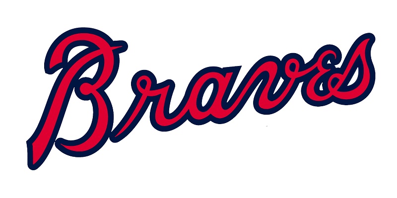 Most of the design elements appearing on the Atlanta Braves logo prior to 1990, especially with regard to the font, have remained the same. For instance, the current typeface still features elongated swirls and curls.
But perhaps the most important thing to note is that the current Atlanta Braves font was customized for the team’s logo. Which implies that the typeface has no exact versions. However, there’s a font known as Braves, which was designed based on the Atlanta Braves logo typeface.
Braves is the work of a designer named Thomas Kennedy. The typeface was released in 2011 through Letterhead Fonts Foundry.
Just like the original font used on the Atlanta Braves logo, the Braves font stands out for its fancy elements. The typeface boasts a thick texture and beautiful outlines, which make it perfect for glitzy designs.
You can deploy the Braves when creating wedding invitation cards or as the main typeface on gift cards. The font might also suit book covers, comic strip covers, company logos, video game titles, etc.
Where to Download the Braves Font
There’s a plethora of websites to download the Braves font. Examples include Fonts Download, the Fonts Magazine, and 8 Fonts.
The Braves is licensed as free for personal use. Be sure to contact the font’s designer for full license details before using it for commercial purposes.