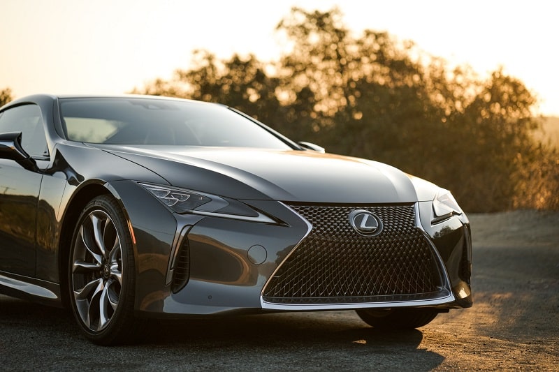
Lexus is the official luxury automobile division of the Japanese automaker Toyota. The division was established in 1989 by Eiji Toyoda.
Lexus is headquartered in Nagoya, Japan. However, the division has operational centers in various locations, including Brussels in Belgium and Plano, Texas, in the United States. And just like its parent company, Lexus cars are sold worldwide.
It’s worth noting that Lexus was founded around the same period as other luxury automobile divisions by Toyota’s major rivals, including Acura by Honda and Infiniti by Nissan.
And while the creation of these outfits appeared coincidental rather than planned, it wasn’t long before the automobiles from respective divisions began competing for global dominance.
Lexus has particularly been successful since the 2000s after it ramped up efforts to penetrate the US market. This post takes a closer look at one aspect of Lexus that has contributed immensely to the division’s runaway success – its logo.
The Lexus Logo
Logo Shape
The logo used by Lexus on its vehicles and official branding materials sports a stylized, italicized letter “L” encircled by an oval frame. The “L” sign is creatively designed such that it resembles an arrow or a curved road. Both the oval and the letter L are set in a steel grey finish.
Although the Lexus logo was created exclusively for this Toyota division, the emblem bears some similarity to the Subaru logo. The two logos share several elements, such as the curvy design.
It’s unusual that two competing brands would come up with somewhat similar graphic images for their products. So, any design similarities between the Lexus and Subaru logos might as well be coincidental rather than planned.
![]()
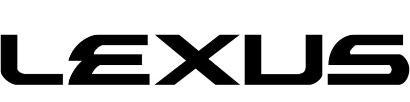
Another noteworthy element of the Lexus logo is the company’s wordmark. The lettering typically appears underneath the oval image and is usually set in CAPS. And just like the rest of the design, the wordmark is executed in grey.
If you examine the “LEXUS” wordmark up-close, you’ll be able to spot an arrow between the E’s three arms and the X’s left sides. As you shall find, this execution isn’t just for show.
Also, the “L” appearing on the Lexus’ graphic image uses a very different font from the “L” on the company’s logotype. The main difference is that the “L” symbol features softer, smoother curves whereas the “L” on the “LEXUS” logotype has more prominent angles.
Lastly, the “L” symbol is not identical for all Lexus logos. In some versions, the “L” is open and touches the oval frame. In others, it’s distinct and set completely inside the frame.
Logo Colors
![]()
The Lexus logo is designed in steel-grey color. However, the design may assume different colors, such as black and white, depending on the media platforms it appears in.
Logo Font
![]()
The Lexus wordmark is set in a unique sans-serif, ALL-CAPITAL typeface. The font was likely designed exclusively for the brand. However, the typeface looks very similar to a font known as Alexis by Iconian Fonts.
Lexus Logo Symbolism
The Oval Shape
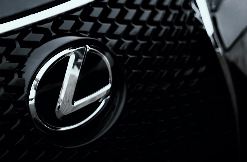
Lexus uses an oval shape on its graphic image as a way of identifying itself with its parent company – Toyota.
Although Lexus and Toyota use distinct logos, the concept of the oval frame is identical for both brands. Oval is a symbol of harmony and perfection, which is pretty much what the Toyota brand values the most.
But while both Toyota and Lexus utilize the oval concept on their respective brand logos, Lexus’ oval looks more like an arrow or a curved road. This design symbolizes the smooth curves that characterized the well-rounded and aerodynamic quality of Lexus automobiles.
Symbolism of the “L” Sign
![]()
The “L” sign on Lexus’ logo has no deeper meaning other than serving as an initial to the company’s name. Perhaps the more pertinent question to settle here is – why did Lexus settle on the name for its brand?
In 1986, Toyota engaged the services of a New York-based image consulting firm, Lippincott & Margulies, to come up with a brand name for its newly-established automobile division. The company proposed 219 possible names, including Verone, Vectre, Calibre, Chaparel, and Alexis.
After careful consideration, Toyota settled on Alexis. ‘Alexis’ was later shortened into Lexis and eventually to Lexus.
But while the origin of the “Lexus” name seems clear, many people have theorized on the actual meaning of the word. Some experts hypothesize that ‘Lexus’ is an acronym for “Luxury Exports to the US.”
Others believe the name was arrived at after combining the words “Luxury” and “Elegance.” Proponents of this theory borrow from the fact that ‘Lexus’ is a combination of root words which include the Latin word “Luxus,” the Greek word “Lexicon,” and the French word “Luxe.” All these words translate into luxury.
Symbolism of the “LEXUS” Wordmark
Lexus is one of the numerous brands whose logos feature both a graphic image and a logotype. The obvious symbolism of the “LEXUS” wordmark is that it helps enhance the brand’s appeal.
The arrows formed between the three arms of the letter “E” and the left side of the letter “X” on the “LEXUS” wordmark symbolize superior speed. It also signifies a connection between the present and the future, thereby portraying Lexus cars as both contemporary and futuristic.
Almost every letter in the wordmark is unique and unrelated to the rest. This portrays Lexus as a unique brand whose automobiles are unparalleled in speed, power, and elegance.
Symbolism of the Color
Steel grey is the official color of Lexus automobiles. The color resonates with creativity, elegance, and finesse.
Lexus Logo History
The original Lexus emblem was created in 1988 by Molly Designs and Hunter Communications. The logo’s concept and design have remained unchanged to date, with the only noticeable changes affecting the shape of the oval.
The original oval frame looked a bit more chaotic than the smoother frame we know today. Also, designers have continually added texture to the design by giving it a more metallic finish.
And as we already indicated, the brand sometimes utilizes a monochrome logo. The black and white logo predominantly appears in press release materials.
The Lexus logo may also change shape depending on the versions in use. Most versions have the “L” symbol set in an incomplete oval frame, such as the letter somewhat touches the frame. In other versions, the “L” stands alone inside the frame.
Lexus’ logo symbolizes a connection between the present and the future. That might explain why the design hasn’t changed fundamentally since its release more than three decades ago.