Last Updated on June 14, 2023
Lego A/S, also known as the Lego Group, is a Danish toy production company founded on August 10, 1932, by Ole Kirk Christiansen. The company is headquartered in Billund, Denmark. However, its toys are available in virtually every region around the world.
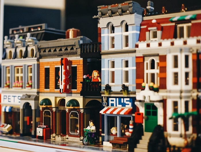
Lego’s toys mainly comprise interlocking plastic bricks. In addition to toys, Lego also owns several amusement parks and retail outlets spread all over the world. Its amusement parks are known as Legolands.
In this post, we focus our attention on the Lego logo and uncover all the fun facts behind it.
Lego Logo Appearance
Logo Shape
Lego‘s logo is a simple wordmark set inside a red square frame. The lettering is UPPERCASED and executed in white. The letters in the wordmark feature a double layer of outlines. Another notable design element is that the red square frame comes with a black border.
Logo Colors
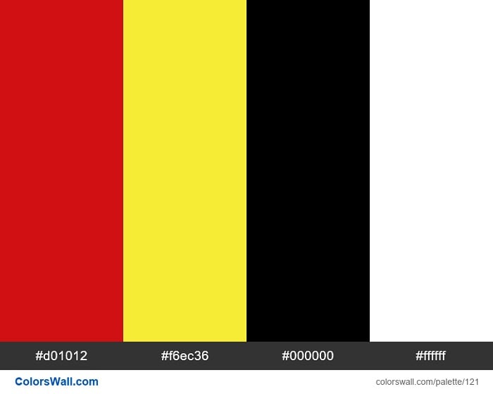
Lego‘s logo utilizes four different colors, namely white, red, black, and yellow. White is the color that the wordmark appears in, while red is the color for the square frame where the logotype is placed. Black is used as the outline for the square frame. Black also forms the inner outline of the letters in the wordmark. And yellow is used for the outer borders of the wordmark.
Logo Font
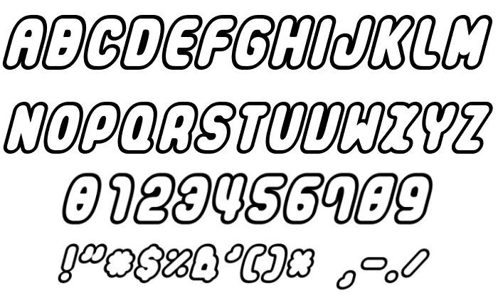
Lego uses an original bubble-shaped typeface for its logotype, known as Lego Font. It is a unique font that was developed exclusively for the toy brand. It’s mainly characterized by its soft, rounded shapes.
However, there are other similar typefaces related to the original Lego Font. A notable example is a freeware font known as LegoThick.
Symbolism of the Lego Logo
Symbolism of the Wordmark
Lego’s wordmark is undoubtedly the most recognizable element of the toy designer’s emblem. The obvious purpose served by the wordmark is to represent the company’s brand name.
Considering that Lego products are designed for children, it’s not surprising that the company’s logotype also sports an attractive display. The wordmark is executed in a solid white color and set on a bright red background, purposefully to make the design look fun and flashy. The utilization of large, rounded fonts only adds to the logo’s visibility.
Why the name Lego?
The word ‘Lego’ derives from the Danish phrase leg godt (spelled as lɑjˀ ˈkʌt]). The phrase simply means “play well.” It was likely chosen to encourage good sportsmanship among Lego users.
Symbolism of the Square Frame
Most companies use square-based geometrical shapes on their logos as a symbol of power and protection. That’s especially where the square forms the frame on which the other design elements are executed.
In the case of Lego, the square shape might also signify the square blocks that the Lego Group is famous for.
Symbolism of the Colors

White stands for purity, balance, and innocence, whereas red symbolizes passion, ambition, and enthusiasm. Black resonates with power, elegance, and class, while yellow is the color of happiness, optimism, and youthfulness.
It’s logical to theorize that Lego had these qualities in mind while designing its logo. But it’s also possible that the company only settled on this color scheme for aesthetic purposes. That’s especially considering that its target market mainly comprises children.
Lego Logo History
The original Lego logo was designed in 1934.
This was the most simplistic logo the toy brand has used throughout its history. It only consisted of the company’s name, UPPERCASED and written in bold-black color, then executed on a white background.
Lego used this logo for only two years before deciding to upgrade it.
1936 – 1946

Lego‘s first logo upgrade happened in 1936. The new logo was still text-based. However, it was now italicized.
The logo was also nestled between two black parallel lines on both sides. The space enclosed by the two parallel lines to the left side of the wordmark had the inscription “FABRIREN,” while a similar space enclosed by the parallel lines to the logotype’s right side had the inscription “BILLUND.”
Underneath the logo was the tagline – FABRIK FOR TRÆVARER OG LEGETØJ –.
1946 – 1950
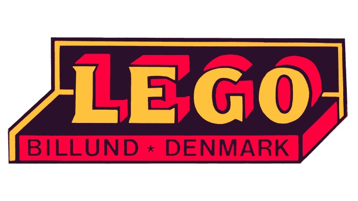
Lego‘s first colorful logo emerged in 1946. The logo was still text-based, but now three-dimensional. It included the company’s brand name set in UPPERCASE.
The wordmark featured thick pink outlines and appeared executed on a black pedestal that resembled a toy package. Beneath the brand name was the phrase “BILLUND * DENMARK.” This logo was mainly used for Lego’s wooden toys.
Lego unveiled another logo during the same period for use on both its wooden and plastic toys. It mainly featured the brand name in the UPPERCASE. The name was in orange color and underneath it was the word “Klodster.”
1953
During this period, Lego‘s design appeared in three main colors – white, red, and black. The brand name was written in white, outlined in black, and set inside a red horizontal oval.
1955
Lego‘s red oval changed to a rectangle. Also, the wordmark changed its color from white to yellow, while the black outlines became bolder.
1960 – 1964
This logo looked nearly identical to its 1955-1960 iteration, except the wordmark reverted to its original white color. Also, the inscription “System” emerged underneath the brand name in calligraphy style handwriting.
1964 – 1972

Lego began experimenting with more shapes and colors during this period. The previous rectangle became a square. Also, a new square joined the main square containing the company’s brand name.
The additional square featured five horizontal bars of different colors – yellow, red, blue, white, and black.
1972 – 1998
Lego did away with the additional multi-colored square in the previous logo and retained the square containing the company’s wordmark. Also, the inscription “System” disappeared and the brand name now featured a double outline of two colors – black and yellow.
1998 – Present
The current Lego logo was unveiled in 1998. The logo looked a lot like its previous version, except for the refined wordmark. The letters in the wordmark now appeared closer to each other, making the entire inscription narrower.
The Lego company has continuously reinvented itself over the years. Part of that reinvention involved modifying the Lego logo. Despite the changes, it’s still a beloved toy brand we know today.

