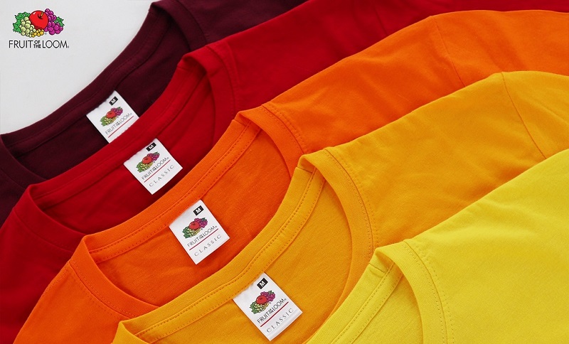
Fruit of the Loom is one of the largest clothing manufacturers in the United States. They are known for their high-quality sportswear, kidswear, and denim products.
In operation since 1851, they are one of the oldest textile brands in all of the US as well, and with this comes both a great responsibility and a great reputation. Brothers Benjamin and Robert Knight bought a mill in Warwick, Rhode Island, and under the name B.B. and R. Knight Corporation, they began making high-quality cotton cloth to sell to textile manufacturers.
In 1870, the brothers registered the name Fruit of the Loom for their company. It was trademark number 418, and it is one of the oldest trademarks in the country. The fact that the company has stood the test of time speaks volumes.
Fruit of the Loom: Short History
The Fruit of the Loom name was inspired by a customer’s daughter named Jessica Skeel. Robert, one of the owners, discovered that Jessica painted fruits on some of the bolts of cloth. Skeel said the decorated bolts sold more quickly than the others.
Since then, Fruit of the Loom has used apples and other fruit in its trademark. A loom is an old-fashioned machine used to make thread and cloth. In choosing this name, the Wrights were referring to cloth as the “fruit” or product of the loom. In 1893, the company released its first emblem. It was an elegant logo in the style many companies used, even today.
The logo of Fruit of the Loom is a simple design with the company’s name in the text, a “F.O.T.L.” logo, and a cornucopia in the background. Some people believe that this cornucopia is meant to represent fertility, which is why it is present on the logo. The company has had 7 logos throughout its lifetime.
Fruit of the Loom Logo Evolution
Over the course of the company’s near 130-year history, Fruit of the Loom has undergone several developments. Let’s take a look at how the company was able to update its brand as the world changed.
1893
![]()
The very first Fruit of the Loom logo contains the famous fruit that it is known for, but the name of the company itself is set inside a stylish and elegant golden banner. The logo itself looks like a painting, and it was ahead of its time in terms of its design. It would last for over 30 years.
1927: A Time for Change
![]()
In this logo, a spherical frame replaces the square frame, and the fruit looks a little different. The fruit is zoomed in on, and the colours are not as dark as they were before.
1936: Complete Change
![]()
1936 saw a complete and utter change to the FOTL design. The long ovular shape made way for a coin looking logo with rough edges. The brown was also a different look. However, the logo still maintained the signature fruits and wordmark.
1951
![]()
In the early 1950s, FOTL underwent another logo update, adding a little brightness to its design. However, the coin-like design remained, at least for another decade until the logo had its look completely changed again.
1962
![]()
In 1962, the FOTL logo underwent its most drastic makeover that would provide the basis for the current design. The emblem had colorful fruits on the edge of a white and black eclipse frame. And inside the frame but below the fruits was the wordmark. Apart from the Letters—F and L, the designer underlined the rest with red lines.
1978
![]()
The fifth redesign had the fruits above an eclipse frame with a shadow. Also, one of its grapes became green, and the letters of the wordmark grew in the same size, weight, and height. Below the wordmark was the inscription—unconditionally guaranteed in uppercase letters.
2003-Present Day
![]()
The Fruit of the Loom’s logo design has taken on a modern approach. With no frame, it has become modest and mouth-watering. The logo features the fruits above the wordmark in bold letters. The designer has redesigned the fundamental graphic elements, making them look cleaner, sharper, visible, and more attractive.
Fruit of the Loom Logo Current Design
![]()
The fruits that take front and center stage in the main image are not meant to be realistic like the fruits from the original logo from the 1870s. Small horizontal stripes are visible on the grapes and the apple, which represent the fabrics used in the textile industry.
The fonts have changed in the logo over time as well. Before, the emblem was full of regular serif words, but a geometric chopped typeface was chosen for the newer designs over time. This typeface is Futura Serie BQ-Book and was developed by a German designer named Paul Renner.
The variety of colors is also representative of the variety of clothing items that they produce, as well as the range of age groups and demographics that FOTL caters for.