Samsung Electronics Co., Ltd., commonly known as Samsung (shortened to SEC and stylized as SΛMSUNG) is a South Korean multinational electronics corporation founded on January 13, 1969, by Ho-Am Byung-chull Lee.
Samsung started as a grocery trading store in Daegu before venturing into electronics manufacturing and supply. The corporation is currently headquartered in the Yeongtong District of Suwon.
As of December 2019, Samsung was the second-largest technology company in the world by revenue. Some of its core offerings include mobile phones and smartphones, televisions, laptops, camera modules, refrigerators, semiconductors, lithium-ion batteries, and image sensors.
All About the Samsung Logo
Logo Shape
![]()
Samsung’s logo is a simple combination of the company’s wordmark set on an elliptical blue oval. The oval is slightly slanted such that its right side appears higher than its left.
Within the elliptical blue oval is the company’s wordmark. The wordmark is written in white and set in ALL-CAPS. It’s also creatively positioned such that the top side of the first letter “S” and the bottom side of the letter “G” intersect with the oval’s edge. The two letters appear as though they’re spilling out of the elliptical oval.
Another noteworthy feature of Samsung’s logotype is that the letter “A” appears without its crossbar. That makes it look like “V” written upside down.
Although Samsung utilizes a fairly simple logo, the logo is highly effective and has played an instrumental role in enhancing the brand’s visual identity among its customers and prospective clients. And while the company maintains several subdivisions, all its departments utilize the same logo.
Logo Colors
![]()
Blue and white are Samsung’s predominant colors. Blue is the background color that the elliptical oval appears in, whereas white is used for the company’s lettering.
However, Samsung occasionally uses black color too. Black usually replaces the blue background and is normally used to enhance the logo’s visual appeal when set on surfaces where the blue color wouldn’t be so conspicuous.
Logo Font
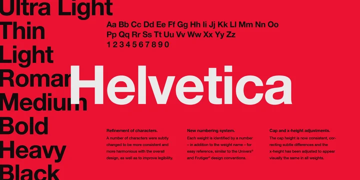
The “SAMSUNG” wordmark appearing on Samsung’s logos is set in a basic Helvetica Black font. Helvetica Black is a black version of Helvetica, a widely-used sans-serif typeface developed in 1957 by Max Miedinger and Eduard Hoffmann.
Also known as Neue Haas Grotesk, Helvetica was developed based on inspirations from late-19th century German and Swiss designs, such as the Akzidenz-Grotesk typeface. The font was released through the Haas Type Foundry and re-issued through the Mergenthaler Linotype Company.
It’s currently available in numerous versions and styles, including;
• Helvetica Black
• Helvetica Compressed
• Helvetica Inserat
• Neue Helvetica
• Helvetica Now
Symbolism of the Samsung Logo
The Elliptical Oval
Samsung did not settle on the elliptical oval just for show. Note that the oval depicts the image of space with the word ‘SAMSUNG’ in it. It helps underscore the company’s objective, which is to offer its products all over the world.
The oval is slightly slanted, a unique feature that adds to the logo’s overall appeal.
The Wordmark
Samsung uses its own company lettering on its logo. The lettering is set in ALL-CAPS to enhance its legibility.
The letters “S” and “G” in the wordmark seem to be spilling out of the logo. That represents Samsung’s readiness to embrace new technological ideas as well as avail its products to virtually every region worldwide – even outside the globe if need be.
The distinct shapes of letters “S” and “G” also means that Samsung operates with a clear sense of freedom and is ready to set up new ventures in the tech field. It also resonates with the company’s commitment to attaining new heights.
Lastly, the letter “A” looks like an inverted letter V, a feature that was likely incorporated to add an extra layer of visual interest to the wordmark.
Another interesting fact about Samsung’s wordmark is that it simply means “three stars” in Korean language. In Korean, Sam means “three” and Sung means “stars.” Most people have theorized that Samsung’s founder settled on the name to represent his intention of bequeathing the company in the hands of his three sons.
Another hypothesis suggests that the name communicated Byung-chull Lee’s dreams of establishing a company that would shine like the stars. We may never know for sure whether this was Byung-chull Lee’s vision. But as to whether Samsung has achieved tremendous success and greatness is well beyond doubt.
Symbolism of the Colors
Blue is the color of royalty, reliability, and trustworthiness. Samsung likely settled on this color to portray the company as reliable, trustworthy and dealing in high-end products.
On the other hand, white is the color of purity and elegance. Again, Samsung’s electronic goods are undeniably top-of-the-range.
Lastly, the utilization of a blue and white color palette makes Samsung’s logo appears simple yet eye-catching.
Samsung Logo History
Although Samsung Electronics was established in 1969, the company’s history goes way back.
Samsung was actually founded in 1938 as a grocery trading store that dealt in noodles, dried fish, fruits, vegetables, and other local produce. The store supplied its products around Daegu city while exporting some of its goods to China.
But even as Lee Byung-Chull gradually incorporated electronics into his business, he initially saw no need to design a logo for his company.
The first Samsung logo was designed in 1958, about twenty years after the business had been in existence. The logo was a simple circle that contained three stripes. On top of the circle was the image of a stylized sheaf of wheat, complete with three 5-pointed stars. The entire logo was monochrome. Samsung used this logo until 1969.
1969 – 1985
![]()
When Samsung-Sanyo Electronics was created in 1969, it was time to design a new logo. The company came up with a rectangular box, which featured three stars. The new emblem looked cleaner and neater than the previous logo. Next to it was the wordmark “Samsung” set in black.
1985 – 1993
![]()
Samsung’s logo changed yet again in 1985. The company adopted a simpler design by removing the outside circle appearing in previous logos.
The three stars remained but they were tweaked a bit. They now appeared bolder and were made of a diamond shape.
1993 – Present
![]()
The current Samsung logo emerged around this period. The company adopted a white, CAPITALIZED wordmark and a blue elliptical oval.
At some point, the Samsung logo appeared without the elliptical oval. However, the company would soon reintegrate the oval into its logo, and the design has remained unchanged for at least two decades.
Final Word
Compared to other major electronic corporations, Samsung sports one of the simplest yet most effective logos.
The company also enjoys quite an illustrious history, having started as a grocery trading store before evolving into the giant electronics corporation we know of it today.