Last Updated on October 9, 2023
A piece of typography has to satisfy certain minimum thresholds to be considered ideal for use. Among those conditions include legibility, aesthetic appeal, and suitability of the design it’s intended to be used on.
While type designers may compromise on some of these requirements, legibility is usually a bare minimum. Legibility denotes how clear and readable a font is.
Now, various factors affect type legibility. One such element is leading, the same that shall be the focus of this post.
What Is Leading In Typography?
https://www.youtube.com/watch?v=izc6yZ9SGo0
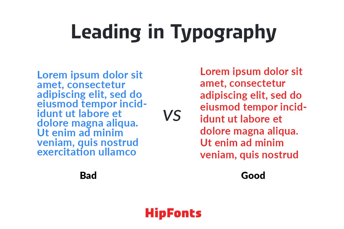
Leading is a term for the space between lines of type. It specifically denotes the line spacing measured in the vertical direction.
The concept of leading is commonly used with respect to print design. However, it equally applies to digital designs, such as applications and websites.
It’s worth noting that leading doesn’t only measure the spacing between two lines of type. It can also denote the distance between many lines.
What Is The Origin Of The Term Leading?
Before the advent of digital printing and the internet, typesetting could only be done by hand. Typesetting is a technique of composing words or text using physical letters and symbols.
Now, typesetting characters in the olden days were made primarily of metal or wood, with lead being the most common metal used in separating different text blocks from each other.
Printing shops often used lead strips to adjust the space between lines of text and highlight the vertical distance. That’s how the term “leading” (pronounced as ledding and not leading) was birthed.
Is Leading Similar To Kerning?
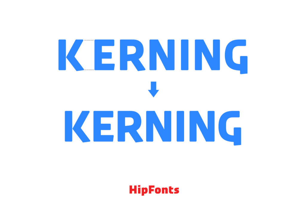
Leading is quite different from kerning, which measures the space between individual characters in a text. While leading works vertically, kerning focuses more on horizontal adjustments.
Another difference between leading and kerning is that leading applies to entire lines or paragraphs while kerning is specific to individual characters. Besides, kerning is usually a result of human error while most cases of poor leading are due to font dynamics or faults in a text editing program.
However, both variables are necessary for creating neat and legible text.
How Do You Calculate Leading?
There’s no definite formula for calculating leading. The best way to measure the vertical distance between different lines of text is using the text’s font size.
Whenever you compose a line of words, there’s usually a baseline along which all the characters rest. Most ruled books clearly indicate the baseline. However, the line exists theoretically on plain books and computer devices.
You basically calculate leading by starting from the baseline, and the results are expressed in terms of pixels.
Leading may vary significantly from one project to another. However, many type experts cite 120% – 145% of the font size used as the optimal leading. The implication is that the space between two lines of text should ideally be 1.2 – 1.45 times larger than the font’s actual size. This guarantees better clarity and legibility.
But as you shall find later on, there are several other factors to consider when deciding on the ideal leading.
What Are The Different Types Of Leading?
https://www.youtube.com/watch?v=yAuUDyUC-GM
Leading can be normal, positive, or negative.
1. Normal Leading
Normal leading is when the distance between two lines of type equals the font size used. It’s often expressed as X 10/10, where X represents the typeface used.
Normal leading is also known as default leading or standard leading. That’s because it’s the starting point before making any adjustments.
2. Positive Leading
Positive leading occurs when the leading measurement exceeds the point size of the typeface used. It’s denoted by X 10/Y, where X is the font and Y is any digit greater than 10.
Most type designers prefer positive to negative and normal leading. That’s because an increase in the vertical space between lines of type translates to better legibility.
Positive leading is also highly recommended when dealing with larger font sizes. It makes the text appear less crowded.
3. Negative Leading
Negative leading is the direct opposite of positive leading. In this scenario, the leading measurement is smaller than the typeface’s point size. The formula for negative leading is X 10/Y, where Y is a number smaller than 10.
Negative leading is probably the least commonly applied leading types. That’s for the simple reason that it encourages compactness, rendering the text unreadable.
Why Are Leading Adjustments Necessary?
a) It Improves Text Legibility
Legibility is the biggest reason to adjust leading in typography. As we mentioned at the beginning, type designers can sacrifice certain requirements but not text readability.
Insufficient leading will make the characters in your text too crowded and difficult to read. On the other hand, a bigger leading affects legibility by causing the text to appear cluttered all over the place.
b) Space Availability
The amount of space a piece of typography occupies depends primarily on the font size used and the font itself. However, leading is also a key consideration, especially when evaluating the space used up by text on plain surfaces.
Reducing the leading can free up a significant amount of space. Just ensure the resultant negative leading doesn’t impair the text’s legibility.
What Factors Affect Leading Choices?
Positive leading may be the ideal choice for most type designers. However, many other factors can help you achieve the perfect leading.
Start by analyzing the text and singling out the different elements in it. This basically entails identifying the title, subheadings, body text, quotes, and captions.
These elements tend to have different point sizes even if rendered in the same font. The idea is to adjust the leading for each variable uniformly across the text.
The following are other key considerations while adjusting leading;
i. X-height
X-height refers to the height difference between the baseline and the mean line of lowercase letters. It’s typically measured based on the height of the letter “x” or other letters that lack ascenders and descenders, such as v, w, and z.
X-height differs considerably from one typeface to another. The distance may also vary when comparing different weights and styles of the same font. So, it’s definitely a variable worth considering while making the right leading choices.
ii. Ascenders and Descenders
Ascenders are elements of a letter that extend above the x-height while descenders are elements that extend below the x-height.
Just like x-height, ascenders and descenders can differ significantly from one typeface to another. Serif fonts tend to have more exaggerated ascenders and descenders than their sans-serif counterparts.
iii. Font
Since x-height varies from one typeface to another, it’s understandable why different fonts will require their unique leading settings.
Typefaces with longer x-heights will need more leading to balance out the text layout. The converse is true for fonts with shorter x-heights.
iv. Color
Although commonly overlooked, text color is an important element to consider when working out the ideal leading.
More leading works best for darker-colored text while less leading would suit lighter text.
v. Program
Programs designed for creating typography layouts usually have different font and text size settings.
Knowing the settings of the specific program you’re using will also come in handy in helping you achieve the ideal leading.
Wrap Up
Leading is an important variable when laying out a piece of typography. That’s because it affects text durability and clarity.
We hope this article will serve as a handy guide for your next type design project.


