Last Updated on August 17, 2023
Dodge shares one fundamental feature with Subaru – both brands enjoy a relatively small but highly dedicated community of fans worldwide. However, these automotive companies differ in nearly all other aspects, including their logos.
Most car enthusiasts would agree that Subaru’s logo looks more stunning and sophisticated than the Dodge one. But it’s the simplicity of Dodge’s emblem that makes the design so easily recognizable.
Let’s dissect the underlying meaning and heritage of the Dodge logo.
About Dodge
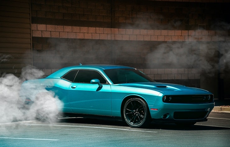
Dodge (formerly Dodge Brothers Company) is an American automobile brand and a division of Stellantis. The company was founded in 1900 by the Dodge Brothers Horace Elgin Dodge and John Francis Dodge. It’s currently based in Auburn Hills, Michigan, United States.
The company was originally founded as a supplier of auto spare parts and assemblies to Detroit-based automobile manufacturers like Ford. It was not until 1914 that the company began building complete vehicles.
In January 1920, one of the Dodge Brothers, John Dodge, died from the Spanish flu. His brother Horace passed on in December of the same year from liver-related complications.
Five years following the death of John and Horace, their family sold the company to ‘Dillon, Read & Co.’ And three years later, the automaker was sold to Chrysler. Dodge rose to widespread popularity as Chrysler’s mid-priced brand above Plymouth. The company has also enjoyed a long history of manufacturing performance cars.
In 1998, Dodge merged with Daimler-Benz AG. The merger lasted nine years. In 2007, the now-struggling automobile brand was acquired by Cerberus Capital Management. Two years later, the company was bailed out by the United States government and subsequently filed for Chapter 11 bankruptcy before being acquired by Fiat.
Dodge Logo Appearance
Logo Shape

Dodge has experimented with numerous sophisticated logos over the years. The current emblem is arguably the simplest the automotive brand has used so far.
The logo features a simple wordmark. The wordmark is in the UPPERCASE and is executed in a bold black serif. Two red diagonal stripes appear to the right of the logotype. The left of the two lines slightly cuts through the letter “E” in the wordmark.
Logo Colors
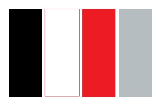
Dodge’s logo features two colors. Well, technically three if you factor in the background color. The colors are black, red, and white or transparent.
Black is used for the wordmark, whereas red is used for the diagonal stripes appearing alongside the lettering. White or transparent is the color the entire Dodge logo typically appears in.
Logo Font
The typeface used for the lettering on Dodge’s logo looks unique and original. It was probably created exclusively for the automobile brand. However, there are several close matches, such as the SF Viper Squadron Solid Regular.

It’s a solid regular variant of the SF Viper Squadron, a ragtag font by an unknown designer. The typeface is published by several font foundries, including Shy Foundry.
SF Viper Squadron is marketed as only free for personal use. A commercial license is required to use the font on official projects. You can download the font from a number of websites, including 1001 Fonts, Fonts Geek, WFonts, and more.
Aside from the solid regular variant, you can also get the SF Viper Squadron in the Regular, Italic, and Solid Italic styles.
Dodge Logo Symbolism
Symbolism of the Wordmark

Dodge’s wordmark is the main highlight of the company’s logo. The lettering basically represents the brand behind the logo. The wordmark also pays tribute to the company’s founders – Horace and John Dodge. Although the Dodge Brothers died over one century ago, their legacy lives on.
Note that Dodge isn’t the only automobile manufacturer that uses its founder’s name on its logo. The same design technique can be seen in other renowned automakers like Toyota, Lamborghini, Bentley, etc.
Symbolism of the Diagonal Stripes
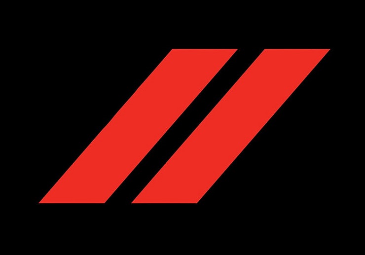
The two parallel lines accompanying Dodge’s logo add extra charm to the otherwise unsophisticated emblem. In fact, the absence of these lines would make the emblem bland and uninspiring.
The fact that the lines are in deep red and diagonally set further enhances their effects on the logo. Besides, the red stripes symbolize a road or lane dividers. The lines offer an idea of the industry Dodge is in.
Symbolism of the Colors
Black symbolizes power, class, and elegance. Most Dodge models are synonymous with these characteristics. Red, on the other hand, stands for passion, strength, and courage. But as we’ve just indicated, red was mainly used to accentuate Dodge’s wordmark and not for its underlying meaning in color psychology.
Dodge Logo History
The original Dodge logo debuted in 1910 and lasted till 1914. The logo featured a stylized bearing, with the monogram DB (for Dodge Brothers) placed inside it.
In 1914, Dodge redesigned its debut emblem into a monochromatic circular design. The central part of the circle featured the map of the globe in the background and the Star of David symbol in the foreground.
At the center of the Magen David symbol were the initials DB, while the inscription “DODGE BROTHERS MOTOR VEHICLES” appeared around the circular frame. This logo stayed with the company until 1928.
Dodge’s logo would subsequently change as follows:
1928 – 1955
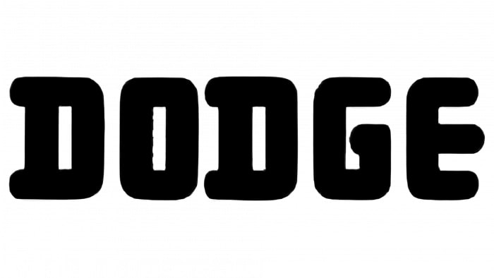
Dodge first experimented with a minimalistic logo in 1928. The company replaced all the fancy elements in its previous emblems with a simple “DODGE” wordmark, executed in a bold, custom serif.
1955 – 1962
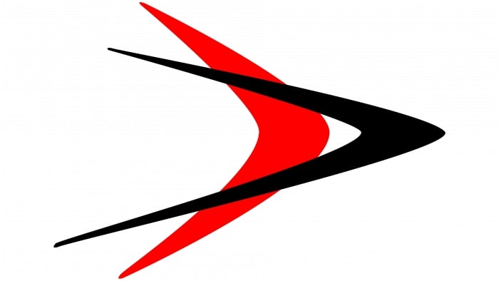
After appearing in monochrome for years, Dodge’s logo finally became colorful. The new emblem featured two overlapping V-shaped lines which looked a lot like arrows. The lines were placed horizontally and pointed to the right.
These two arrows differed in color, length, and design. The front arrow was black, more sharply curved, and longer than the back arrow, which was in red.
1962 – 1968
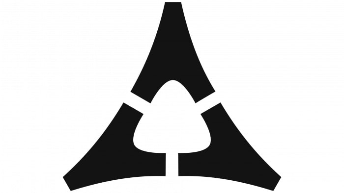
In 1962, Dodge’s logo became more abstract. The image comprised three black cone-shaped elements that were arranged to form a large triangle whose inner space featured what looked like a spade.
1964 – 1993
Dodge reverted to a minimalistic logo during this period. The emblem used during this period was a red wordmark executed in a modern typeface.
1969 – 1993
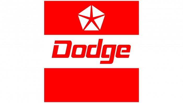
Dodge’s logo maintained the red color from its previous iteration. However, the emblem changed dramatically. The new badge comprised two red rectangles enclosing the logotype from up and down. On the upper rectangle was a red five-pointed star enclosed in a white pentagon.
1994 – 2010
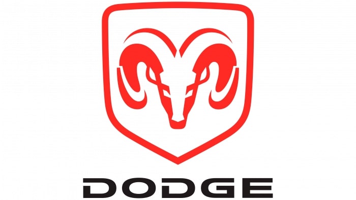
The logo used during this period is arguably Dodge’s most memorable. It sports the stylized head of a ram in red, set inside a red shield. Underneath the shield is the company’s wordmark, CAPITALIZED and executed in a black, bold serif.
2010 – Today

The current Dodge logo emerged in 2010. After experimenting with several sophisticated designs, Dodge went back to a simplistic logo – a black lettering executed in CAPITAL letters. Only that this time, the wordmark appears with red markings.
Final Word
Dodge has used numerous designs on its logo over the years. As the company’s fortunes continue to change, we can only expect those transformations to reflect on its official emblem.

