Last Updated on August 17, 2023
Here’s an ode to a brand that needs no introduction. From SUVs to sedans, from massive trucks to luggage vans – this brand has everything and more in store. But how did Toyota skyrocket to such humongous success?
And what is the meaning and history behind its unique logo?
Did you know Toyota manufactures 10 million vehicles per year? That’s crazy! Moreover, there’s a city in Japan named after Toyota! This Japanese car manufacturing company has a rich past; their premium quality cars have catered to a massive fan base of loyal customers.

Photo by Kenny Sabugo on Unsplash
Over the years, Toyota has leveled its brand to auspicious heights. A tailor-made logo representing their growth and trajectory became mandatory, so the logo underwent multiple redesigns to become the emblem we know today.
In this blog post, we will be introducing you to the origins of Toyota and its revolutionary logo.
How Toyota Got Started
The founder of Toyota was Toyoda Kiichiro Toyoda. The company was founded in 1937 during the hot months of August. 1937 is the year Toyota produced its first-ever vehicle.
But here’s what you don’t know: this company started out as a textile industry before it became an automotive company!
It all started when Kiichiro gave birth to the world’s first automatic loom. His creative innovation became the kickstart motivation he needed, so he decided to open up a Spinning and Weaving factory in 1918.
After world war II, Toyota became subject to bankruptcy due to massive financial constraints that prevailed over the entire globe.
Over the next few years, after the resignation of president Kiichiro Toyoda, the company started to regain its valor. Taizo Ishida was Toyoda’s successor, and heir to the throne of a company that set out to become one of the largest automobile manufacturers in the world.
The Toyota Crown series became a hallmark of excellence and bagged the title of the first Japanese car to be exported across American borders.
What is The Meaning of The Toyota Logo?
The Toyota symbol or logo comprises of 3 ovals. The larger one is placed horizontally and it engulfs the smaller two. The inner circles fall perpendicular to one another.

Photo by Christina Telep on Unsplash
The inner ovals depict the customer’s heart and that of Toyota’s. So, saying that Toyota’s ideology is to interwind the customer and company snugly together won’t be an understatement.
The overlapping of the smaller logos also represents trust, cordial relationship, and commitment. These two ovals also form the letter ‘T’ while simultaneously giving the effect of the steering wheel of a car.
Now coming to the larger, horizontal oval. This oval represents Toyota’s world. The spaces in between are incorporated to depict ‘infinite values’.
Toyota defines these infinite values as ‘superb quality, value beyond expectation, joy of driving, innovation, and integrity in safety, the environment, and social responsibility’.
History of the Toyota Logo
The Toyota logo that we see today was blueprinted back in 1989 after it made its 50th-anniversary benchmark in the automobile industry.
1935

The very first Toyota logo wasn’t even a Toyota logo! It had Toyoda written on it instead. You can see a roughly diamond shape with a red and white theme going on.
The red and white color scheme was chosen to display victory, passion, vigor along with virtues of peace and tranquility. The lettering was bold and edgy, representing aspects of professionalism.
1949
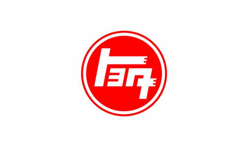
This is the year Toyota decided to go Japanese with the logo! A red circle bordered by a white and red outline was designed to showcase Toyota’s Japanese roots. White hieroglyphs inside the red circle translated as Toyota. This logo is very similar to the flag of Japan.
1958

Because this vehicle brand started to make it through the borders of the United States of America as a quality export, an American variant of the logo became necessary. The lettering was in a black, bold serif typeface, which reminds me of the Times New Roman font.
1969

Toyota decided to opt for the Sans serif typeface in 1969. It also further boldened the lettering to make it look sleek and powerful. This font is similar to Hypersans Heavy.
1978

This logo font is the one we see in the modern-day. Toyota decided to jump back to the red and white color scheme it had adorned since the beginning. This logo is relatively neat, balanced, and gives a corporate finish to the brand. The tails and bars of the logo were slightly reduced.
1989

What we see here is the debut of the infamous oval emblem, a symbol that needs no introduction in the current day. This symbol has three ovals; the larger one is horizontal, and it houses two overlapping smaller ovals inside. The Toyota lettering is placed in the right-hand corner.
2005

Toyota digitized the oval emblem symbol further to give it a 3-D look. It was enhanced and given with a reflective silver color that’s in contrast with the same old red Toyota lettering. This logo was intended to express the growth Toyota had gained over the years.
2019

The iconic oval emblem evolved yet again, but Toyota’s prime heritage was used as the inspirational raw material. The contours of the oval emblem were refined and laid on a red background placed beside the black Toyota lettering. This logo takes a rectangular shape and represents the virtues of quality and confidence.
2020

Toyota has gained enough popularity that it no longer felt the need to express its identity through lettering. The 2020 logo is just the iconic oval emblem with refined contours and a black monochrome color scheme.
Toyota continues to impress with their new offerings, such as hybrid cars and fuel cell technology vehicles. With sleek styles and fast speeds, no wonder they are still a top choice among drivers and car enthusiasts around the world. And their new minimalist logo is a reflection of a commitment towards quality and efficiency.